


Pigeon Reveals CF Montreal's New Logo

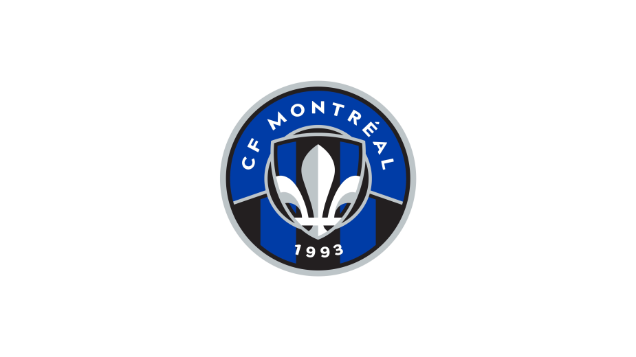
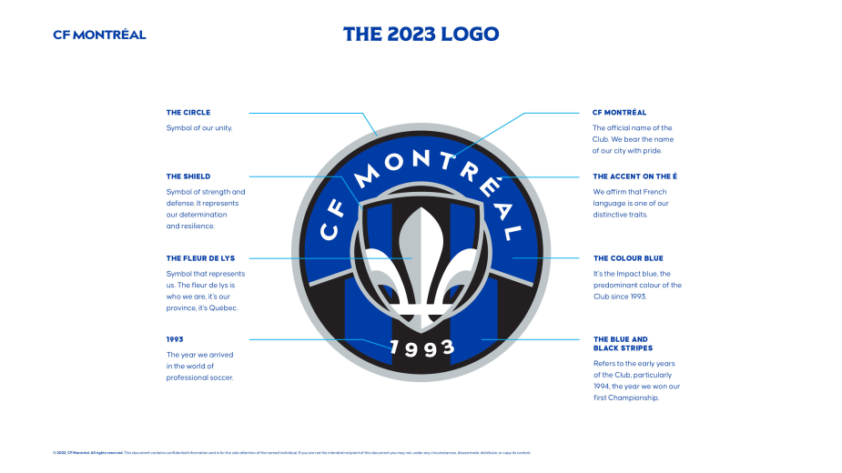
CF Montréal unveiled its new logo today, which will be officially used as of the 2023 season. The organisation proposes a new crest that honours the club's history.
It features the team’s official name, CF Montréal, the fleur-de-lys, the shield, the predominance of the colour blue, and 1993, the year of the Club’s inaugural season. The black and blue stripes call back to the Club’s early years, particularly 1994, year of the Club’s first championship. This upcoming holiday season, a selection of items featuring the new crest will be available for fans to purchase online.
"Strongly committed for a long time to our Montréal soccer team since we developed the 2002 and 2012 logos, we are honored to participate in the elaboration of the new CF Montréal identity. It is the result of a long process of reflection, listening and sharing. The new club crest is highly symbolic. It includes all the symbols that define the club and that are dear to the fans. Its integrity and graphic elements were carefully defined to communicate who CF Montreal is, its values, its mission," said Olivier Chevillot, executive creative director of PIGEON.
“Today we are turning another important page of our history,” said CF Montréal Chairman of the board of directors, Joey Saputo. “A few months ago, we began to reflect on our identity, as well as our logo, and concluded that a realignment was necessary. The employees, fans, and partners we met clearly expressed their desire to reinstate certain elements that have marked the Club's history and are at the heart of our identity. We heard them loud and clear, and we are proposing a logo that meets those requests.”
“I am pleased that the ‘Impact blue,’ as we have named it, will dominate our new emblem. I would like to thank our employees, fans and partners for their contribution, as well as MLS, and the equipment manufacturer adidas for their collaboration. Developing a new logo is a complex exercise. The process, which began before my arrival, also had its share of challenges in an ecosystem like MLS, both in the choice of shapes and colours.", said CF Montréal president and CEO, Gabriel Gervais.
“The process surrounding the new logo also allowed us to reflect and clarify our raison d'être as an organisation, and what defines us,” added Gabriel Gervais. “The logo is part of a broader reflection on CF Montréal’s identity. The process also allowed us to make observations that will influence our future communications.”
“We need to raise awareness about our role in Quebec, including developing local talent, from the grassroots to the professional level, the importance of giving back to the community, promoting soccer culture in the province, and represent, even celebrate, Montreal’s identity,” mentioned Joey Saputo.


