Pigeon Injects Fresh into Vegetable Brand Arctic Gardens

PIGEON is proud to to share its collaboration with Aliments Nortera (formerly Bonduelle Americas) for developing the evolution and repositioning of its flagship brand Arctic Gardens.
Launched in 1987, Arctic Gardens is a brand of high quality vegetables, both in terms of the diversity of its offering and its production methods. However, over time, the brand image no longer met the needs of current consumers, and it became necessary to update it. The brand therefore had to inspire its consumer base once again and appeal to a new generation of parents looking for healthy food for their families.
The challenge for the PIGEON team was to relaunch a well-established brand, which was facing growing competition. The injection of a fresh look and feel was needed to send a strong signal to the market in order to clarify and enhance the perceived value of the brand.
The strategic thinking mandate was expressed through a new positioning and a new brand territory, a new brand ecosystem, a brand book and a new packaging platform.
The work of strategic reflection has demonstrated the opportunity to distinguish Arctic Gardens as a responsible and generous brand that offers quality products of incomparable freshness. The freezing method, which retains all the nutritional qualities, is inspired by arctic conditions, as its name originally intended. In order to give meaning to the brand, to no longer limit it to the practical or cooked aspect of frozen vegetables, and to give it more elasticity, we are positioning Arctic Gardens as a local brand (from northern America), which help consumers be smart about increasing their vegetable intake. This is what inspired the new essence and positioning 'Nordic freshness'.
Arctic Gardens today pays tribute to its know-how. A brand for which craftsmen and people work together with nature to take care of its land. A full family of homegrown vegetables, including a range tested for pesticide residues, are part of the portfolio. The revitalisation and positioning allows the brand to remain relevant in the eyes of new generations of young parents for whom frozen vegetables are ideal economic solutions in terms of good nutrition, saving time and reducing waste.
"Arctic Gardens has established itself as the leader in frozen vegetables over the years. The brand has been able to stay the course with its innovations and its approach to inspire occasions to consume vegetables in spaghetti, soup, etc. To continue to affirm its relevance, we needed to modernise its brand image. We did this by promoting the brand values and product benefits that resonate more and more with young families, not to mention our loyal consumers who have made Arctic Gardens a greatly appreciated brand in the country. We are bringing back to the fore several of our assets that were not sufficiently known to consumers.” - Nicolas Joly, marketing director, Aliments Nortera.
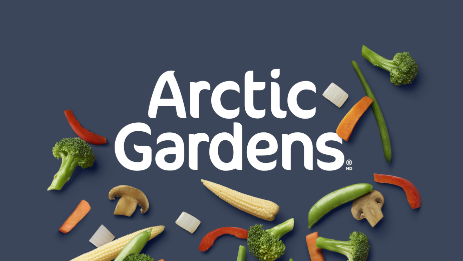
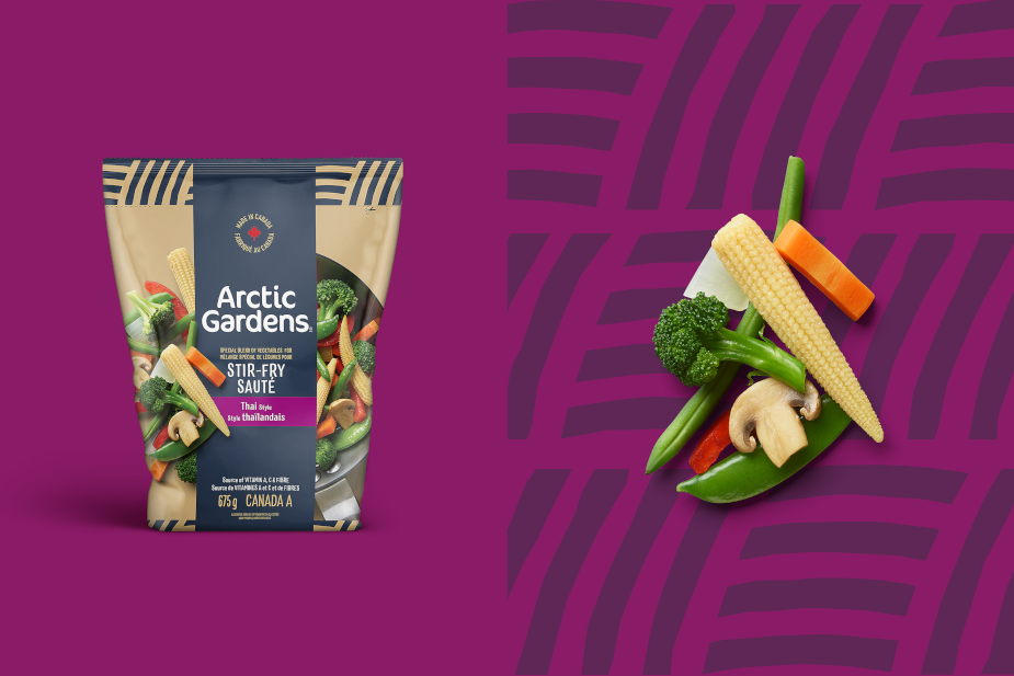
“The majority of the category is traditional or focused on the functional aspect of frozen vegetables. We had the opportunity to put forward a true story related to the origin of local products, connected with local producers, where the best vegetables and the best varieties come from. It is a truly differentiated platform that is very current and impactful in the category of frozen vegetables. We glorify the quality, freshness, naturalness and beauty of these vegetables that can be consumed year-round. We took advantage of the repositioning to adopt a unique brand colour, Nordic blue. This rich blue is intended to accentuate this perception of incomparable freshness of products picked fresh and just right, and to evoke our origins. Voluntarily, we have moved away from the colour codes of green or white that we associate with the competition. The secondary colours and the craft look, combined with the careful photography of the vegetables, communicate the naturalness, simplicity and healthy and nutritious character of the vegetables. A graphic pattern allows us to evoke cultivated fields. The logo has been redesigned to meet modernisation objectives and to make it easier to read in a digital communication context." - Olivier Chevillot, executive creative director, PIGEON.
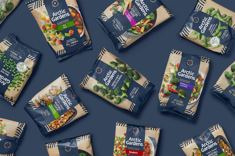
The product portfolio has been organised into four main segments and navigation has been optimised with the addition of a colour band that makes it easy to identify the recipe, style or flavour sought. This new brand platform greatly increases its visibility in grocery stores. The block effect created and the visual power of attraction generated force consumers to pay attention to Arctic Gardens and, thus, lead them to navigate and discover its diversified vegetable offering.
The first expression of the new platform, the updated packaging, will be introduced in stores throughout the fall of 2022