Your Shot: Transforming Earth Landscapes into Retro Sci-Fi Scenes for Pantone

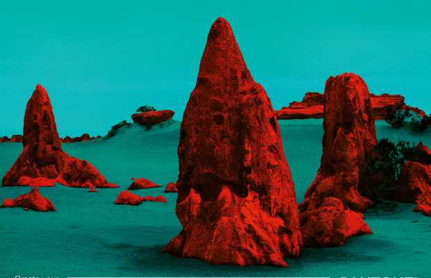
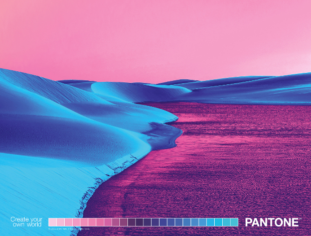
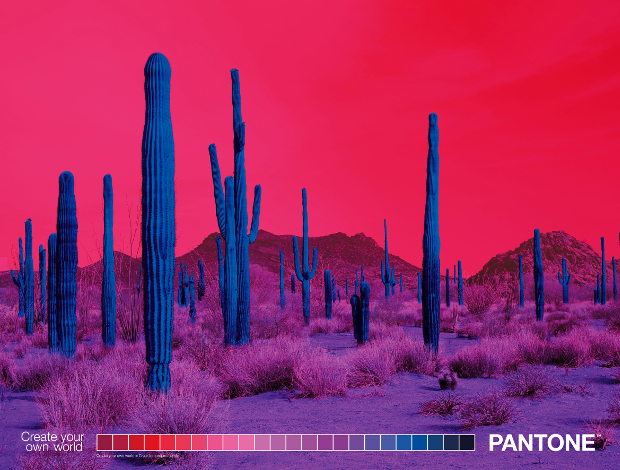
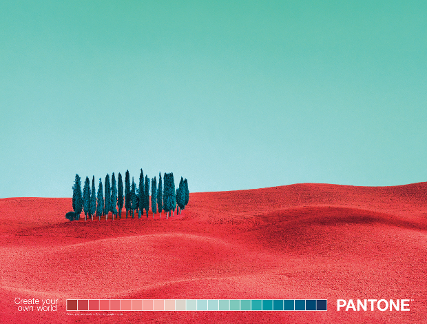
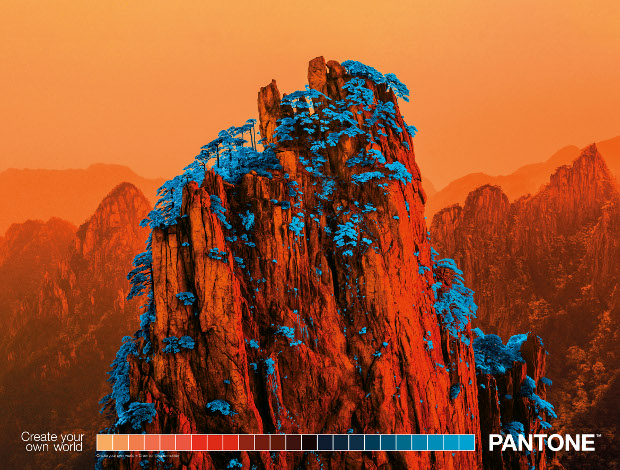
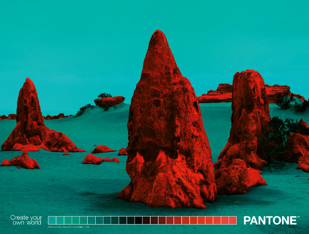
I’m the sort of person who holds his well-thumbed, colorfully illustrated ‘70s editions of Frank Herbert’s Dune saga among some of his most prized possessions. I’ve also recently been spending my evenings basking in the retrofuturist landscapes of space exploration game No Man’s Sky (it’s a good game now, by the way). So when a set of stunning, seemingly alien landscapes, complete with pink skies and blue bushes, landed in my inbox like a Korvax space hauler, I got a bit excited.
The otherworldly images were in fact a campaign by TBWA\Paris that set out to demonstrate the range of colours available in the Pantone range in a fresh new way, by taking photos of real Earth landscapes and manipulating them to look totally alien. I had to speak to art directors Nicolas Vidolov and Théo Lebihan to find out more.
LBB> Anyone with a visual creative background appreciates Pantone’s important place in the design world. What does it mean to you?
Nicolas and Théo> Obviously Pantone takes an essential place in the design world due to their know-how in terms of colours and creative ideas. Thanks to Pantone and their colour range we were able to bring an alternative glance to these spectacular landscapes such as Lençóis Maranhenses in Brazil or the Huangshan Mountains in China.
LBB> And what were your initial thoughts when you first discovered you’d be working on the account?
Nicolas and Théo> When we discovered that we were going to work with Pantone, we started naturally to do some research on their way of working. Quickly, we discovered that on their past campaigns only a few colours were showcased. Hence, we decided to work on this aspect, highlighting a spectrum of their colour range. The goal is to synthesise on each print the large range of shades provided by Pantone.
LBB> What was the initial inspiration for this series of images?
Nicolas and Théo> We were fueled by sci-fi movies where we observed supernatural and highly creative universes. We appreciate the real and unreal synergy that can occur in those movies, as in Blade Runner 2049, Abyss, Enter The Void or even on the Nasa Exoplanet poster print campaign. We wanted to explore the beauty of our nature and put the spectator in doubt as to where the pictures came from.
LBB> And how did that become the final idea?
Nicolas and Théo> Initially we started to work on architecture images but we rapidly discovered that possibilities were limited, due to a lack of colours and shades on the buildings. Visuals including vegetation were the most spectacular, so we then started to work on landscapes! Overall, we chose pictures where we thought the difference between reality and imaginary was obvious.
LBB> What influences were you drawing upon? It has a space opera / pulp sci-fi feel to me. Like book covers from the ‘50s and ‘60s. But maybe that’s just my personal taste…
Nicolas and Théo> Exactly, we were highly influenced by some old book covers with a futuristic approach. The Watchmen comics by Alan Moore were, for example, a reference for us in the way he used settings and colours. Moreover, we recommend retro_scifiarts, an Instagram account that was inspirational.
LBB> How did you choose the photographers / photographs for the series?
Nicolas and Théo> Our approach was to look for landscape photographers that were able to project the viewer in an unknown world, as we wanted to transform them into photographs of another planet. We also sought to create a singular universe, like we usually see in advertising.
LBB> What was the process of manipulating the images and how did that involve Pantone technology?
Nicolas and Théo> 30 million Photoshop layers, some moonlighting and a few beers. We had to adapt the settings and methods for each image as they were all really different from one to another.
LBB> Are the prints available to buy? I'd put one on my wall!
Nicolas and Théo> For the moment this question wasn’t mentioned but we would love to share our prints with great pleasure. To be honest, this depends mainly on Pantone decisions.