


Wrigley’s Extra Chewing Gum Refreshes with New Global Brand Identity

Global chewing gum brand, Wrigley’s Extra, has unveiled a new brand identity, which shifts its look away from dental hygiene codes to a bolder focus on flavour and moments of confidence.
Created by global design consultancy Elmwood, the rebrand elevates Extra’s ‘ding’ symbol within the brand flag and puts it front and centre of the visual identity. Its bold and simple form will become the metaphor for confident moments as the wider identity rolls out. 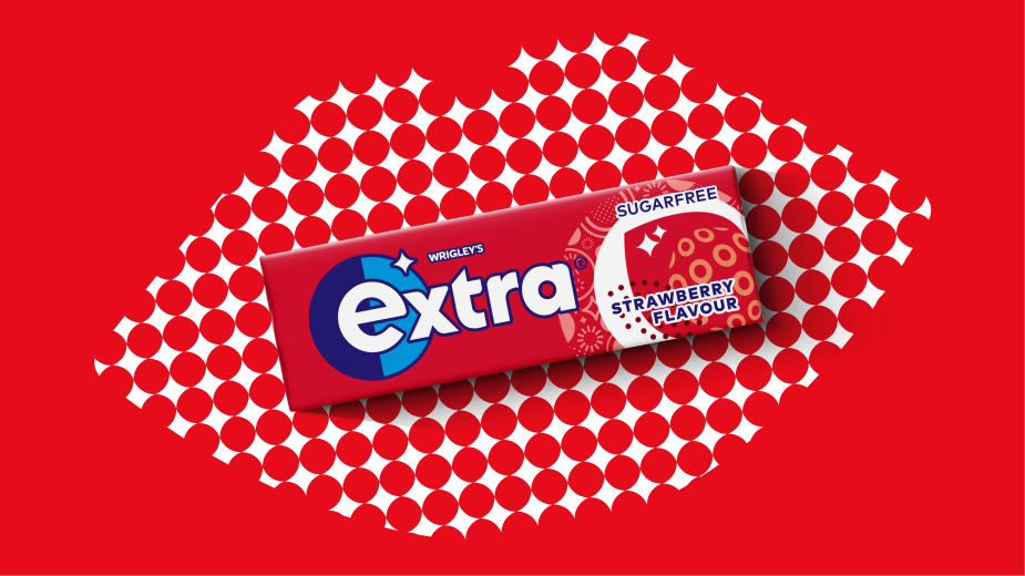
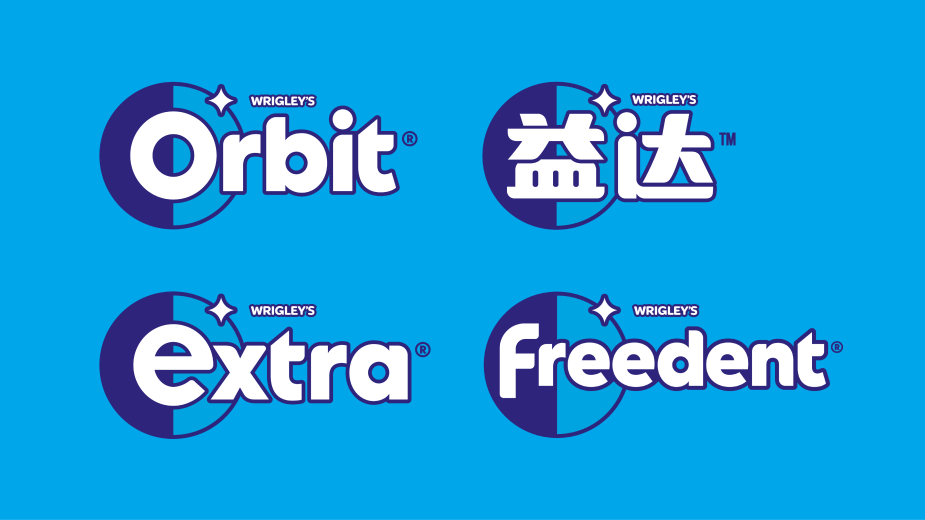
The new master brand expression has been unified globally, where the brand is also known as Orbit, Yida or Freedent. Updated with softened curves and a simplified yet eye-catching look, the new ding symbol is set beside a circular ‘shield’ shape, highlighting the initial letter of each brand name to form the full brand flag suite. The shield and ding lock-up can also be used alone as a universal icon across all touchpoints, a feature that gives the brand potential in the digital age, bridging the tension between iconicity and flexibility.
The brand flag’s circular language has been baked into many other elements of the visual identity including the new packaging – from the typography to the ‘spotlight’ architecture - showcasing flavour depiction with clarity for the first time in some markets, such as the UK. A stronger design architecture for ‘benefit driven’ product ranges such as the White gum line, make navigation easier for consumers, and allow a design solution for future innovations.
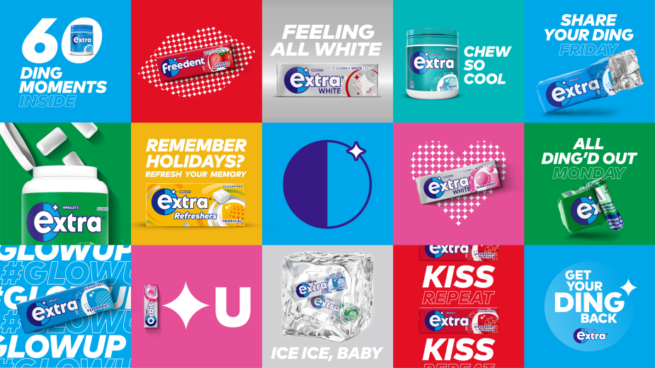
The new packaging design launched in the UK in January and will roll out across continental Europe over the coming months. Over time, all markets will unveil the new brand identity - activating the redesign - and it is through this that the brands’ celebration of confidence really comes to life. Elmwood has elevated the ding shape to key-asset status with a series of striking visual assets designed for digital and social channels. These include motion expressions where an animated ding allows key messaging to be boldly staged. Pop art inspires striking images of hearts and lips made from Lichtenstein-esque ding patterns accompanied by light-hearted copy such as “Share Ding is Caring” and “Club Tropicana Dings are free”.
Craig Barnes, Studio Creative Director at Elmwood said: “In place of its traditional look built around dental hygiene and refreshment, we created a distinctive, forward-thinking identity for Extra that radiates confidence well beyond the packaging. With a choiceful amount of new assets taking centre stage in storytelling, there is now a strong system in play that can still be flexed creatively to meet any markets’ needs.”
In January, Extra used the rebrand to launch a cross-promotion campaign partnership with Gen Z-focused online fashion retailer, I Saw it First.


