


Woolworths Group Symbolises Its Collective Impact on a Better Tomorrow with New Brand Identity from Re
Woolworths Group this week rolled out a new brand identity to better symbolise its evolution and what its collective businesses and platforms stand for today.
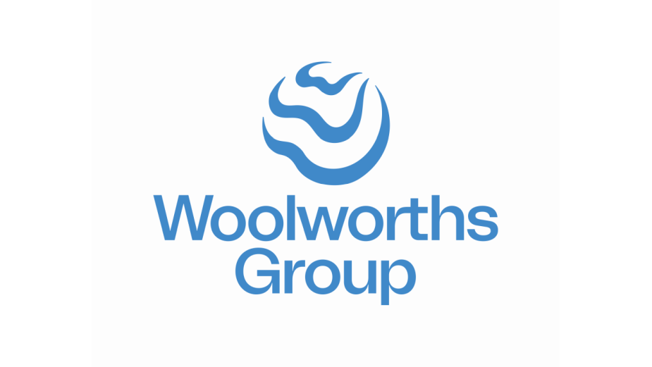
The new brand symbol and system was developed by Re, in partnership with M&C Saatchi Group.
Re - M&C Saatchi Group’s design and experience agency - developed the new brand identity to represent the connected and unified purpose at the heart of Woolworths Group. The new symbol showcasing the impact Woolworths Group can have when it comes together in partnership with others to create change for a better tomorrow.
“In designing the new symbol, it was important we represented what we stand for as a Group today and how we will continue to act in the future. Our commitment to our purpose was key to the design architecture,” said Andrew Hicks, Woolworths Group Chief Marketing Officer.
“The lines in the new logo are inspired by ripples, with each moving outward creating consecutive waves of impact. The lines also create a series of ‘W’ shapes, nodding to the Woolworths Group name and the deeper focus on ‘we’.'' said Andy Thomas, Executive Creative Director at Re.
“It is the power of ‘We’ in terms of creating better experiences together for a better tomorrow that is represented in our new Group brand identity. It’s a symbol of the positive impact that we aspire to have and the purpose that unites us. It's only by working together as a Group, across all our businesses and platforms, and in partnership with others, that we will be able to help to create a better tomorrow,” said Brad Banducci, Woolworths Group CEO.
Alongside the logo, Re developed a completely new design system including a bespoke typeface, a vibrant and energetic colour palette and fresh tone of voice.
Andrew Hicks added: “The new symbol is only the start of how we are evolving the ways in which we communicate our Group’s collective impact to our key stakeholders, suppliers, partners, customers and our team. We’re excited by the opportunity it creates to further unite us across the various Group businesses and with our partners.”


