


Vintage Vibes: Colourists Share Their Secrets of Time Travel

In post houses and visual effects companies around the world, colourists are defying physics and doing the impossible - they’re performing acts of time travel. Using texture, colour, contrast, light bleeds and noise, they’re able to transport viewers to past decades
“Throughout film history, a decade can be identified purely by the visual aesthetic of a film from that time,” says James Bamford, creative director at Rascal Post. “We as consumers of those films collate unconsciously certain styles and feelings that remind us of that era. Now in modern times we as colourists try to emulate those eras by our grading styles and evaluate certain film stocks and processes to apply to our footage.”
Mark Meadows, senior colourist at Stone Dog Post, says that such projects can be true journeys into the past. “I try to understand the visual characteristics associated with the time period I am trying to replicate. Different eras tend to have distinct colour palettes, using film, photographs and art of the time period I am trying to evoke as reference I take these elements and introduce them into the footage I am grading.”
Evoking those vintage vibes is a nuanced and occasionally nerdy process that takes us to the heart of the colour grading craft. There’s no one-size-fits-all approach as the techniques and processes and creative debates will depend not just on the era, but the story, the purpose of the film and, for commercials and music videos, the brand or musician featured.
Navigating Memory Lane
Generally, colourists tend to have an obsessive eye for detail, particularly when it comes to film - but despite working movie magic, their memories are as fallible as the rest of us. And so, says Jim Bracher, senior colourist at The Post Arm, research is key.
“I think the key is authenticity. Even if you're old enough to have first-hand experience of the time period you wish to evoke, your memory can be clouded by preconceptions. For example, these might be memories that are very specific to you personally or other projects you may have seen. It's easy to resort to stereotypes, so research is essential, and is relatively easy thanks to the mind-boggling amount of archive footage available online.”
Philip Hambi, senior colourist at The Mill agrees that our memories can play tricks on us - for those of us born before the advent of Blu-ray and HD, even our favourite films of classic Hollywood were distorted by shonky VHS or the snowstorm of terrestrial TV.
“As I was born in 1986, my memory of anything before the 90s is non-existent and anything before the 2000’s is pretty hazy,” reflects Philip. “Reference stills are one of the best methods of ensuring the accuracy of the look. The introduction of Blu-rays was also incredibly important, as we’re now able to experience cinema from the ‘60s, ‘70s to the current era in high definition. If you’ve ever gone back to watching a VHS or a DVD, it’s quite a shock seeing what we had to put up with for so long!”
But that slippery fake memory can be used to the colourists’ advantage. Viewers have their own collection of touchstones and it may be more important or effective to lean into those rather than to create something visually off-putting. Ultimately, it depends on what the director wants to achieve and that balance can be a rich creative conversion.
“Generally speaking, evoking a particular time period is a matter of feeling instead of colour accuracy which usually means using the references that viewers use as indicative of that time period as guides,” says Clinton Homuth, senior colourist at Artjail. “Looking at any film from the ‘60s or ‘80s isn't as important as looking at the films that come to represent the style of that time. For example, Donny Darko came out in 2001 but is very clearly an aesthetic representative of the smart cinema of the mid to late nineties.”
Going Back to the Source
However, if accuracy is the priority or if the colourist and director want to create something that goes beyond general visual touchstones, nothing beats research. And for some colourists, digging out films and photos from the era can only take you so far.
Jim Bracher jokes about the tendency of directors sitting next to colourists to urge, “It needs to look more shit. It’s not shit enough.” But of course, looking at a vintage photograph or tape in 2023 isn’t the same as looking at it when it was freshly captured in 1913 or 1972. Or your references have become distorted by being transferred into different formats. And so it’s just as important to understand the mechanics behind the references.
“You do need to tread carefully because sometimes the examples you find will have artefacts that are the results of shoddy encoding, rather than characteristics of vintage footage that you want to mimic, so you need to source multiple examples for corroboration. One thing I've found surprising is how wrong I can be when I try to evoke a time period from memory and then discover how different my idealised version is when compared with real-world examples. It's also helpful if you have an understanding of some of the vintage technologies used to capture the footage you are trying to evoke, as the physical mechanics of these technologies is what tends to introduce the artefacts you are trying to mimic,” says Jim, who has an extra advantage having started his a career as a VT operator.
“I have first-hand experience of formats that are now considered 'vintage'. Whether they be Beta SP or one inch tape. If you spent years of your life as an assistant working night shifts scanning negatives then you will naturally have a good idea of its aesthetics.”
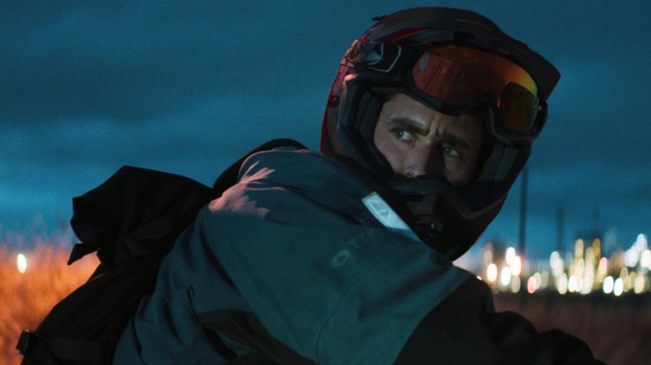
A still from Jackdaw, which saw James Bamford recreating the look of Portra 160 film stock.
If you get the chance to get your hands on the format and technology you’re trying to recreate, to play with it yourself, even better. It is, admittedly, a luxury that most projects simply won’t allow for. But when the chance arises it can be magical. James Bamford recalls his experience working on the dark thriller ‘Jackdaw’, directed by Jamie Childs.
“The director and DOP wanted a specific look. They referenced a 35mm stills film stock - Portra 160. This had a very interesting look and made some of the colours quite acidic. Normally I would have used some references of this stock and created a style that would be close. Some film emulation LUTS [a kind of colour grading preset calculation] can be useful in achieving this. However, as we had some time before shooting, we shot some tests on both the Venice [camera] and on the Portra 160. We evaluated each exposure and variable light and matched the Venice to film. We then created a show LUT for the film based on this.”
Whither the Fates Carry Us is a short film by Tom Day and graded by The Mill's Philip Hambi is about boxer Adrian Roach. The reference for the grade was a still from photographer Mike Brodie and his “A period of Juvenile Prosperity’ works.
The Land Before Time
References only take you so far, though. What about creating vintage ‘looks’ for period pieces for colour films set in a time when all photography and film was black and white? Or, trickier yet, films about the world pre-photography? There, colourists have to get creative.
Matt Turner, head of colour at Absolute Post, reflects that photography is a relatively recent development in human history. “It wasn’t until the 1830s, in response to the emerging demand for portraiture from the middle classes, that photography really took off. The demand could not be met in volume and cost by oil painting, hence the development of photography and its resulting visual references,” he says. “Most representations we see today in film, TV and advertising of decades before the invention of colour photography are rendered in colour, not black and white. Therefore everything we see of those eras is all somewhat subjective interpretation, and in most cases, a ‘film effect’ seems to be the most aesthetically apt treatment.”
Going further back in time, colourists may find themselves taking cues from 20th century directors who have also created influential period stories - or they may look not to photography but to contemporary painting. “Not forgetting, of course, that we are influenced by what has come before - for example, Kubrick’s 'Barry Lyndon' is a classic film reference to depict the 1750s, having been shot in the 1970s! Going further back, inspiration can be drawn from paintings: the allure of chiaroscuro is very evocative,” says Matt.
In this Ferrari film, Copa di Sicilia, UPP created a sepia-ish colour palette for a story set in 1925 for Ivan Zachariáš and his DOP Jan Velicky. Check the film out here.
The Tech of Time-Travel
Speaking to colourists about the technical challenges they’ve come up against and ingenious solutions they’ve come up with, there’s something uniquely satisfying and meaty about taking viewers back in time.
At a top level, colourists have a number of levers they can pull and manipulate. They can play with colour density, colour temperature, contrast, halation [the spread or bleed of light]. They can add grain textures scanned from film stock or add noise.
Jim Bracher at The Post Arm recalls one job that had not one challenge but many. He recently coloured Daniel Kleinman’s spoof documentary, ‘The Love Box in Your Living Room', which celebrated 100 years of the BBC. Notable challenges included trying to capture the look of artificially colourised black and white footage. To do that, they took modern, digitally-captured footage of comedian Harry Enfield, drained it of colour, and used a combination of extreme sharpening and soting, adding a bit of ‘bounce’ and layering on film grain textures. A combination of keying and using manually drawn shapes to ‘colour in’ mimicked the look. In another shot, intended to mimick cosy 1960s show ‘Dickson of Dock Green’, Jim had found inexplicable vertical lines in the reference footage that he suspects arose from the way the BBC used to telerecord and archive their programmes at the time. To recreate it, he layered and and stretched scans of 16mm film grain textures.
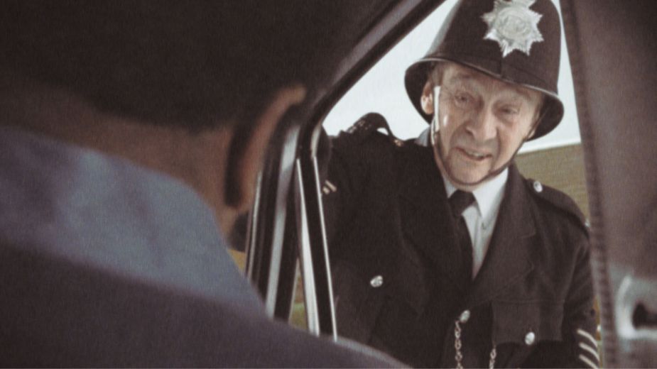
Comedian Paul Whitehouse spoofs a vintage British police show in The Love Box in Your Living Room.
“This was a good example of something I would never have thought of had I not done the research. It was such a rewarding project to work on because it involved so many different era specific looks and I had to experiment with all sorts of techniques to try to get the desired effect,” says Jim. “I really had to make it up as I went along and my role was as much that of a VFX artist as a grader.”
Matthieu Toullet at Company3 says that getting involved in a project early in the process can result in different solutions, and even the chance to bring the whole team along on the colour journey. For the Lewis Capaldi promo ‘Forget Me’, he created a ‘show LUT’ or preset that could be applied during the shoot and offline edit so that everyone else from the director to the editor and commissioner could get an idea of roughly what the end footage would look like, which helped the other craftspeople and creatives with their decision making. Then the final grade began in earnest.
“16mm film was used to bring this particular grain and the chroma aberration. Then when we jumped on the final grade, we were constantly questioning whether we needed to be close to the reference or had the freedom to try things out. There was much back and forth in the grading sessions to nail down the final look,” he says. “I'm super proud of the final result, as it was one of the trickiest pieces of work I've ever graded, recreating something known so well.”
Lewis Capaldi's Forget Me music video was an interesting challenge for Matthieu Toullet.
Where things can get extra tricky is when colourists have to manipulate footage that’s heavy on computer generated imagery, says Edgar Guizar at Ool Digital. “The main challenge is to achieve the exact combination between the texture and the colour pallet between different shots. The camera equipment election and the lighting plays a leading role. This kind of work requires research about how old cameras used to record the imagen, the colour grading that they used to capture, especially when we are working with 3D CGI because the first renders are too perfect, and require a lot of texture and shading work to achieve the vintage look.”
And once you’ve cracked the look you’re trying to achieve, it’s crucial that you can achieve consistency across the whole project. What works in one dark and moody scene can feel fake or off in a brightly lit scene, for example. “Often, the difficulty with these looks are that the images are highly manipulated and pushed, so you can sometimes find yourself in trouble when the lighting or scene changes,” says Nic Apostoli at Comfort and Fame in South Africa. “In such cases, the biggest challenges are getting the colours to react similarly throughout the entire project. Therefore, being able to fault find and react quickly to adjust to the changes is critical in achieving the desired look.”
Art Direction Above All
Colour grading may have a magic about it, but colourists’ magic can only do so much. They can enhance, refine, polish or degrade - but they can’t make up for lazy art direction or production design.
“I find that what has been shot plays a massive part in how effective the grade I have created is,” says Mark Meadows. “What I mean by this is my grade could have all the elements required to create an accurate vintage look but if the environment or costumes are off my grade will not be anywhere near as effective.”
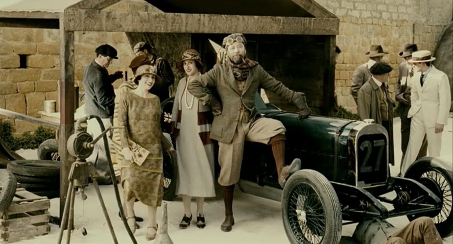
This project by director Joe Giacomet is all about larger than life, retro art direction, which the grade from Stone Dogs enhances
Matt Turner at Absolute is in absolute agreement. “If the art direction is not on point, it can be a challenge,” he says. “If you took a shot of Oxford Street as it looks today and asked me to make it look like the 1950s through colour, you’ll have a challenge on your hands. 90% of the information processed by the brain is visual. It takes only 13 milliseconds for the human brain to process an image, so it takes you a fraction of a second to spot a modern car or building, for example.”
“Grading, on its own, will struggle to evoke a specific time period,” adds Nic Apostoli. “The collaboration from those on set will assist in achieving the correct look and feel. The art direction, lighting and even your lensing options can make a big difference. Colour grading is just the cement that binds everything together and drives the final overall idea home. It is easy to match a look, but if you fail to capture the essence of the period on set, even the best looks will fall short.”
Of course, not all projects that involve a retro style colour grade are period pieces. Some contemporary stories can be enhanced or elevated by combining a modern world with a grade that evokes a different decade. That's a creative choice that can help express the mindset of a character, for example.
Colourists and Cinematography
Similarly, the director of photography is a key relationship for colourists trying to nail a particular period look. The camera, lens, lighting and format choices all inform what routes and options are available in post production.
A really strong collaboration between DP and colourists will result in decisions that enhance and support the other’s work. “The grade is crucial to creating this look; however, you must work closely with art direction and the DOP. It's a team effort with great art direction and approach from the DOP.” says Matthieu at Company3.
“Achieving a specific and accurate look is a combination of experience, technical expertise and, most importantly, adhering to the director's or director of photography's (DOP) vision,” says Ondrej Stinbinr of Czechia-based studio UPP [Universal Production Partners].
Nic Apostoli concurs that getting everyone aligned before shooting starts is key. “Colour Grading is a very subjective craft and there is no right or wrong look. However, some of my best work happens when all disciplines are aligned. In other words, in pre-production meetings where the director, DP, gaffer and the colourist all discuss the direction that should be taken and find an accurate reference to what they are trying to achieve. So when all these disciplines are aligned, the results are pure magic.”
Story>History
Of course, while authenticity is key, colourists are not in the business of museum restoration - they’re storytellers. Edgar Guizar is SVP creative at Ool Digital in Mexico and he warns that time period is only one factor to consider.
“The main key is storytelling, due to the fact that colour grading should follow and communicate what the story is about or what the message is. It’s not only the time period that the image is recreating, it’s also the mood and what is going on around it. In addition, an image’s key colours could talk about happiness, extravaganza, love or even darkness and economic recession - each time period identifies with a colour palette that evokes the social environment; fashion and a specific aesthetic.”
Clinton Homuth at ArtJail agrees that colourists should allow themselves a degree of flexibility. “Emulation is the key here, not simulation. Taking some lessons from older material without being too prescriptive works best. If you stray too far into direct comparisons, chances are you've gone too far. The key is to do a lot and then pare it down until the feeling is there without standing in the way of the piece.”
Over-emphasising time period can lead to an air of cartoonishness, shallowness or even a jarring fakeness. A skilled colourist should be able to navigate this with a lightness of touch, says Ondrej. “Creating a ‘vintage’ look or style poses significant challenges, mainly revolving around achieving authenticity without appearing forced or overly artificial. Successfully evoking the essence of a past era requires a deep understanding of the aesthetics, colours and visual elements characteristic of that specific time period.”
This cartoonishness can arise when there’s no specificity. There’s no one ‘1960s’ look or ‘1970s’ look, after all, says James Bamford. “Creating a generic look from a certain time can be challenging as there are so many examples from that time.”
In the case of advertising, one also has to make sure that the brand or product doesn’t get lost in the period details, Ondrej warns. “Particularly in commercials, it's essential to strike the right balance in stylisation, ensuring it enhances the product rather than overpowering it.”
That’s something Philip at The Mill agrees with. “I think the biggest challenge, especially when working on a commercial, is to make sure that the final product still feels premium and something that the clients are happy with aesthetically. The world of advertising is all about the balance between the narrative and the product.”
This spot for National Express, which was graded at Absolute Post, combines a modern setting with a vintage vibe, allowing the brand to stay relevant to modern and relevant while capturing a funky vibe
Getting Playful with Period Colour
While evoking different eras on film is both technically challenging and a commercial balancing act, it’s also lots of fun. So, what periods do our colour experts most enjoy playing with?
“I really like recreating looks from the 1970s and ‘80s as they are so distinctive and recognisable, and a lot of fun to play around with,” says Mark Meadows at Stone Dogs.
“I guess if I had to choose an era that I enjoy evoking with a grade, it has to be the ‘80s because that's the decade I grew up in, so it has a special place in my heart,” says Jim Bracher.
For Philip Hambi at The Mill, he can’t quite decide. “The ‘60s, ‘70s and ‘90s are probably my favourite eras to draw from, aesthetically, they are the ones that I get the most satisfaction out of achieving. The ‘60/’70s is an era that has always resonated with me, both musically and with its cinema. I’ve always just been drawn to the tones and textures of the films from these eras,” he says. “It’s also the boldness of the ‘90s - the contrast, the colour, it’s all just been cranked to 11. Directors of the MTV generation really pushed creativity to its limits and broke the mould of what was expected in the world of music videos.”
Edgar Guizar can’t get enough of the 1990s either, as a kind of bridge between the past and present. “Our favorite vintage look is the second part of the ‘90s because of the balance blend between anaolgue and today’s digital image.“
Nor can Clinton Homuth, ”I've done a few of the VHS ‘90s era looks and that's fun. The combination of primary boost, over-sharpening and midtone detail softening has a nice textural feel.”
Artjail takes us back to a 90s gameshow in this Dr Pepper spot
And Matthieu Toullett can’t beat the classic Super 8 look. “It holds an exceptional place in my heart as I remember watching family home videos on a Super 8 projector from past holidays. So whenever I get to work with it, it makes me feel warm and emotional as it takes me back to that time.”
Matt Turner looks back even further in time to the early Hollywood colour looks of the 1930s. “The three-strip Technicolor process is probably the most difficult and most rewarding to try and recreate. The incredible deep and highly saturated colours are so beautiful and rich, it’s very challenging to get it right without overdoing it.”
While James Bamford loves all of it. “Emulating a look is always exciting. I wouldn’t say I have a particular favourite as they all bring their own individual challenges. Although, anything that really pushes the timeframe that the setting encapsulates is what I love working on the most.”


