UNIT’s Harry Shelton: Northern Colour Aesthetics and Clear Vision

Harry Shelton’s career in colour started with a passion for photography. He joined UNIT in 2017 as a production runner where his enthusiasm for stills branched out into moving pictures.
His love for portraiture guides his colour grade palette choices, but Nottingham, where he is originally from is the culprit for his first colour inspirations before moving to London. He focuses on delivering immaculate skin tones and tasteful, honest colour application to everything he grades - from music promos, fashion films, short films to branded content and commercials.
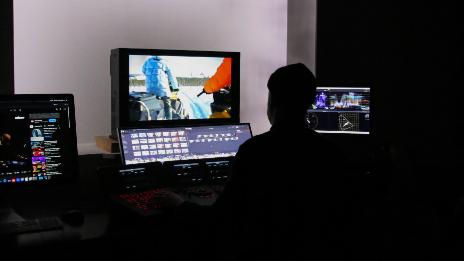
Harry in the grading suite
LBB> Tell us a bit about your background and what made you want to get into colour grading?
Harry> I moved down to London from Nottingham when I was 25 after finding a role as a runner here at UNIT. Nottingham is a city full of greys, greens and blues - a northern colour aesthetic that definitely influenced my work. Moving to London, in contrast, felt so exciting and opened me up to a whole new palette of colour.
I always had an interest in the VFX industry, along with my love of portrait photography. I remember the first time I walked into a grading suite and the instant fascination I felt towards it. The more time I spent in grade suites, the more I was intrigued to see the final look created at the end of each day.
I first shot film on an old Nikon FM, back in college, while studying photography. There was a lot of trial, error, and bad photos back then - I like to think I’ve gotten a little better since!
I’ve always been drawn to photographers like Terry Richardson, Robbie McIntosh, Rob Bremner and Annie Leibovitz to name a few. I like that they all shoot a real variety of different people in different environments, all with an individual style.
LBB> Where do you like to look for inspiration and ideas around colour and texture for film? Do you consider your colour palette to be diverse?
Harry> A lot of my inspiration comes from day-to-day visuals. Anything from fashion to architecture. I appreciate when things are unique and have their own style, which I think translates into colour grading. Also using Instagram to showcase work. Seeing clips and stills from other colourists' work also has a huge influence on me. I like to watch lots of TV and film as huge sources of ideas and inspiration.
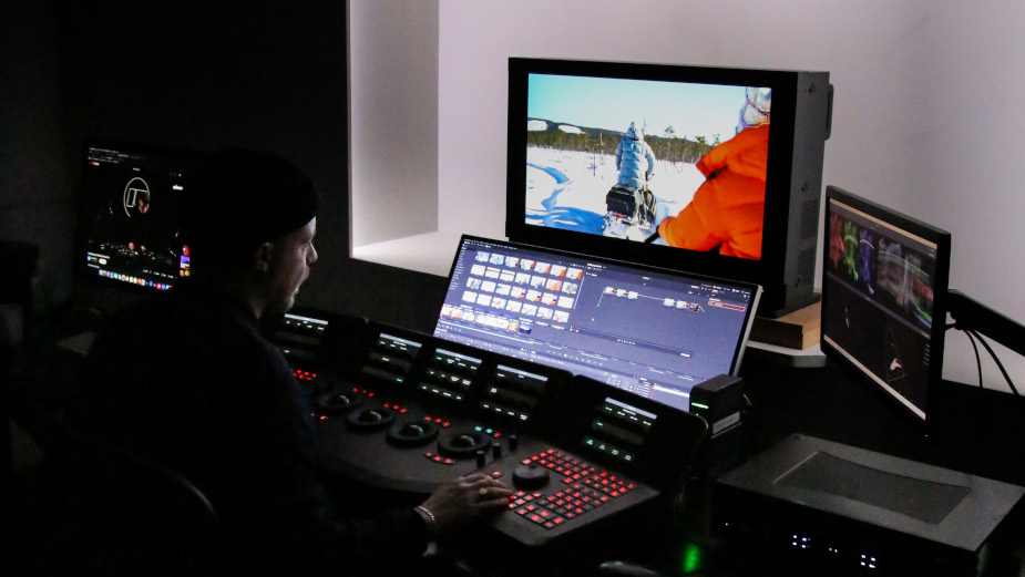

Harry in the grading suite
I always look to magazines for inspiration. I like ‘The Face’, ‘Highsnobiety’, ‘The Gentlewoman’, ‘Sleek’, ‘Re- Edition’. They give me great references for current trends, colour and skin tones.
Jackets and coats are my current focus. I’ve been watching lots of videos of people experimenting with colour dyes. This stems from going to the football and seeing plenty of unique jackets in the stands.
LBB> What trends or developments in colour grading are most interesting to you at the moment?
Harry> I originally learnt on Baselight and have since moved onto Resolve. It’s been really interesting working on both, and being able to expand my skills across both systems.
Since UNIT has set up Film & TV, it's been great to see how the episodic side of grading is done as well as the short-form approach. So I’ve been working on lots of HDR projects with them which has been great to learn.
Also grading using ACEs workflows, it’s great to challenge your skills across different starting points on different footage. From colour managed to log.
LBB> You’ve recently collaborated on several short films including ‘The Deserters’ and ‘The Eyes of Marge’. Can you tell us more about them?
Harry> ‘The Deserters’ is a WWI short film set on the Western Front. It’s an exploration on the effects of war and sheds light on the lesser known history of the British West Indies Regiment and of Black Soldiers of WWI. Having watched ‘All Quiet On The Western Front’ around the time we started the grade, I had lots of inspiration of where I wanted to take it, setting a few looks pre grade. We decided together to lean into the natural light and give each scene its own look, opposed to an overall one. This worked hand in hand with the mood and tone.
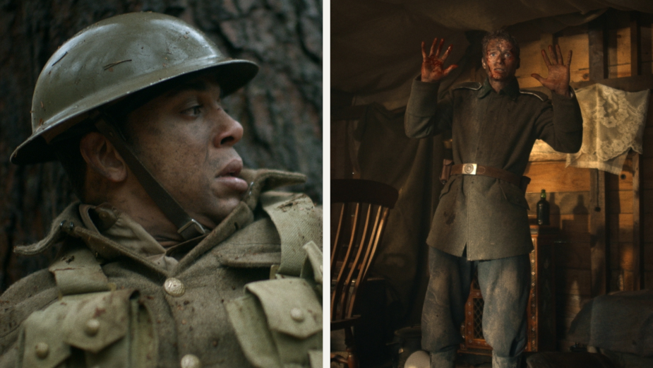

Stills from 'Deserters'
‘The Eyes Of Marge’ is a social horror that flips a standard slasher film on its head. I had an amazing visual board from DoP Ben Saffer. I was given reference tones for each character and scene set up. This helped me instantly know where to take the grade and have key visuals to reference throughout.
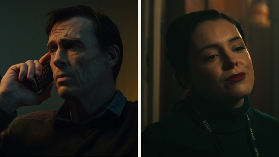
Stills from 'the Eyes of Marge'
LBB> They both feel cinematic and exude atmosphere and suspense. How did you achieve this? Is this a style you are drawn to?
Harry> They were both collaborative projects with DoPs and directors which makes everything much more enjoyable. Both had clear visions, however I also set different looks to see what worked best across both films. Both grades required a lot of finessing and fine tuning. Creating such refined grades always has to work hand in hand with the audio. It was important to watch back and make sure it reflected and added to the suspense and drama of the short.
LBB> What work have you seen recently that makes you think ‘I wish I graded that?’ and why?
Hary> ‘Saltburn’. The colour contrast and high saturation aesthetic is something I really like, which was empathised by being shot on film. Along with great production value and locations it made it a winner.
I recently graded a music promo for Kid Kapichi. Directed by Nick Suchak along with DoP Jed Darlington Roberts, which was shot on 16mm. It was so great working on film - the mix of exposure, contrast, and saturation all react in different ways to digital.
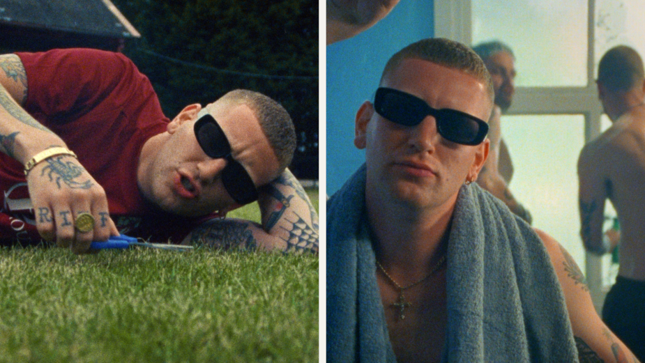
Stills from the project with Kid Kapichi
LBB> Which project are you proudest of and why?
Harry> My proudest project to date would have to be ’Sports for All’ directed by Dean Moore. I entered this into the Young Arrows last year and was shortlisted, so I feel like I’ll always be attached to that job. I really couldn’t have been any prouder.
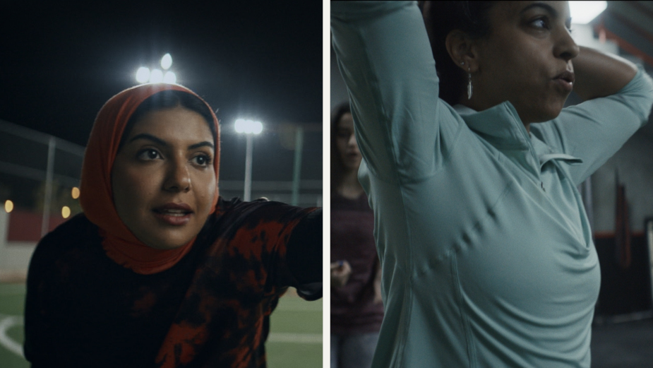
Stills from 'Sports for All'
It’s been great working with Dean on a few other projects now, including Adidas’ ‘Declan Rice Reveal’. Dean allowed me to experiment and have so much creative freedom alongside a healthy amount of productive feedback.
LBB> What’s next for you and what are your ambitions for the future?
Harry> My creative ambitions are to keep working on new projects and develop my knowledge of colour grading. In an ever changing industry I'm always excited to see what is around the corner. I would love to keep developing and growing my skills here at UNIT.


