


Trending Now: Colour’s Role in Individuality, TikTok and Digital Worlds

Trends, by their very nature, are transient. That’s as true in the world of colour as it is in any other category. Whilst subtle, the impact of colour trends across film and advertising invariably leave an indelible mark on our culture. Their influence is keenly felt, too, by brands looking to explore colour schemes and communicate their identities.
Today, the fragmented nature of our media landscape means that the relationship between colour and trends has become more difficult to trace. Even just 20 years ago, society was more homogeneous and received its news and trend queues from a handful of places - fashion, film, magazines. But with the modern explosion of channels and predominance of individuality, colour trends are more difficult to track across demographics. A few, however, are difficult to avoid.
Pantone launched the now widely-popular ‘Colour of the Year’ feature in 2000, predicting the rise of shades like ‘Tangerine Tango’ in 2012 - a juicy sunset-hued orange, and 2015’s ‘Marsala’ - an earthy red that appears faded light overexposure. It was 2016’s ‘Rose Quarts’ that would cause the biggest stir; re-dubbed ‘Millennial Pink’ by numerous magazines, the shade became ubiquitous in product packaging, clothing, and on screen too - a not-too-pink pink that embraced femininity without appearing overly saccharine. Jenny Clark, head of colour at WGSN, said: “Millennial pink was one of those important colours that captured the zeitgeist. It pushed the boundaries to become a colour which was gender neutral and it felt empowering, youthful, playful, and, most importantly, wearable."

Brands like Glossier, makers of minimal skincare and makeup, became synonymous with the hue, designing their packaging and outfitting their stores in the distinctive shade. During the 2016 US election, the shade represented resistance with hundreds of thousands of people marching and protesting while wearing pink ‘pussy’ hats, in contrast to the red caps of choice of the incumbent president. The shade swiftly became omnipresent across industries and products (interiors, fashion, tech) and soon reached a point of cultural oversaturation. Its demise was marked this year when the London restaurant, Sketch, redecorated its iconic pink Instagram-destination of a dining room (launched in 2014, the same year as Wes Anderson’s rose-hued The Grand Budapest Hotel hit the cinemas) in shades of earthy yellow.
Today, the colour tides have turned - just in time for Gen Z to replace Millennials as the new ‘youth generation’ towards whom brands everywhere aim to market.
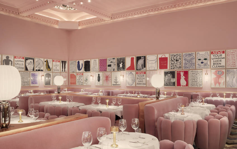
Sketch's pink dining room (photo credit: Ed Reeve)
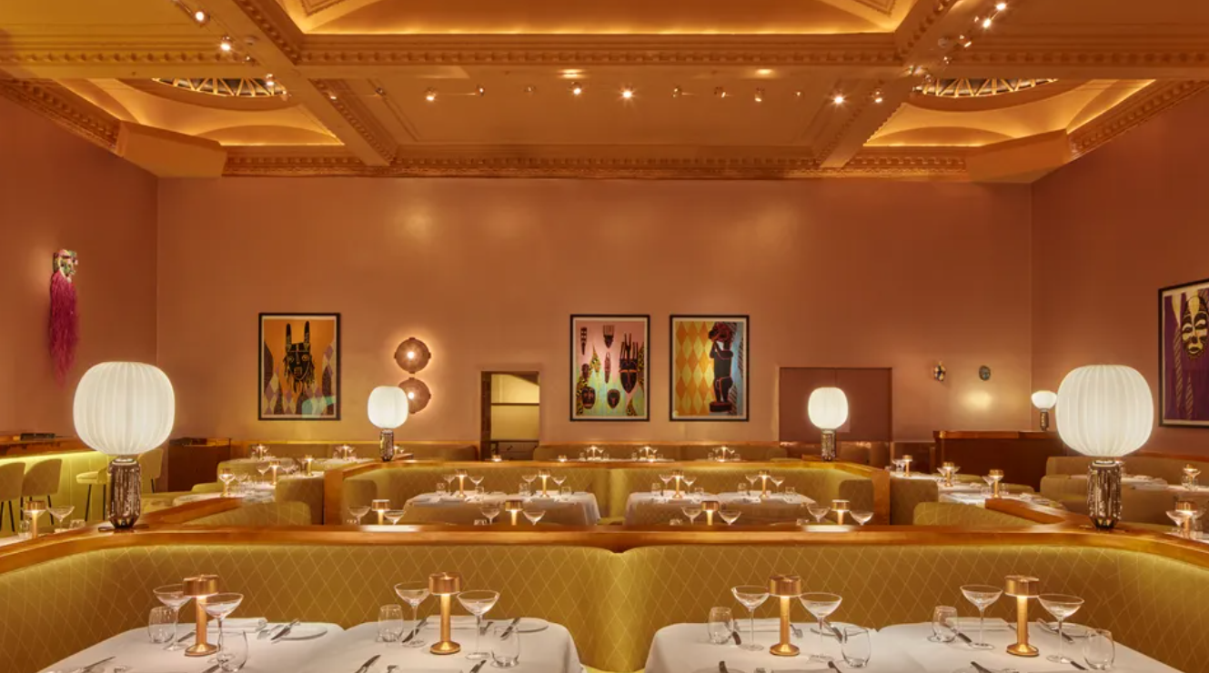
Sketch's newly refurbished mustard surroundings (photo credit: Edmund Dabney)
Digital Natives
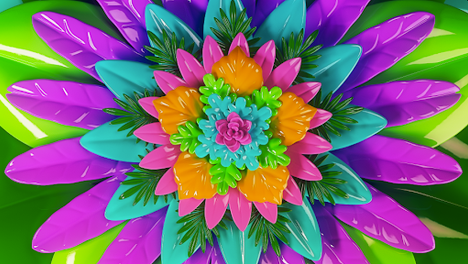
While Instagram’s popularity remains high - where palette of neutrals and pastels reigns - TikTok is gen Z’s app of choice. There, bright colours prevail. As the first generation of digital natives, it makes sense that the line between the virtual and the material world is more porous, with the two influencing each other in ever-more direct ways. Growing up online means that digital worlds provide inspiration for fashion and beauty. “We’re seeing young people dye their hair in really bold colours, to align closer to the avatars they’re playing in games like Fortnite,” says Chris Huban, executive creative director at the creative agency Big Spaceship. “Young people are excited about the possibility of who they can be in this digital space, what it and they can look like. There’s a real feel of freedom and creative expression that they’re then applying to the real world.”
The rise of virtual environments (not least including the metaverse) and the keenness of brands, marketers, and artists to explore its potential has interesting consequences for colour. With the world grinding to a halt over the past two years and trapping us in the familiarity of our walls during the pandemic (with some of those walls and furnishings likely to be neutral and pastel, as per millennials’ preferred colour palette), the metaverse’s expansive horizons provided endless opportunities and possibilities to explore.

Digital worlds have always been brighter and more highly contrasted than anything the natural world typically offers the eye. For Huban, it’s obvious that digital worlds are necessarily bolder, “because they’re RGB-based, which means colours are more saturated than a CMYK print palette can be.” Through colour, digital worlds are able to represent a consistent vision of a future that’s hopeful and optimistic; an escapist utopia offering comfort in a rapidly changing world. “Those who are at the wheel, driving the development of these platforms, want to create a world that’s different to the one we’ve been living in because we’re looking for the most exciting forms of escapism,” adds Huban.
The colourists at Nice Shoes have felt a shift too, with Tricia Hagoriles saying: “In the work that I’ve been doing, the trend has been more RGB LED lighting, different skin tones, and more purposeful exposures. So in my colour work, the trend has been to embrace the colour, to embrace the mood, and to emphasise the dimension of a frame.”
Ninaad Kulkarni, creative director of immersive at Nice Shoes, further adds: “Colour has a vital role to play in immersive experiences. Traditionally in film, a director would use a combination of colours to evoke moods, create atmosphere and help in immersing the viewer to tell the story effectively. When we talk about Immersive storytelling such as the use of Virtual Reality, we have already isolated and immersed the viewer in an alternate virtual world. The world we create no longer lives on a detached rectangular screen in your room, it surrounds you from all angles. The role of colour and importance of it significantly multiplies and empowers the artist to create a deeper impact on the viewer. It is our responsibility as artists, creators to use the power of colour in immersive storytelling to help the user feel everything the XR experience demands but in a comfortable yet impactful way and guide the viewers attention in the vast 360 world.”

In many ways, digital worlds, AR, and VR are still in their nascency, with the creative and advertising industries only just scratching the surface of what’s possible to achieve with the new technologies. One of the questions at the top of many creative minds is “Should we replicate the world as we know it in virtual reality, or build something completely new?” This affects colour in as far as creatives have whole new palettes to play with, allowing them to build on existing aesthetics or start anew in the virtual space. Replication, innovation, or both - it’s an exciting time to explore new ways of storytelling with new technologies.
Kulkarni’s work has dealt with the spectrum of virtual experiences, building the fantastical and recreating the natural while expanding on its sensory potential. For the launch of Audi’s e-Tron GT, Ninaad and Nice Shoes helped to create an AR leg of the project that celebrated the new car and its beautiful design with real-time reflections and studio lighting, keeping the user hooked to the experience, and showcasing the car in beautiful colours. “We put the customer in a stylishly-lit showroom where they could manipulate the lighting in addition to the car's colours. Huge attention to detail was paid to rendering reflections, tones, highlights, shadows and hues authentically when the car is placed in various studio and natural environments”, he explains.
Broadly, however, these new technologies offer an enormous new environment which creatives have barely begun to explore. But, as Kulkarni goes on to explain, the key to unlocking this new potential can only be found by harnessing everything we already know to be true about colour. “Colour Theory, the history of how colour interaction happens, and how it affects the mind, the psyche. Research still needs to be done - and it is being done - to see how VR environments affect us as opposed to a screen.”, he notes. “Research on perceptual phenomena such as visualising synaesthesia are being explored, or for example ‘Notes on Blindness VR'; a project that explores the journey of an individual losing their eyesight, where hearing could become a visual experience. More research needs to happen to answer that question accurately. The only thing we have to rely on currently is the history of colour, how it makes us personally feel in the moment, and continuing to challenge various immersive mediums and assess the outcomes”.
For an industry which tends to live firmly in the moment, that could be construed as a comforting thought. Zoom out, however, and the colour trends of today paint an image of tomorrow’s industry. It’s a kaleidoscopic vision of fragmented media, deep virtual worlds to explore, and enriching immersive experiences. While that full picture is still yet to take shape, what we know for certain is that it will look bright.


