


The&Partnership Reshapes Toyota Brand Visual Identity in Europe


The independent agency network The&Partnership today launches its new logo and visual identity (VI) for the Toyota brand in Europe. Developed by the agency’s in-house branding studio, as part of its full-service partnership with Toyota Motor Europe (TME), the work will be used across all internal and external Toyota brand communications in Europe.
Toyota is on a journey of rapid expansion into electrified vehicles, online retailing and new ownership models. Whilst the business is transforming, the brand VI had remained the same for over a decade. TME and The&Partnership identified the need to evolve Toyota’s VI to ensure it kept pace with the business and all its digital touch-points.
The aim of the redesign was to build Toyota’s image as a more progressive brand, while guaranteeing longevity in a digital world and ensuring that the brand continues to appeal to a modern and expanding customer base. The&Partnership Europe’s branding studio delivered the project from start to finish; adding a new string to the agency’s bow of creative capabilities.
Dan Beckett, head of art at The&Partnership said: “The key to this project was not to simply see it as bringing the brand identity up to date, but preparing it for years to come. As well as re-modernising the brand we also sought to bring a more premium feeling while working hard to simplify the brand architecture and creating a design system which will be fluent across today and tomorrow’s touch-points. Toyota has recently made great forward strides in its product design and we really wanted to see that reflected in the visual identity.”
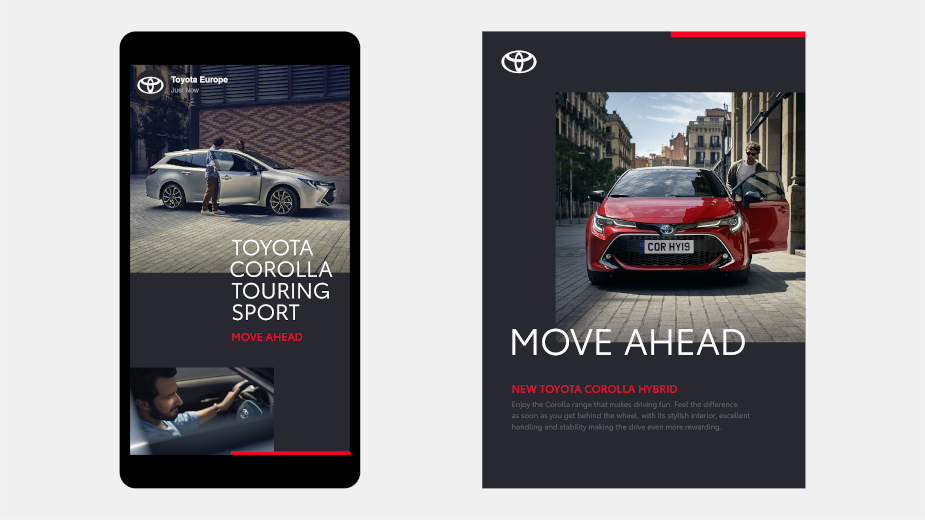
The direction for the new VI is shaped by four key goals: Forward-Thinking, More Premium feel, Consistent and Mobile-First. The&Partnership’s design approach employed simplification, distilling Toyota’s key visual properties into a clean, considered system that better unifies the brand. At its core is the new logo, which distils the brand’s emblem to a simplified 2-D design, losing the ‘Toyota’ wordmark; an acknowledgement of its status as one of the most recognisable brands in the world.
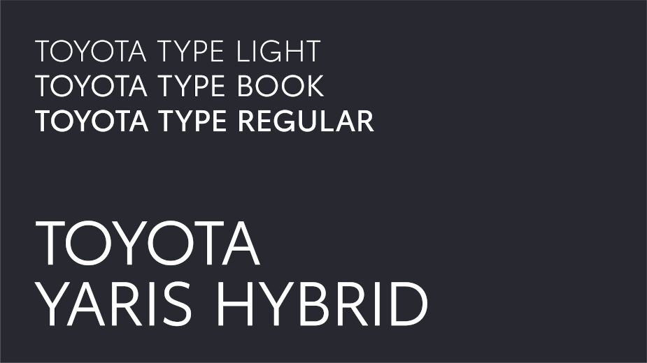
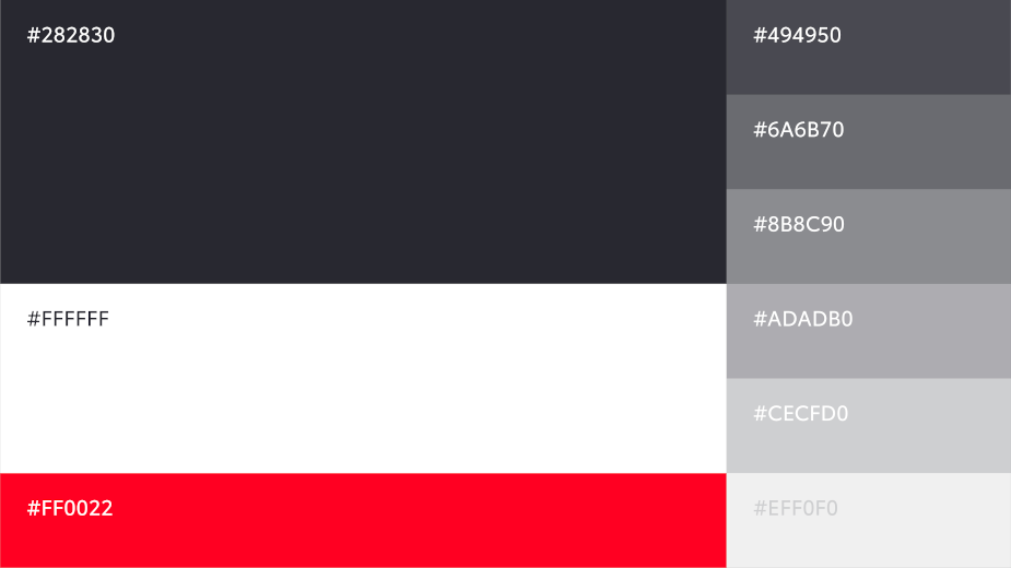
The new bespoke typography is Toyota Type, a sans serif font which enhances clarity and consistency across Toyota’s different business units. Emphasising this is the primary colour palette, a clean, premium monochrome, with a red accent that provides a distinctive nod to Toyota. The brand architecture has been streamlined and simplified through name changes, consistent typesetting and logo lock-ups.
Starting in July 2019, The&Partnership Europe’s branding studio worked closely with the TME project team over 12 months to develop the new VI and guidelines; housed in an online toolkit for anyone who works with the Toyota brand in Europe to access. Roll-out across all European markets in all channels (except retail) begins today.


