


The Look of Love: Romantic Design in 2023
We all have a picture in our heads of what Valentine’s Day looks like from a design perspective. Fluffy things, hearts, roses, reds and pinks, cursive typefaces – horrors to make your skin crawl, whether you’re a designer or not. But what does romance really look like in 2023? What visual cues and styles say love or romance, without slipping into cliché? Many brands play a role in our romantic lives though. So what design direction should they take if they want us to welcome them into our love lives?
LBB’s Alex Reeves asked some of the industry’s design thinkers.
Andy Cooke
Creative director and head of design, BBH London
Anything visually ‘romantic’ or linked to the notion of being in love instantly brings cues associated with a style that is traditionally viewed as feminine (with women being patriarchally defined as only the receivers of romance), often maximalist (born out of the romanticism era itself) along with a ton of hearts, reds, and flowers.
However, for me, it’s the combination of these cliches that really makes me lose interest. The big retailers of this world cashing in on Valentine’s Day will always overdo it, layering all of these overdone symbols on top of one another. But the truth of visual cues that define how love is designed (or anything else that requests a limbic response) shouldn’t be underestimated. We can and should use them, but with responsibility.
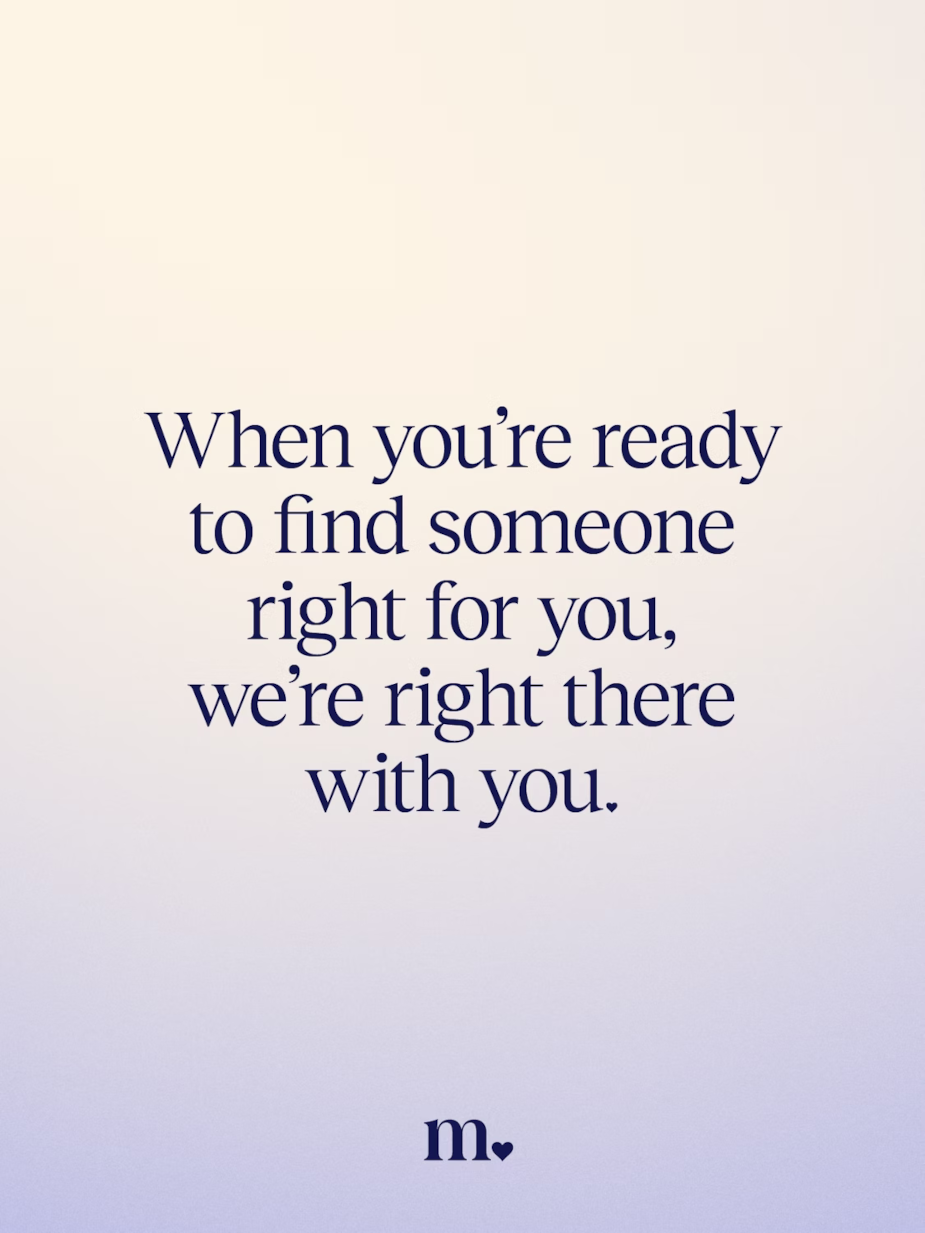
Collins’ re-brand of match.com a couple of years ago pulled on these cues but presented them back in a distinct way that avoided anything too tropey, something we often see elsewhere in the category. There is a balance of semiotic softness and new-age approachability in the visual language that makes it a success. It’s romance visualised for adults looking for love, over competitors that can lean into cliches for those looking for lust.

Allison Ball
Lead designer, The Gate London
Advertising has always used love (and sex) to sell, but it’s tricky to get right. But Good graphic design is magic. It can take the cheesiest concept and make it beautiful. And with the right colour pallet, anything can work.
We are in the midst of a cultural shift, where romance is changing and how we show is too. There are brands that are using their platform to highlight inclusion, diversity and empowerment and people are loving it. People also want to see more realism and intimacy in advertising. They want to see a story that they haven’t heard before.
Researching ‘romantic design’ brings up pages and pages of hearts, cupid’s and general valentines day cheese. But what it did show me is that illustration is a great way of striking the nice balance between cheese and style. It's a lovely way to visualise emotions
But there is nothing out there that hasn’t been done before. And often done badly! It is a designer’s job to try to put a different visual spin on something that’s been done 1000 times before. Especially if there are hearts and flowers involved!
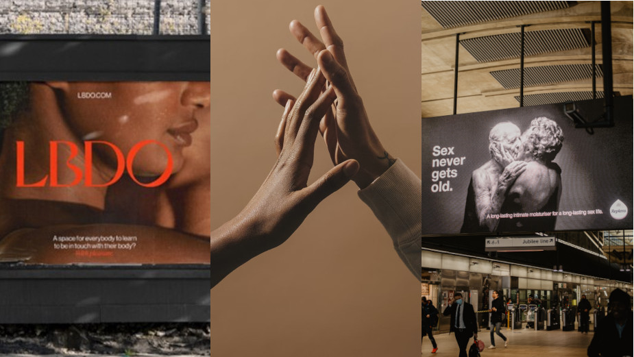
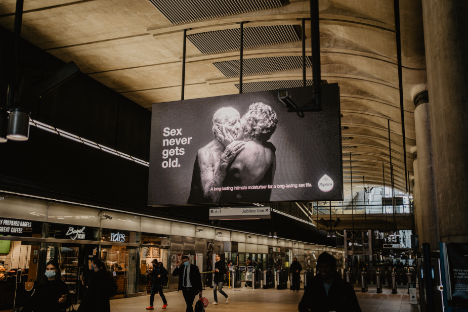
A good example of contemporary romantic design is The Replens Sex Never Gets Old campaign, which showed couples we wouldn’t normally see in mainstream advertising. It was real, intimate and beautifully crafted.
Using illustration, some things I have seen and loved lately:
Animest. A wall mural by Andreea Moise for an animation festival. Takes kissing, heart shaped trees and people hugging on a bench and makes it… gorgeous. https://www.behance.net/gallery/158930087/Animest-Mural-Painting?tracking_source=search_projects%7CAnimest
Maggie Gaudaen has designed a brilliant sex education kit designed around the tricky subject of consent. It’s fun, quirky and informative. And proves how design can really target an audience and allow the information to be seen
https://www.behance.net/gallery/44213513/The-It-Kit-Sex-Education-Prototype
Matt Hauke
Senior designer, Structure
Eurodance artist Haddaway once pondered the question, ‘What Is Love?’ across dancefloors everywhere. For him, it meant trust, honesty, and dedication. I think the same applies to brands.
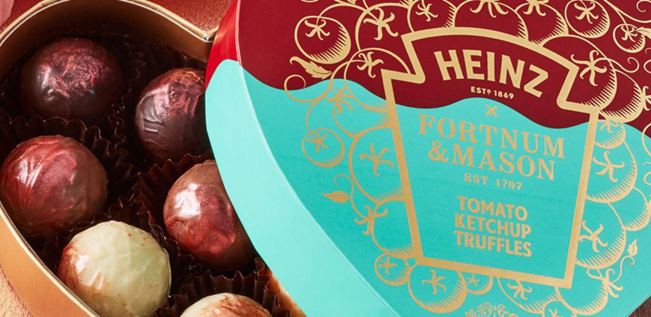
When it comes to Valentine’s Day, for brands looking to inject a little more love, it’s important to ensure any activity is relatable, otherwise, they run the risk of being contrived. There are many ways brands can step into the romantic design territory and with the right idea all brands can inject a bit of love without slipping into cliches and remaining true to themselves. Heinz did this perfectly when it collaborated with Fortnum and Mason to launch ketchup chocolates. [ https://www.fortnumandmason.com/stories/fortnums-x-heinz-tomato-ketchup-truffles ] It doubled down on the feeling of joy at the heart of the brand and produced something so left-field that it bizarrely works.
Brands that operate in the love and romance sector all year round do so in a more refined way. Match.com, the online dating site, is a great example of this; pairing sophisticated typography and dreamy gradients to transport users into a loving haze. No hearts (bar the logo), no pinks, no squishy soft fonts etc. It evokes the core feeling of love in a smart and sophisticated visual system, without the cliches.
Brands perform best when they’re backed by an army of lovers, not just likers. People who engage and champion the brand because they truly believe in what it does and the way it does it… now that’s true love!
Joshua Cutts
Middleweight brand designer, Notepad
In times that are chaotic, turbulent and plainly scary, Romance in Design stands as a way to bring levity and authenticity to audiences.
Romance cliches have many visages: more effeminate designs, cursive type and floral dressings. But these dated and stereotypical treatments are certainly on their way out. People (particularly the Gen Z crowd) are craving healthier representations of romance than we are used to, and are wanting more intimacy and representation across the board.
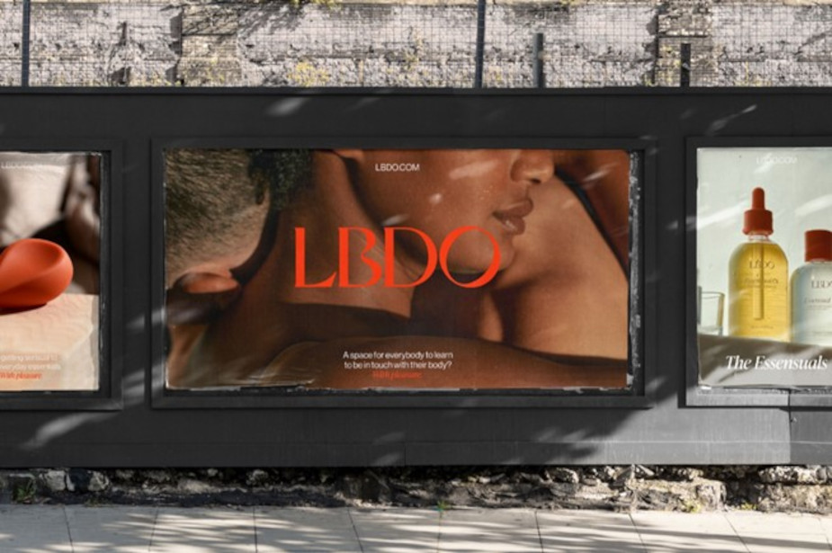
Brands would do well to stay away from clichéd and gendered designs, and look to brands like LBDO that ignite themes of body positivity, intimacy and self love, using beautiful type treatments, intimate photography and a logo that turns a simple serifed font into a representation of the unique quirks that make us all beautiful in our own way.
Match is clean, delicate, and relationship focused. The ethereal gradients and copy back this by being simple and optimistic.
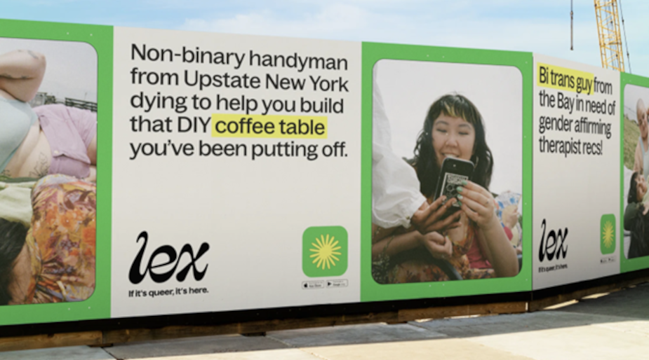
Lex shows a focus on LGBTQ+ individuals coming together and finding connection. The logo is an organic word mark that pairs with maximalist colours and application with very real, authentic photography and great use of queer vernacular.
In not so many words, people want less Tinder and more Hinge.


