


The Lifecycle of the Gradient
2020 keeps hitting us where it hurts - and its latest target is a particularly notable one: the gradient. “But the gradient is still young!” you exclaim. “We used one in our web designs last week!”
That’s cute. Sweet, even. But there’s no fighting the march of progress. Obsolescence comes for everyone and everything. Like puka shell necklaces, or the Roseanne reboot. So just let it go. Let. It. Go. Because the bell tolls for thee - yes, even as the once-noble gradient struggles for life, arguing for its own vitality like a peasant thrown on a corpse cart in Monty Python and the Holy Grail. “But I’m not washed yet,” pleads the gradient,
its annoying little voice joining your chorus of pertinacious pity. “You can find me on venngage.com’s list of the year’s top design trends! This year! 2020! I’m still belov—.”
But we can barely hear the gradient any more.
“Shhh. Go to sleep, gradient,” we whisper to no one and nothing.
Then we smirk, listening to its (for legal reasons, proverbial) screams muffled by the atonal thump of freshly shoveled earth as we literally, figuratively - and most important, sustainably! - bury it alive. It may seem harsh. It may seem cruel. So just trust us when we say it was necessary. Because at the risk of mixing metaphors, you don’t feel bad when you take the trash out to the trash. Same principle!
Of course, there’s no denying the gradient has served us well. From Apple to Instagram, the gradient has furnished our phone screens and our digital designs with a pleasant, practically narcotic potpourri of pigment. But the gradient has outlived its usefulness.
That same ubiquity has become predictability. And what do we do with design trends that no longer feel fresh and vital? We take them out back and feed them to our earth mother, so that something better may grow in its place.
Ashes to ashes. Dust to dust. Gradients have monopolised colour, derided borders, and blotted out the better angels of our design nature for too damn long. The gradient is the manspreader of design, taking up space without having anything of interest to say. It is the lorem ipsum of visual language, a dialect that passed from the lips of the living an eon ago (or in relative internet time, at least a couple weeks).
Which is why this can only be classified as an act of mercy - so that the gradient may
live long in our collective imagination as a lightbringer and a beacon of hope, not an elegantly regurgitated box of crayons. When our group creative director Jessica Lee casually declared on Slack the other day, “I don’t fux with gradients no more,” it was as if a Zeusian thunderbolt split the sky, and the burn of her words clarified and cleansed us of the need to lean on this tired-ass design trope.
You can feel it, can’t you? The possibilities. Stop reading for a second. Just listen.
Those are buds. Blossoms, peaking through the loam. In the fresh, fertile soil, where the recently necrotised gradient now lies, something new is in the first stages of life.
Because life? Well, life finds a way, my friends. In the bloom of the day, we see fresh
and vital design trends climb to the sky, hungry for nurture, hungry for the shine denied to them for so long by the pervasive, persistent gradient.
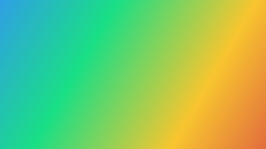
The sky breaks. The fog recedes, shuddering aside, leaving only spectral trails to mark its passage from our atmosphere. The sun beams, feeding our fledgling little design sprouts. And from behind the retreating cloudform comes something bright, bountiful, and undeniable: a rainbow.
A rainbow. A rainbow? A rainbow’s totally a gradient. Well, hmm.
Sam Eisen is senior copywriter at Code and Theory


