


The Legacy Craft Behind Cadbury’s 200-Anniversary Posters

Not many brands have ever had the chance to celebrate 200 years, let alone one as beloved as British-born chocolate institution Cadbury. So with two centuries of bringing joy to the nation behind it, 2024 is a whole year of celebration for the brand.
The ‘Yours for 200 Years’ campaign, which will take many forms throughout the year, was created by Cadbury’s agency VCCP and deploys the nostalgia that a fabric-of-the-nation brand like this has at its disposal to its maximum potential.
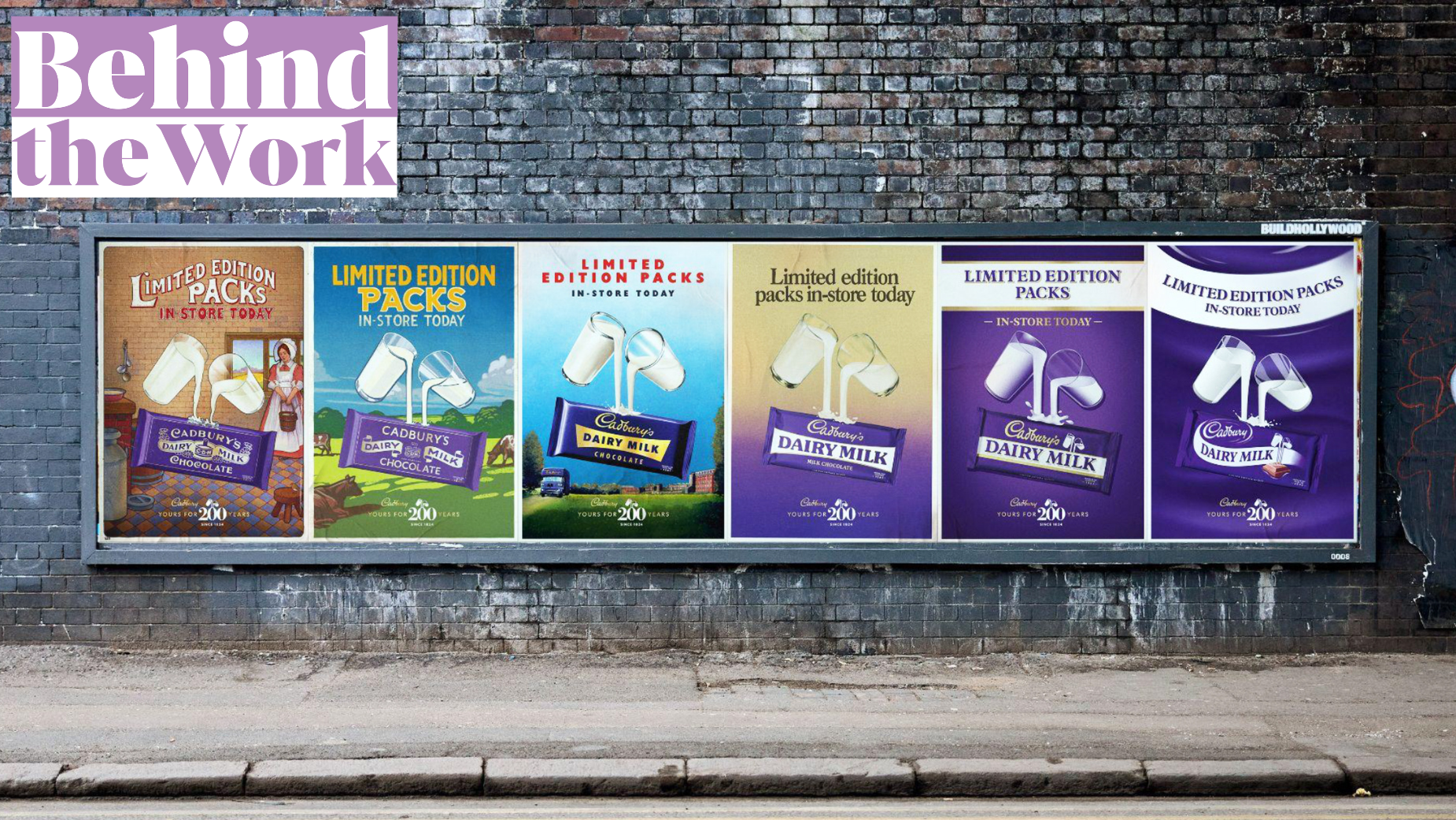
While the main film in the campaign used clever visual effects craft to take a recent ad on a time-travelling journey through history, the out-of-home component of the campaign was built using craft skills that date back through the decades. Illustrators and designers recreated iconic Cadbury posters from 1915 to 2024, with VCCP leading on setting the creative direction. Made to promote limited-edition packs of seven Cadbury Dairy Milk bars featuring classic designs, illustrators and designers took inspiration from previous Cadbury advertising over the decades, using techniques including oil painting, linocut printing, watercolours and acrylics, all the way to modern computer design.
LBB’s Alex Reeves speaks to Angus Vine, VCCP creative director, to hear how this nostalgic celebration of generosity came together.

LBB> For those who haven't seen it, what is the main creative thread of the 'Yours for 200 Years' campaign?
Angus> Cadbury is thought of as a national treasure that belongs to the public. It has been rooted in British culture for generations and has a special connection through its products to moments, big and small for generations. So the ‘Yours for 200 Years’ campaign looks to hero the very people who have made the brand what it is today.

LBB> The OOH part of the campaign is hugely nostalgic. How did the idea of remixing old posters come about?
Angus> To celebrate their 200th birthday, Cadbury released the nation's favourite Dairy Milk packaging designs from over the years as a series of limited edition packs. We were massively inspired by visiting the Cadbury archive at Bournville which holds an amazing collection of original Cadbury advertising. We loved the idea of showing how product advertising has changed over the years, especially the techniques that were used to create the ads themselves. An individual poster was created for every bar, each matching the artistic style of the period, by its own specialised artist or designer.


LBB> How did you choose which posters to draw inspiration from and where to update them?
Angus> For the posters we were guided by the dates of the packaging designs that were being released. Six unique artists and designers were commissioned to reimagine classic Cadbury advertising, born entirely of the era each iconic packaging design originated from. From early oil painting, linocut printing, watercolours and acrylics, all the way to modern computer design. The posters were faithfully and meticulously crafted, replicating the techniques and styles of the eras.

LBB> What was the process like of working with the illustrators and designers to make sure you got the aesthetic right?
Angus> It was a great experience working with so many talented artists: Archie Proudfoot, Chris Wormell, Vince McIndoe, Carol Lawson, Bruce Emmett and not forgetting the amazing design team at VCCP. Each bringing their individual artistic skills that worked perfectly to represent the time period we were replicating.
We started by setting a template, to make sure the ‘Glass and a half’ and the Cadbury bar were consistent throughout the set of posters whilst leaving room for the headline and our lockup. We then shared lots of inspiration and references from the period of advertising they were recreating. The responses from the artists were stunning and captured the feel of the periods perfectly.


LBB> What were the biggest challenges?
Angus> Posters for the more modern bars were the trickiest to create. It took a lot of development to make them feel like they were matching the dates of those pack designs. It's when more consistent brand worlds came in and we saw less differentiation over those later years.

LBB> Are there any details on the posters that you're particularly happy with?
Angus> I particularly love all the unique little inconsistencies that you get with hand crafted work. Be it some of the linocut print texture coming through or seeing the hand painted brush marks in the creative.


LBB> How have people responded? I bet there are some collectors and Cadbury fanatics out there who are obsessed.
Angus> The response has been great. As a set of posters they look great and I know the bars have been going down very well, with people looking to collect the full set. Apparently the 1940s one is the trickiest one to get your hands on. So look out for that one.


