The Art of the Iconic: How do Film Posters Get Made?


Film posters are unique in the world of advertising. Dressing the walls and windows of movie theatres, the bedrooms of film-fanatics, and drawing viewers to the latest releases on streaming services worldwide, film posters have a unique ability to leave an indelible imprint on those who observe them. But, how often have you stepped back and thought about the craftsmanship behind them? How do these striking visuals that we consume so regularly come together?
In any film poster, there’s a delicate creative tightrope to be walked. Should the design communicate something conceptual about the film, revealing its tone or genre? Or should the designer work out a way to include the stars of the movie? And how should posters walk the line between new iconography and the established rules of the medium?
To find out more about the artistry behind the medium, LBB sat down with illustrator and graphic designer, Matt Ryan Tobin, and Mark Delottinville, owner and executive producer at Canadian production company, Big Pig to discuss their working relationship, creative processes, ‘napkin sketches’. and the film posters that inspired them…
LBB> What is your creative process and working relationship?
Matt> When it comes to my creative process, first there's the spark, and then there's the hook. The spark in my brain, and the idea ignited by watching a film that I'm working on. That's usually followed by a hook, which is something that I commonly use in posters that is sort of a read-between-the-lines type of visual. A visual that tells a story, without telling the entire story. It's something that gives the viewer a little insight into the film, more than just showcasing who's in the film and more about the story itself. And I've always loved art like that - something to be interpreted. Working with Mark, his films have always, instantly given me a spark and instantly given me a hook.
Mark> I think that's the one thing I always loved about Matt's work, is that I never could turn away from the poster, there's always something that brought me into it. Even though most of our films have been shorts up until now, I would say that Matt's still been able to create some sort of hook to that story that doesn't spoil it, it just adds to it, which I love. It's something that makes the viewer look at it and think, “this is something that I want to watch”. An intriguing tidbit that gets you interested.
LBB> So how do you work together to ensure that your shared creative vision is reflected in the final poster?
Matt> I always want to make sure when working with any client, and with Mark, that my ideas are going to complement and communicate the film appropriately. Both being creatives, we both have visions, and I come from a completely different space than Mark does. So usually, what I would do is once I've got that spark and ignited that idea, I send what I would call a “napkin sketch” to Mark.
Mark> I love how you call it a 'napkin sketch', because they are so well done. It would be the fanciest napkin!
Matt> That's funny because sometimes you get in a situation where you produce a napkin sketch, which is just shapes and a rough composition. With Mark, I feel comfortable giving a more fleshed-out concept.
Mark> For me, it's just whatever Matt makes - because it's always great. I don't want it to spoil the movie, I want to add to the movie. A lot of the stuff that we've done brings out concepts of the movie that subconsciously you might not even think about, but it's really cool to see. And that is really interesting to go back and forth on. I still remember the first one he did for me. I was at a dinner with my family, and I audibly went, “yooooooo”, in the middle of dinner. And then proceeded to show all my relatives this poster concept.
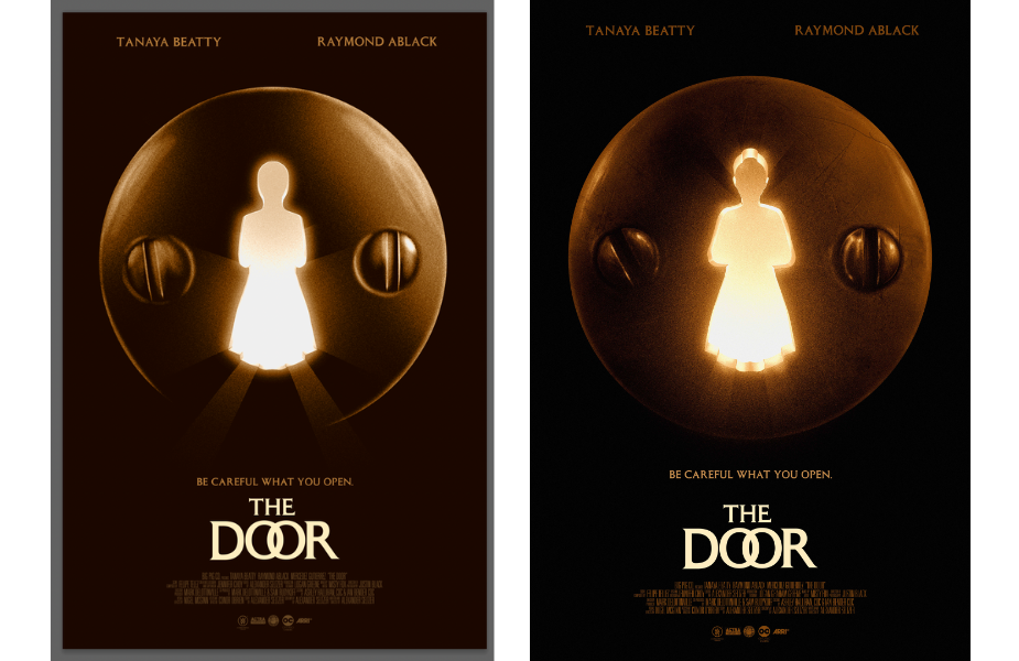
Above, the 'napkin sketch' (left) vs the final film poster for 'The Door' (right)
Matt> When you work directly with a filmmaker, this is something that is their passion. So you’re coming together from a passion-driven place and creating imagery together, a melding of two perspectives. So that always makes for stronger art. Mark will always advocate for wanting something that's more art-derived rather than something that's trying to sell you the film, which is always such a pleasure. As an artist, to work on projects like that it is really creatively liberating.
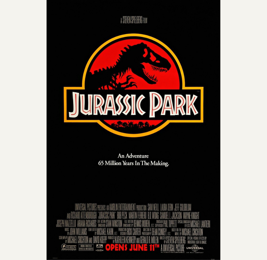
Mark> That's probably a mixture of my youth having seen the posters that I remember so vividly. I remember the posters with artistic concepts, not with floating heads. I always go back to 'Jurassic Park' (1993) or 'Batman' (1989). It's very simple in what the concept is, and what it's telling you.
Matt> The 'Jurassic Park' original one sheet is essentially just black negative space with the Jurassic Park logo on it, and that's all you're given. I think people often overlook what the direction was with that poster. It's just the logo of the park. So it's marketing the actual park, not a movie. It’s not showing dinosaurs from the film, it's not showing the action, it’s showing the logo of the park. So in and of itself, that's telling you a story. It's so subtle, but so clever. And I think that that often gets overlooked.
LBB> When you design a poster, where do you envision it being placed? Is it on a street wall, outside a cinema, or hanging on a film student’s bedroom wall? What’s its natural place?
Matt> That's a great question. Honestly, I think the first thing that comes into my mind when I'm creating a poster is how it would look on the wall of my studio. More so than, you know, a theatre marquee or in a video store window. And the funny thing about that is I have none of my art hanging in my home!
As a kid, my bedroom walls were littered with film posters. So that's the headspace I'm in. If the art was captivating enough, someone would proudly hang it in their house.
Mark> See, I do have your posters on my wall in my house. I’m staring at your 'Roadhouse' (1989) poster right now. Coming from a filmmaking perspective, you're thinking about a poster on a cinema wall, however that doesn't tend to happen as much unless you're working on a massive property. So you have to also think about if someone's scrolling through their phone.
Matt> Absolutely. For those who don't know, there's a lot of different angles that studios will come from with marketing posters, different sorts of needs need to be met for certain mediums. When you're looking at a phone, the thumbnail of that image for that film is maybe an inch tall. That is why on Netflix or Prime or whatever you are watching content on, more often than not, you'll just see a still of a known actor's face because it's direct. It's to-the-point and the whole goal is to make sure that someone's attention is grabbed right away. So with posters that are complex compositionally, they don't really register at that scale. In those instances with those parameters, having a solid concept with a singular visual like the poster for 'The Door' (2024) that tells a story, it's actually totally legible at that scale. I think [the poster for 'The Door'] is really neat at that scale, because I don't think you'd make out what the image is right away, you would just just see a lock. You have to look closer. It makes you engage with the art, which is what you want.

LBB> What do you think is the main role of a film poster - is it a straight-up ad for the film, or is it supposed to convey something about the film’s tone or its story?
Matt> I think it's all in the iconography. Honestly, I think it’s about finding a singular image, whether it's like we did with 'Cruise' (2022) with the phone and the revolver chamber, or 'The Door' (2024), it's a singular image that one can retain after looking at it once. Take the posters for 'Jaws' (1975), or the original one sheet for 'E.T.' (1982), with just E.T. and Elliott's fingers over the world. It's very simple, but it's very bold. And that's why it's stuck in people's brains for decades.
Mark> Going back to your point about thumbnails, if I think about it, growing up my whole exposure to film posters were at theatres, and then at video rental stores. So I’m seeing some similarities to what you're saying and looking at a VHS or DVD cover from a distance and it being so comparatively small.
Matt> Yes, exactly.
Mark> You’re looking at something that is so small. You would look to the very back of the store and then you would see a specific image where you'd be like, “oh, I want that”. For me it was always posters that were so simple. The poster for 'Alien' (1979) for example, is just the egg and it’s both iconic and memorable. If you can pick out an image and remember it from a distance, then I think you've made a great film poster.
LBB> Do either of you have a favourite poster from that era?
Mark> That is such a hard question. I do remember 'Pulp Fiction' (1994) - it's not necessarily my favourite but I remember it. That, and 'Dumb and Dumber' (1994).
Matt> I used to get posters given to me by a local movie store. I’d go with my dad and all the posters that would hang in the window after they were done with their promo run, they would roll it up, put it in a box behind the counter, and I could have any one that I wanted. And they had 'Pulp Fiction' up in the window and it faced the inside of the store so it never got sunbleached. That was in my room and I had never even seen 'Pulp Fiction' before, I just liked the poster.
Mark> I always remember the poster for 'Amadeus' (1984) for some reason as well, or 'Full Metal Jacket' (1987). I remember never understanding what it was but my dad told me “you can’t watch that” I remember 'The Exorcist' (1973), and 'Indiana Jones and the Last Crusade' (1989). Oh, and 'The Fugitive' (1993).
LBB> Why are film posters such an important medium in the marketing of a film? In what ways are they different from other forms of advertising?
Mark> I can take the jump off this one. I actually think that film posters, if I'm being completely honest, have lost their importance a little. There are only a few from the past decade or so that I think are iconic. 'The Dark Knight' (2008) is a good one.
A lot of new posters use imagery from the movie, and I feel like there's only a certain amount of those that really do that well. Recently 'Madame Web' (2024) was shot almost entirely in the centre frame so that when they released it they could cut the whole thing to be on TikTok. I even placed all the shots from the trailer and there are still so many more that would work with this centre frame format I didn’t use.
Matt> I think the landscape has shifted a lot from the 70s and 80s to now in terms of film posters. Back then all of the weight and responsibility for marketing rested on the shoulders of the poster. In the 80s, trailers rarely played on television and you’d only really see trailers when you went to the theatre before you'd watch the film. So really, the only times you’d hear about a film or know about a film was because of the poster, either on a marquee, or maybe at the back of a newspaper. Studios relied on the poster to sell the film. Whereas now that we do have numerous trailers and teaser trailers and set photos popping up on social media, there is just so much more.
But what I do notice is that some studios understand that there's a desire for both. Both for the mass market poster that does sort of hit you over the head with this is what this movie is, and then something else that’s a little bit more artistic. So they'll commonly commission multiple different styles of posters and often there will be the like, alternative poster for that film which leans more into conceptualism, perhaps. They want to have these options for marketing, because there are a lot of different kinds of people and what appeals to anyone differs from person-to-person. Some people might not watch a film because the poster could be too minimalist or too cerebral.
LBB> Tell us about the work you’ve done together, what are your highlights?
Mark> So me and Matt have worked on three posters, technically one of which is still unreleased that we are still trying to get made. Whenever I thought about doing a poster, Matt was the first person I thought of being able to create something that is just so interesting, and so different. And I think we both have a horror influence in our work.
I think my biggest highlight, for us, is the very first napkin sketch you sent me for 'Cruise' (2022). Cruise was my first real short film and it will always be so sentimental to me, because it's the first indication of myself trying to put my name out there as a professional filmmaker. And as soon as I saw that poster, it was almost like a reassurance that this was going to be great. I have people who believe in it, who love it, and are producing incredible work in support of it. It's one of those things where you have people that are so passionate about your work and bring their passion to it. I'll always remember seeing that with my family at dinner, and thinking, "this is so much better than I could have ever imagined".
It's tough for people to take you seriously sometimes, you can say you're a filmmaker, but are you? And I'm sure it's the same with artists as well, too. But when you do make something and then to see the support of people that you admire to like, go and do that and create something that makes your work even more amazing, it elevates it, it’s the little cherry on top.
Matt> I feel like we're kind of torn from the same creative cloth, Mark. We both have a strong passion for what we do. What's wonderful about working with you is that you give me carte blanche creatively to explore. I don't feel like there's any limitations that you set and because you make such thought provoking art with your films, it makes it really easy to create thought provoking art for the poster. I feel like you and I hit the nail on the head together each time. And that's a great feeling.

Above, the 'napkin sketch' (left) vs the final poster artwork (right) for 'Cruise'
LBB> What kind of work can we expect to see from you both in the next year?
Mark> So for us, we're really pushing into narrative work for 2024. We are doing advertising, which we continue to do and still love to do. But narrative is just another branch of stuff that we would be offering and being able to develop stories and really make stuff that people want to watch. And then we've got two short films that we're going to camera, for sure, in less than six months. After that, we have three or four feature films that we've optioned that we're looking to develop over the next few years. And hopefully, Matt won't be too busy with all of his massive projects to do the posters for those films. My hope is at least two more, for sure with Matt by this year, and then kind of go from there.
Matt> I definitely looking forward to working with Mark again, and creating some new thought-provoking art for his amazing films. Unfortunately, a lot of things that I'm working on, I can't talk about just yet. Something I can talk about, however, is my first art book released this year, 'NEON VOID: the Art of Matt Ryan Tobin'. It chronicles the last 10 or so years of my work in poster art. So I'm going to be pushing that book for the remainder of the year. And we actually weren't even able to get everything into it. There's at least another book worth of stuff. So here's hoping that we can do a second volume as well!
You can pre-order Matt’s book, ‘NEON VOID: The Art of Matt Ryan Tobin’, here.