Tank Design Tapped to Develop Re:wild's New Visual Identity
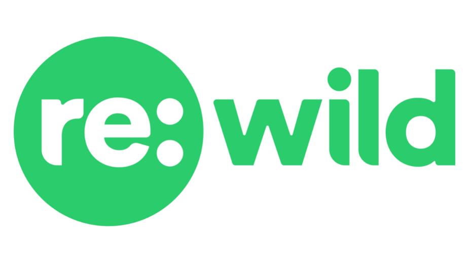
Tank has partnered with Re:wild to support the global environmental organisation’s movement to protect what’s still wild and restore the rest.
Tasked with developing the brand’s new visual identity, Tank’s challenge was to create a design that links three fundamentally important aspects of the brand together - connecting the dots between biodiversity, human society, and the climate crisis. The answer was hidden in plain sight. The circle represents our collective home, our earth, our family. The colon in the name connects those dots, enabling Tank to turn the name into a rallying cry: the cry of Reimagining our society. Reimagining the action needed. Reimagining the change we must take. Reimagine togetherness. Reimagine technological break throughs to meet this challenge... Reimagining wild.


