


Syncsmith Hires Leading Female Typographist, Morgane VanTorre for Rebrand
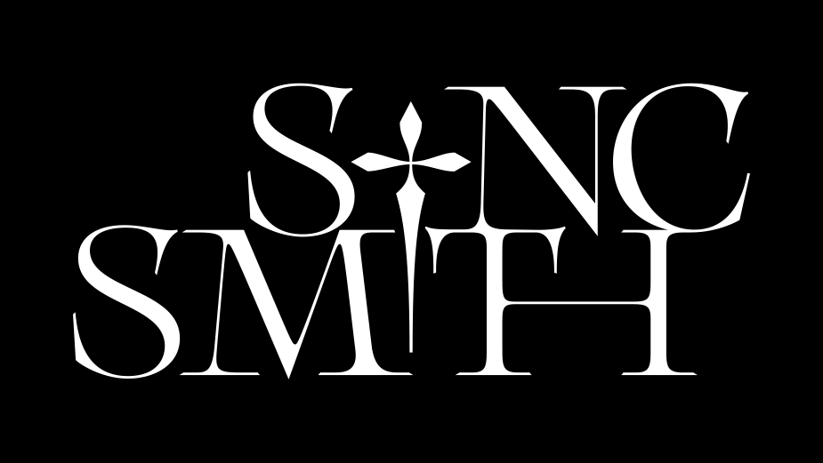
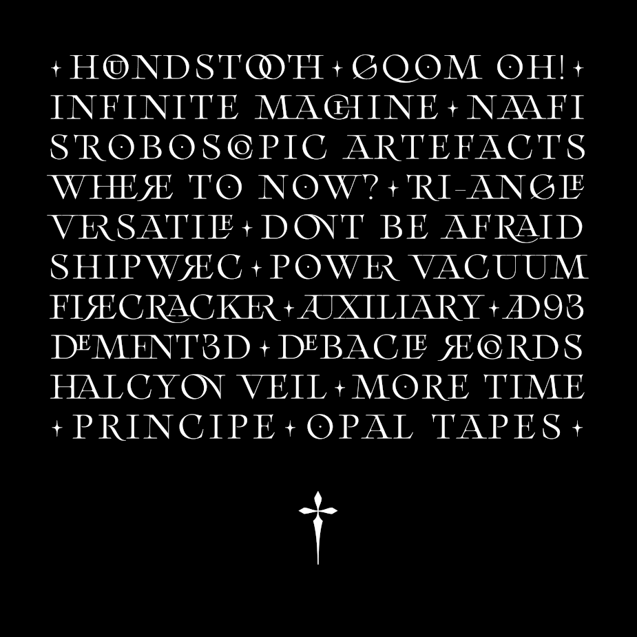
The UK based start-up Syncsmith, now in their 36th month of operation, champions electronic composers by placing their bespoke audio material and sound design into groundbreaking premium campaigns including Nike, BMW, Burberry and Campari. Having just signed Halcyon Veil, Opal Tapes and Tri-Angle Records, the time has arrived for a completely fresh aesthetic.
Founder Gavin Mee on selecting Morgane VanTorre for the rebrand: “I wanted to select a typographist as opposed to a traditional graphic designer as I felt there were so many nuances, dichotomies and idiosyncrasies within the brand and those discrete messages needed to be converged and conveyed through microscopic attention to detail. I found Morgane’s profile through the creative magazine It’s Nice That and was instantly drawn to her timeless, elegant and avant-garde typography. We’re really content with the results; she has quite literally knocked this into the 18th Arrondissement”.
Morgane VanTorre is a typographical designer based in Paris, practicing in the fields of type design, edition, graphic design and web design. The French designer cites nature and geographical influences on her typography practice, she is fascinated by innovative methods of presenting her work (stone masonry carvings through embroidery) and is currently working towards a Master’s in type design at École Estienne in Paris.
The typography selected by designer Morgane centers around Arthemys, which is a whole serif family based on 18th Century French aesthetics. Arthemys represents a revival of iconic ancient forms which remain sensitive to their legacy and heritage, the typeface is inherently laden with ligatures and stylistic alternates which enable any prose or block of text to adopt a majestic and visceral value.
Morgane on her initial assessment of the rebrand: “I noticed that Syncsmith has a strong duality in its personality. Both atypical and experimental with a strong look to the future, but also a traditionalism aspect where elegance and rigor/precision are the keywords”.
“As with all branding exercises it’s not just the typography, the colours, the messaging, ideally something symbolic is needed to drive the brand message home” explains Syncsmith’s founder “given our lineage and traditionalist values centered around the blacksmith/metalsmith and master craftsmen we knew we needed something tangible that wasn’t an Anvil and were hooked when Morgane presented her designs using the 'Obelus' to replicate varying characters.
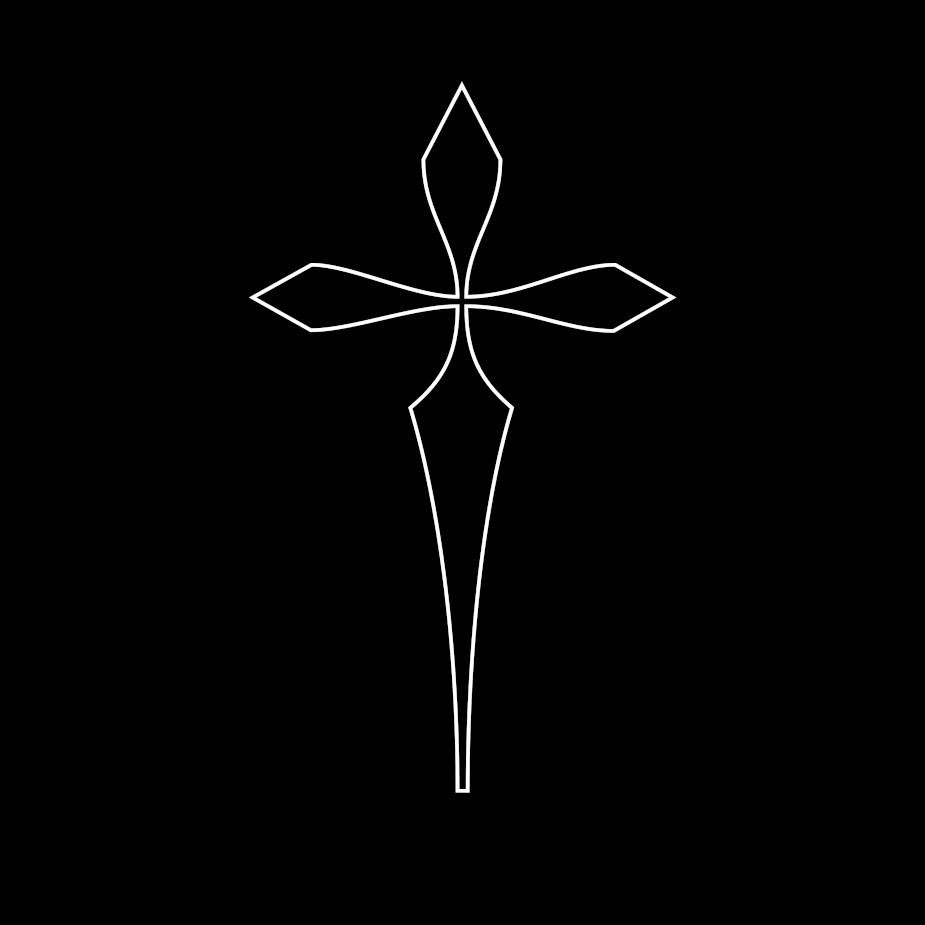
The Obelus’ use within typography identified as Obelism dates back to Ancient Greek where it was invented by the Homeric Scholar Zenodotus, depicted by the modern dagger symbol it originated from a variant of the obelus, and represents the end of a marked passage, the cutting out of dubious matter or to lay low the superfluous. St. Jerome (c. 347–420) used a simple horizontal slash for an obelus, but only for passages in the Old Testament. He describes the use of the asterisk and the dagger as: "an asterisk makes a light shine, whereas the obelisk cuts and pierces".

