Suffolk Unveils New Brand Identity from MullenLowe US

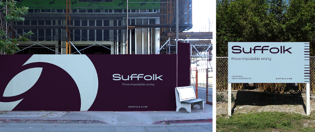
Suffolk, one of the most innovative and successful contractors in the US, has launched a contemporary brand positioning and identity that reflects the evolution of the business and reflects a forward-thinking strategy and commitment to pushing the boundaries of what is possible. Building on the equity in the core business, the brand identity lays the foundation for expansion and elasticity beyond the traditional construction category. The new brand is different from any other in the industry, in a category in which marketing and brand are often overlooked.
Suffolk engaged MullenLowe US to help develop strategic positioning, articulate the company’s ‘why’ and greater purpose, and design a new visual identity. Suffolk’s new tagline, logo and wordmark are the most visible expressions of this rebranding and strategic effort. Suffolk’s new tagline, ‘Prove impossible wrong,’ is a bold, ambitious call to action that supports its greater purpose to redefine what is possible, challenge boundaries and dream big. Suffolk’s first-ever logo is welcoming, adaptable and precise, symbolising the balance between what is possible and impossible. Suffolk’s new colour palette includes a carefully blended shade of red and blue that stands alone in its category, offers a nod to the colours associated with Suffolk’s brand for 35 years and provides a visual representation of Suffolk’s shift into a new era.

“The time was right to evolve the brand into something more meaningful and contemporary to differentiate ourselves in the market. We require a brand identity as sophisticated and refined as our business and the iconic brands of our clients and partners,” said Lea Stendahl, chief marketing officer for Suffolk.


