


Style Guide: Creating in a More Experimental and Imperfect Way with Rob Draper

Rob Draper is a British artist & designer who has gained global acclaim for his unique take on creativity and an international client list ranging from The Golden Globes, NASA/JPL, Nike, Gap, Levi's, Samsung, Penguin, Pentagram, Gumball 3000, Sunglass Hut and WWF.
His work has been featured in the worldwide press from IdN International Designers Network, Design Taxi, UC Quarterly, The Design Museum London, The Daily Mail and has been featured in numerous art/design/style/creativity books and publications. He is represented by Oskar Illustration.
LBB> How would you describe the work that you do?
Rob> Eclectic, hand generated art, design and creativity.
LBB> And do you have a particular style (or styles) that you like to work in? If so, how would you describe that?
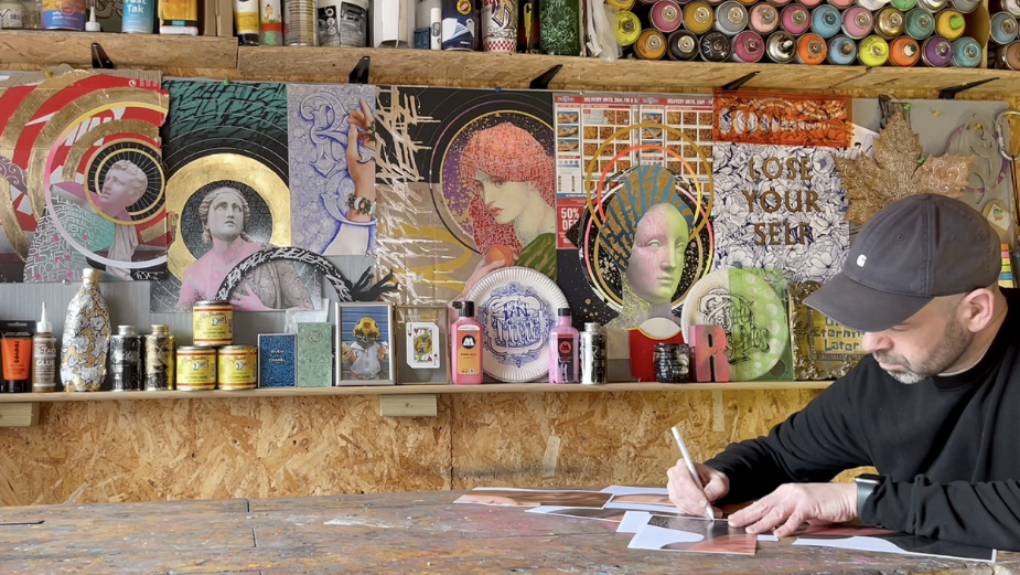
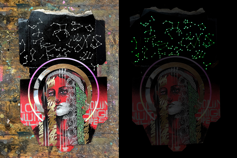
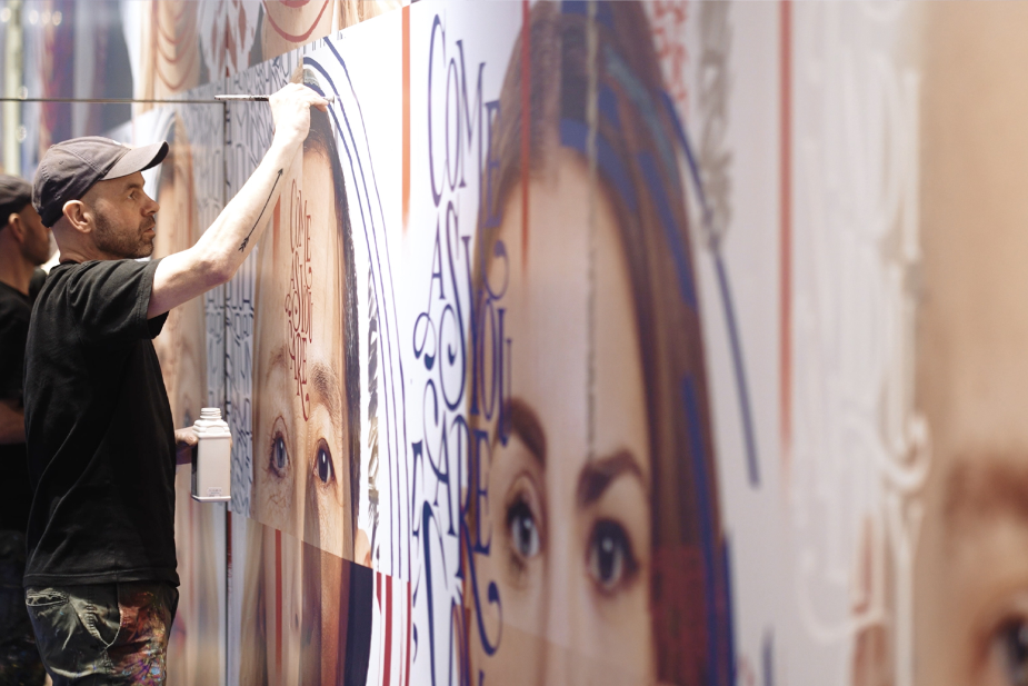
Rob> I think it's become quite an organic journey where through my career I have learnt different styles and techniques - i.e. traditional custom lettering, composition, digital type, illustration, collage, contemporary painting, traditional signwriting, painting on discarded/unusual objects, slow considered meticulous type, immediate fast expressive type and it has become a case of throwing all those things into the air again and again and see how they land. I try to constantly challenge and interest myself to see where it can go, often with failure but trying to find useful nuggets to take forward. I enjoy filming work capturing the process, the grit, the imperfections and quirks of analogue work. Recently I have been trying to explore the limits of collage and contrast, combining over-saturation of ideas, styles, materials, colour and techniques.
LBB> How did you gravitate towards the particular medium you work in?
Rob> Curiosity, age and a love of experimentation. As a child, art and creating felt natural like a great escape and I have drawn and drawn for as long as I can remember. I caught the first wave of graffiti art in the UK which gave me confidence, a social life and adventures and an appreciation for creativity. After leaving school I went to art college for three years and ended up with qualifications in art and graphic design and then university for another three years for a degree in visual communication. I always wanted to be an artist but people like me didn’t become artists and I had by now developed a love of letterforms so it made much more economic sense at the time to pursue a career in graphic design. Over the years I have done pretty much most roles within the industry from designer, magazine designer, senior designer, art director and creative director yet over time through all the roles I had, art crept in somewhere or another, this strange charm and pursuit of finding solutions by stepping away from the computer. A few years ago the last role I had was an art director, the brand I worked for relocated and I was made redundant so after an initial wave of panic, feeling burnt out and reflection it felt like it was finally time to pursue this path. I had very little money, very little work and very little opportunity so I began using social media as a hopeful ‘shop window’ by finding the most discarded, free or unusual item and spending as long as I can embellishing it, this eventually went viral and it created the foundations of the role I have now. The exposure it gave my work helped me to connect to clients around the world and I have been fortunate to work on some distinctive creative art projects since then.
LBB> And when you started developing your creative skills and styles, what were you inspirations and influences?
Rob> When I was young we could go on college/university trips to art galleries and amongst others I was fascinated by the clean graphic lines of Roy Lichtenstein and the energy and immediacy of Jackson Pollock. What I particularly liked was when you got close you saw the brush strokes, the grit, the slight variations in colour and line width. Those characteristics stuck with me and have continued to influence me. I caught the first wave of graffiti art in the UK which gave me an appreciation for style, composition and creativity and in the mid nineties I was really influenced by the dominance of expressive experimental typography within graphic design by David Carson, Scott Clum & Tomato amongst others.
LBB> How has your style evolved over time - and can you talk to us about some of the stylistic experiments or avenues you’ve explored over the years?
Rob> Over the years art has crept further and further into my design work and with that it has opened the floodgates to any possible materials, whether that is art materials - ink, pencil, acrylic paint, aerosol paint, gold leaf or materials napkins, pizza boxes, canvas, shoe boxes anything goes and I use the challenge and possibilities to try and drive me forward. The tools and what you are applying it to often have a steer on the overall style too.
LBB> And was there any one particular moment or project that really crystallised your understanding of what your style is or should be? If so, can you tell us about it?
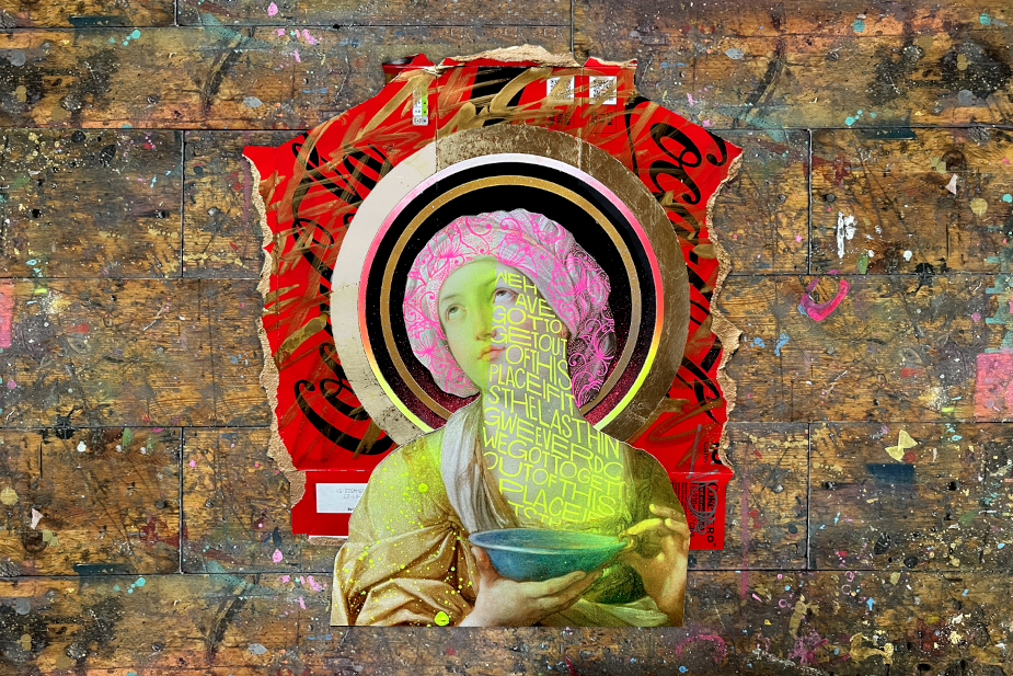
Rob> Initially it was contrast. This odd idea of finding something that shouldn’t or hasn’t been drawn on and then spending as long as I could drawing on it, often having to experiment and experiment until I could find the right tools for the job. After that I think it was probably a gold leaf. I realised that it created such a strong contrast with anything you applied it to and the more disposable, unusual or distinctive the material the greater the contrast.
LBB> From NFTs to the metaverse, there are more spaces for your work to show up - what are your thoughts on the impact, challenges and opportunities brought up by these new spaces? And do they influence how you think about your style (ie. is there pressure to adapt or change your style to fit these new digital frontiers - or is it kind of exciting?)
Rob> The acceleration of digital solutions for creativity has made me go the other way a little, more process, more experiments and with that maybe more imperfection. There is obviously digital work within mine and it is something I try to keep as up to date as possible with and however analogue I create something, obviously there has to be digital routes to its broadcast but I find my motivation, curiosity and creativity more natural through creating using more analogue processes.
LBB> Working in the commercial sphere, is it more important for an artist to have a distinct brand or style? What’s the balance having a distinctive voice and being able to accommodate the visual language of the brand/campaign?
Rob> I think that depends on where you see your career heading and it's a personal choice with no right or wrong approach. When I first started working for myself I was aiming to be a commercial lettering artist and not necessarily name checked in projects I worked on. Through a lack of commercial work, the more ‘personal’ self initiated works I did the more naturally a style seemed to form, it was those personal works that made clients notice me and in turn, when they commissioned projects they would tend to use those same personal works as a mood board for direction at the start of the brief.
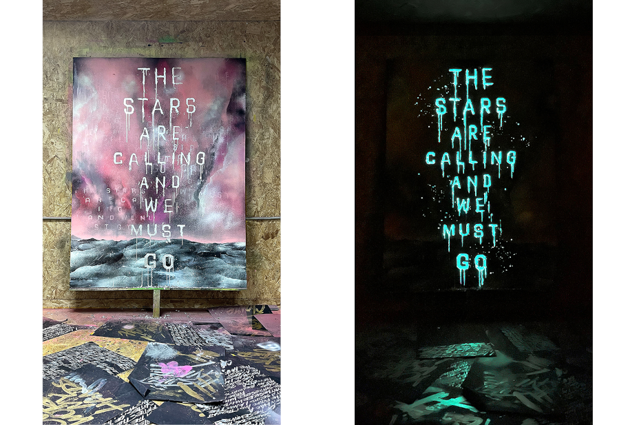
Artwork created for ‘The Stars are Calling’ campaign for a series of installations on site at NASA JPL in California.
LBB> Typically, on a commercial project, how do you like to tackle a brief?
Rob> It often depends on the client. There is a sliding scale in that some want to have full control and collaboration through the process to the other end where some are very much just ‘get on with it’ and there’s minimal input. I am happy to work on both and have got used to that over time.
That said, it's really useful whatever approach to get a mood board of directions at the start to give me some guidance. I then started quite rough and supplied the client with a selection of directions that I would present and talk through the concepts. Over time we then whittle down again and again, presenting each stage until we are all happy and at that point I would then create the final piece of work.
LBB> What projects have you worked on recently that you feel were a really satisfying marriage between a brand and your own style? What was it about these projects that made them really interesting to work on?
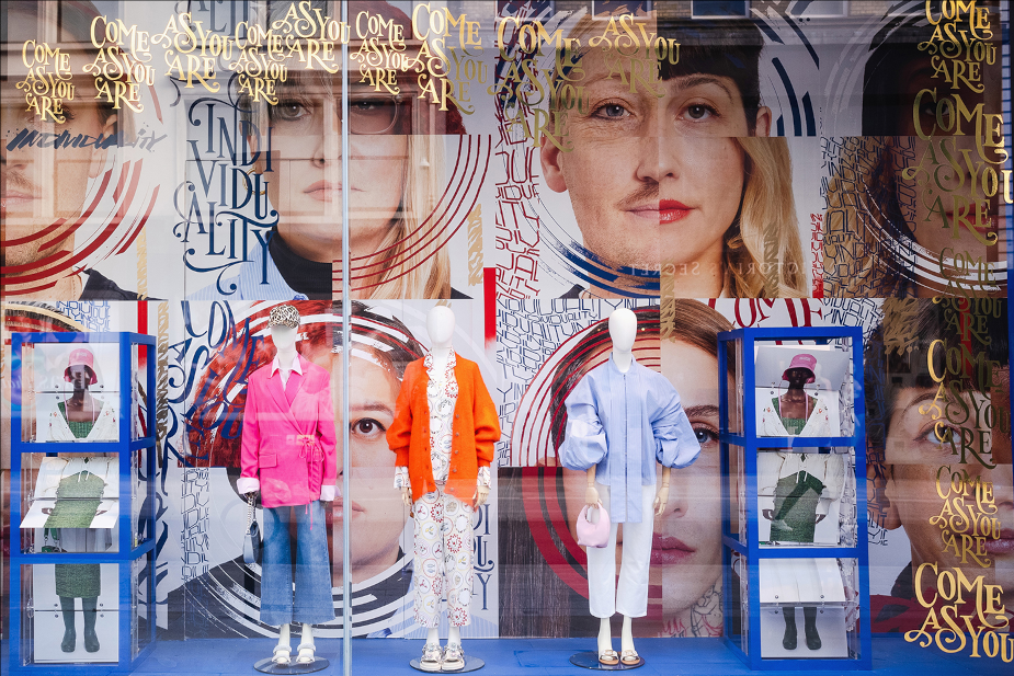
Rob> The current work just launched with Fenwick for their ‘Individuality’ campaign. My aim was to create a campaign that is distinctive, creative and interesting. It became important that the campaign had a definite ‘hands on’ feel, deliberately non digital in areas with all the charm and imperfection that analogue creating brings. The aim throughout was that all the techniques and treatments would support and do the subject matter and the project justice, true individuality.
You can see more of Rob’s work here.


