St. John Helps New Restaurant Take Flight and Deliver with 'Fast. Craft. Food.'

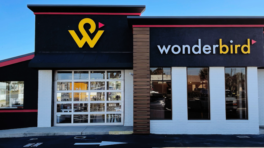
Jacksonville, Florida-based independent agency St. John has unveiled a new full brand identity for Wonderbird, a new fast food chicken concept aiming to close the gap between fast and quality food. The agency led the charge in conceptualising, designing and executing all aspects of the brand. The first restaurant opened In Jacksonville Beach, Fla., on 2nd February.
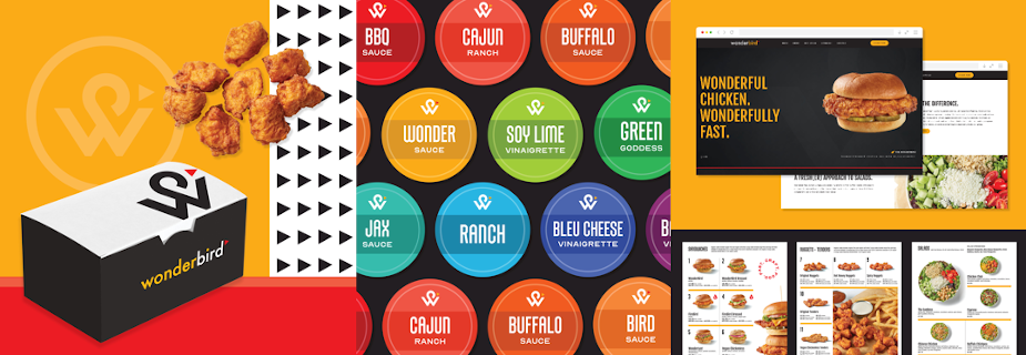
Wonderbird has a lot to offer, with an expansive menu featuring fresh, craveable chicken sandwiches, nuggets and tenders with 11 homemade savoury sauces, as well as flavourful salads, sides, desserts and vegan chickenless sandwich and tenders meal options. But in order to close the gap between fast and quality, St. John worked with Wonderbird to position the brand as a new 'fast crafted restaurant' and create a brand identity that is equally as unique as Wonderbird’s food.
“So many of the QSR brands we’re acquainted with today have roots dating back 40-50 years, and honestly some haven’t aged particularly well,” said Peter Herbst, St. John’s executive creative director. “This was a chance to start from scratch with a brand that wanted to do something different in the category. We knew Wonderbird’s branding should feel different - lighter, fresher, sharper with an air of whimsy and inclusiveness. From the name to the menu boards, it had to stand out in a way that would make folks smile.”
'Magnetic' served as the primary attribute St. John strived to convey in each design element, with the goal of attracting customers in a visceral, powerful way across the entire dining experience, from the food to the environment to the packaging and every communication in between.
As the name suggests, Wonderbird looks, acts and serves food that is a step above the rest in its category. To balance the need to communicate fast food but also high-quality food, St. John incorporated a more traditional red and yellow colour palette as commonly seen in the fast food world with heavy doses of matte black. The agency also selected streamlined typefaces, while opting for a clean and simple logo mark to avoid the flourished type and pattern often found in the craft food category to help Wonderbird stand out. The increased visibility of the Wonderbird logo across packaging was also kept modern and playful with the placement and scale of the mark.
St. John won the business in March of 2020 and began working on the project last May. The firm came up with 'Fast. Craft. Food.' as the brand’s descriptor to connote simplicity, freshness and quality ingredients without sacrificing the convenience of a drive-thru. The agency also pulled on secondary brand personality traits such as infectious, spirited, imaginative, approachable, sincere and soulful to bring a whimsical feel to the brand.
St. John developed everything from the brand’s name and logo, to the colour palette, typography, product packaging and branded materials, interior and exterior signage, menu boards, website design, food photography, and employee T-shirts and visors and manager polo shirts.