


Pentathlon GB Launches Multi-Sports Platform for Next Generation of Athletes and Sporting Fans


Pentathlon GB, the UK’s national governing body for Modern Pentathlon, has unveiled the identity for a new sub brand, Penta+, the new multi-sports platform for the next generation of athletes and sporting fans. The brand strategy, visual identity and logo were defined and developed by creative agency Household. The brand, distinct from the governing body, is a combination and culmination of the organisation’s mission to modernise itself as a multi-sport provider and better reflect the diversity of its audiences. Its primary goal is to drive recruitment and participation with members, athletes, and future fans of all ages and abilities, by fostering an active athlete community that empowers participation.
The launch follows the recent announcement by the International Olympic Committee that Modern Pentathlon will continue to be part of their programme for the Los Angeles 2028 Games.

Pentathlon GB is an organisation with its roots in the ancient Olympic Games, and now as it celebrates 100 years since its modern reincarnation, it has an ambitious strategy to extend its relevance and reach, engage with more diverse audiences, win more medals, and ensure its sustainability for the long term. This is achieved through a new brand expression, ‘Be Brave. Be More’, and a personality characterised by accessibility, dynamism, bravery and fun.
The name Penta+ reflects the multiple sports, such as Penta Run, Penta Swim, and Penta Ride that make up Pentathlon and represents the limitless potential of its new multi-sports platform. It can be used as a flexible brand hierarchy that signposts the individual sports and how they come together to create competitions, such as Modern Biathlon, Modern Triathlon, and Modern Pentathlon.
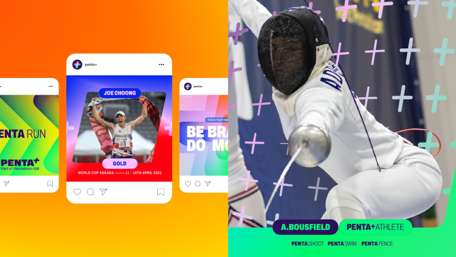
Across the brand’s visual identity, the theme of ‘doing and being more’ is brought to life through active and assertive photography capturing athletes of all levels realising their potential in sport and life. A bold new colour palette, inspired by Pentathlon GB colours as a foundation, has been designed to create a combination of gradients which signifies the diversity of sports on offer and its commitment to equal representation. The + symbol has been abstracted to create a flexible graphic system of static and movement-based patterns that can frame and lay across content to create a bold and ever-moving visual system that is uniquely Penta+.
With races, training events and brand experiences a significant channel through which Penta+ will engage and extend its audience, the brand identity has been designed not just as a two-dimensional expression, but as a holistic brand world that will include athlete kit, merchandise and event staging and communication. Penta+’s new typeface - a combination of Archivo and Inter, icon style, and layout principles will play a critical role in bringing to life Penta+’s strong personality and establishing its prominence in future partnerships and activations across media and channels, including online, print, OOH, desktop, and device.

Household was chosen earlier this year to deliver the new brand identity. They were chosen without a competitive pitch.
Trafford Wilson, CEO at Pentathlon GB said, “As we celebrate 100 years of Pentathlon in the UK, this rebrand of the sport signifies a pivotal moment in our journey and for Pentathlon. Working with Household has been a true delight, and we’re so thrilled to unveil the launch to the general public. For far too long misconceptions surrounding the organisation have prevented people from participating in the sport and we wanted to change that narrative. Pentathlon should be a sport for everyone, and it was incredibly important for us to create a brand that speaks to all groups, but most importantly supports all groups. For us, Penta+ is a true embodiment of our commitment to the evolution of the sport and our work with Household perfectly communicates that.”
Matt Michaluk, executive creative director at Household said, “As part of our ethos, Household is committed to supporting non-profit organisations through the power of creativity. It has been a privilege working with Pentathlon GB on their vision to create a vibrant and inclusive brand that fits the world of today - a diverse family of sports, created for every ability. Our shared vision focused not only on rebranding, but ensured that the refreshed assets reflected key messages around equality, positive change and a sense of community. We are excited to have helped modernise one of the oldest sports in the world, opening it up to new generations of fans and celebrating the uniqueness of this multisport. Here’s to the next 100 years!”


