Overwhelming Typographic Collages Represent the Onslaught of Emails We All Face

A new project from Minneapolis-based artist Doug Pedersen mashes together every subject line from every email received in a single day.
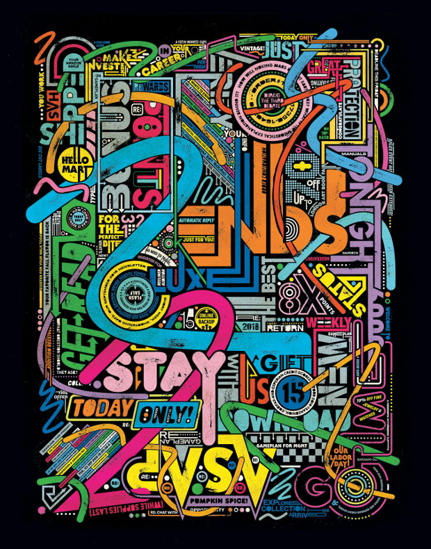
‘Inboxed’ combines the day’s headers into one big overwhelming, typographic collage in an effort to visually represent some of the vast amount of digital noise that comes at you in just one day. Over several months, three large-scale pieces were created - each piece featured email subject lines from one specific day.
“For the last few years I’ve been creating work that plays off the notion that there’s an overwhelming amount of stuff coming at people everyday,” says Doug. “Between the news, emails, social media and a world that’s increasingly moving faster and faster it can be overwhelming. This project (along with a couple others that I’ve completed recently or am still working on) is, I think, my way of trying to process all of that and turn it into something artful.
“Also, the fact that I’m one of those people who has something like 20,000+ undeleted messages sitting in their inbox. People always freak out when they find that out.”
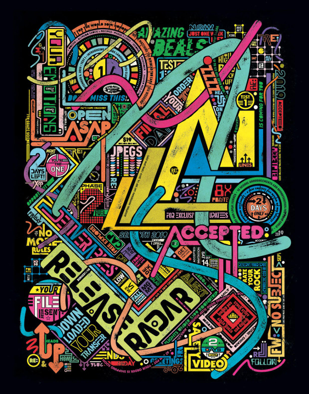
Doug’s been working on typographically-driven projects that intertwine words and letters for the past few years. “I really enjoy making these elaborate, intricate pieces and the idea for this project seemed to dovetail nicely with that look and feel,” he says.
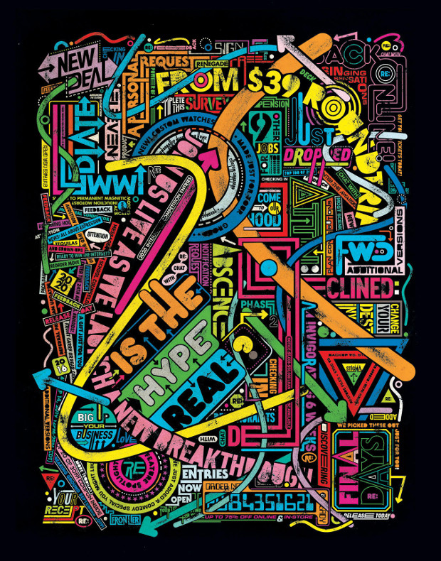
“I wanted the pieces to hit you and feel overwhelming when you initially look at them. But I also wanted them to feel fun - kind of like a circus. That’s what influenced the choice of type and colour. To me, it’s like every sign on the Vegas strip came at you all at one time.”