


Neale’s Sweet N’ Nice Ice Cream Channels its Caribbean Roots with New Brand and Packaging

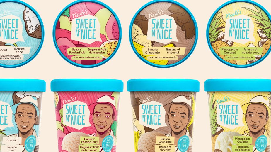
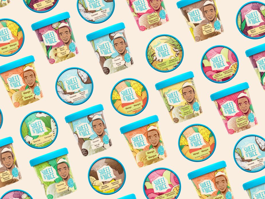
Following a steady year of growth and increased consumer demand across Canada, Neale’s Sweet N’ Nice Ice Cream has officially unveiled its new brand design and packaging while highlighting the company’s family legacy and original Trinidadian founder, Charles Alfred Neale at the forefront.
Neale’s Sweet N’ Nice is a family-owned business that launched in Canada in 2012, with its core products centred on ice cream recipes developed in the 1940s in Trinidad by the founders’ father and grandfather who would sell ice cream to help put his 12 kids through school. The new packaging uses beautiful illustrations and vibrant colours to help give the Caribbean-inspired product a fun, tropical identity in Canada.
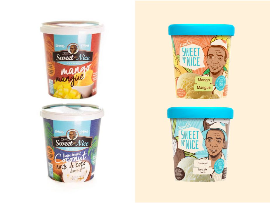
“Working with Le Parc Design, creative agency Juniper Park/TBWA’s design arm, we wanted our new identity to speak to the natural ingredients in our ice cream without overwhelming consumers with a busy package design,” said Andrew McBarnett, co-founder and CEO, Neale’s Sweet N’ Nice. “We also want to continue to celebrate our heritage and our origins are now more clearly defined by the illustrations of my grandfather, Charles Neale, who used to call out ‘Sweet N’ Nice…’ when he rode his bike around South Trinidad.”
Since their launch, Neale’s Sweet N’ Nice has grown its product offering from three to six flavours with one more on the way and has appealed to a loyal and passionate following of ice cream fans, including from the Caribbean expat community in Canada.
“With a history so rich, we felt it was vital not only to keep Charles’ portrait on the label, but to actually make him the front and center of the new branding,” says Nathalie Cusson, creative director of design, Le Parc. “We’ve also expanded the colour palette to be as varied as the flavours, with a constant turquoise woven throughout.”
Turquoise was selected as the principal hue for the brand, retaining some equity from the old packaging while also representing the colour of the Caribbean Sea. This unique colour is also highlighted on the lid of each ice cream tub, creating distinction from competitors in the ice cream aisle.
The new packaging bears shapes that are perfectly imperfect, to add an element of ‘home-made’ which mirrors how Charles Neale first created his ice cream. Included is a speech bubble with the phrase, ‘Sweet N’ Nice’ as per the company’s history.
Sweet N’ Nice ice cream can be found at major grocery stores across Ontario, British Columbia, Saskatchewan and Manitoba. This summer the ice cream company is planning to expand in Alberta, Quebec and the Maritimes.


