


My Most Immortal Ad: Wayne Deakin on Supreme
With just a few weeks to go until this year's Immortal Awards deadline, our jurors have been taking it in turns to select the ads and campaigns that are most immortal to them, revealing the reasons why they've stayed with them until this day.
Next up is Wayne Deakin, executive creative director at Huge London, who opts for a wearable ad (that isn't an ad) from cult skateboarding brand Supreme.
The deadline for this year's Immortal Awards is Friday 10th September. More information on how to enter can be found at the bottom of the article.
Supreme
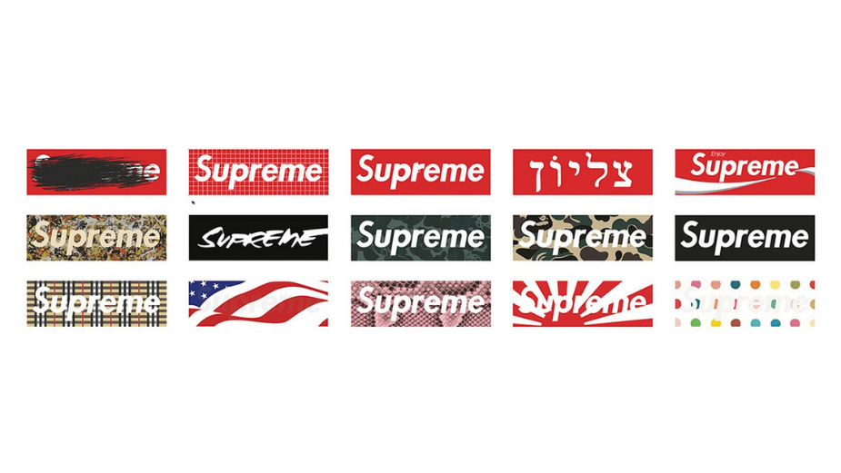
As a resident of adland’s fringes with sights set more clearly on less traditional creative solutions, my choice for Most Immortal Ad is, in fact, a non-ad: the stuff of legend that is Supreme’s non-advertising advertising.
The cult apparel brand founded by James Jebbia in 1994 hit the streets with a beautiful bold oblique Future-typed white Supreme in a red box. The Heavy Oblique, a sans serif italicized type created by Paul Renner in 1927 and the logo designed by one of Jebbia’s close friends, it was inspired by the anti-capitalist, anti-logo aesthetic of New York conceptual artist Barbara Kruger.
With its bold white letters surrounded by the red font, the logo mocked society. With its branding, positioning and hype engineering culture so well, it made Supreme an icon for generations to come.
Strong creative bravery made up for its next-to-nothing budgets and today, this upstart still out guns big names like Gucci, Fila, Adidas, Louis Vuitton and Nike.
Supreme’s logo is a great example of simple strong design. Yet the aggressive mix of the font and colour scheme is one that broadcasts a message of rebellion and anti-authority that resonated with the brand’s customers instantly.
And as one of the most recognisable marks in fashion, it still does three decades on.
This humble Redbox identity has now become a kind of living brand expression with new stories to be told as it surfaces with countless cool and authentic creative reinventions that are both local and global in its impact. A wearable ad that isn’t an ad. Because that’s modern creativity in my book and why design is a secret and immortalising weapon that we should embrace and love more.
Brand: Supreme
Non-ad: Logo
Typeface: Future Bold Italic
Established: 1927, by Paul Renner
Re-imagined: 1979, when the typeface over text block format was created by Barbara Kruger, inspired by the Russian school of suprematism 4
Re-purposed: 1994, by Supreme
Entries to The Immortal Awards are now open and Little Black Book members can make their submissions here today.
Entries into The Immortal Awards will be accepted until September 10th 2021. All entries must be made for a commissioning client, and must have first aired, broadcast, displayed, launched or published between 1st September 2020 and 31st August 2021.
Every member of LBB is entitled to up to five entries, depending on their membership tier. This year, Bronze members receive one entry, Silver members will receive two entries and Gold members will receive five entries. The full list of rules, including eligibility dates, can be found here.
Thanks to our wonderful Immortal Awards partners
Adobe | Framestore | MullenLowe Group | Tag | Whitehouse Post
23/32 Films | Absolute Post | Blind Pig | Chesterfield Group | Gramercy Park Studios | Okay Studio | Raygun
Cinelab London | Compass Rose | Oliver | UNiDAYS | Woodblock


