


Matt Branton on Colour Grading Animated Series Kizazi Moto


Having worked with Windmill Lane for over 16 years Matt Branton has an enviable portfolio of work across film, tv, commercials and animation. Recently Matt handled the colour grading on the Disney+ animated series Kizazi Moto.
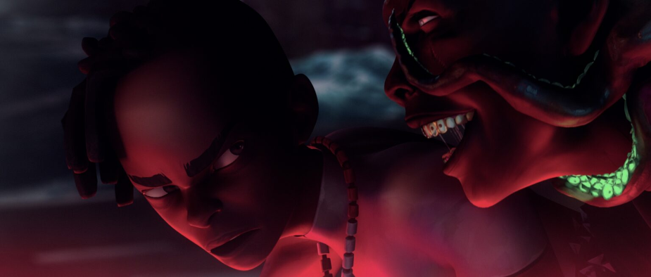
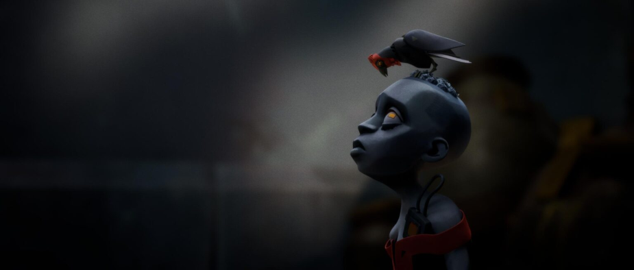
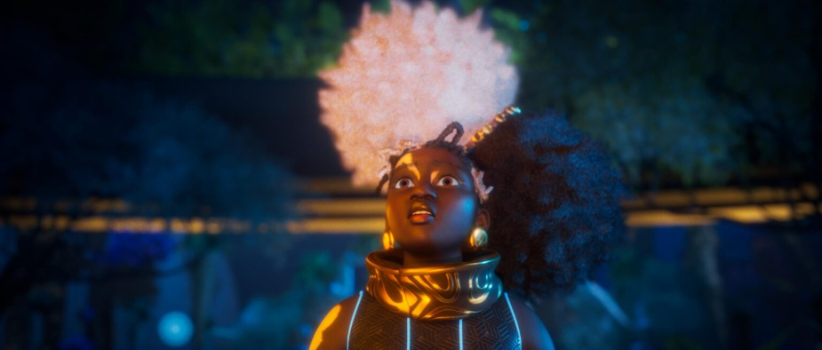
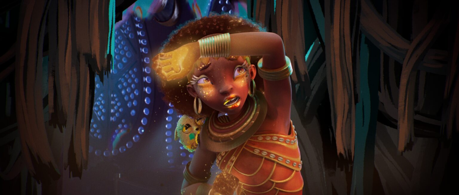
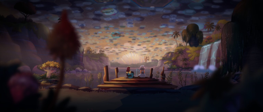
This animated anthology, by Irish based animation studio Triggerfish, brings together a new wave of animation stars to take you on a wildly entertaining ride into Africa’s future. Inspired by the continent’s diverse histories and cultures, these action-packed sci-fi and fantasy stories present bold visions of advanced technology, aliens, spirits and monsters imagined from uniquely African perspectives.
The Art of Animation
Having worked on a variety of both live-action and animated projects in his career, Matt is well aware of the different requirements and expectations when it comes to grading animation.
“Generally with animation, it would be quite rare to be involved in the creative side of things, we would usually be brought in at the end to tidy a few loose ends and provide a technical pass, basically the final polish in order to get the best out of the images. With live-action, there is much more emphasis on creating a look as well as dealing with real world variables… the kind of thing you don’t have to worry about with animation,” he comments.
In his experience there are aspects of animation that allow for more fidelity. “There’s also the option with animation to be a lot more precise with the grading. If required, we can access any element in the image and adjust it accordingly using matte channels, something you often don’t have the luxury of with live-action images.”
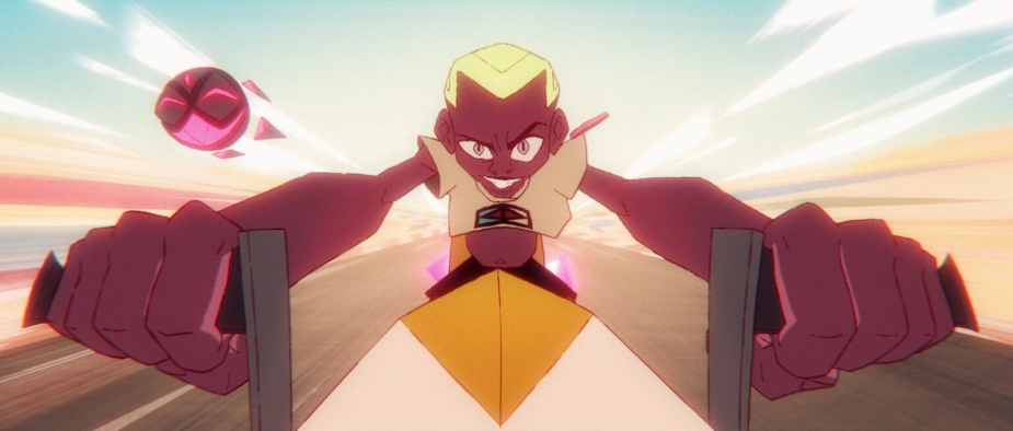
Kizazi Moto: Generation Fire
Following his work on My Little Pony: A New Generation & more recently El Deafo, Matt was excited to be approached by the Disney+ team to help with the grade. For this animation project, he was brought in early in the process and was willing to support the team with both creative and technical advice.
“I was brought in quite early in the project, before the animation got underway, I was introduced to the directors and had a chat about their vision for their episodes, as well as discussing what was achievable in the grade. A lot of them hadn’t really attended grade sessions before as their main experience was in animation. When I actually started work on the episodes it was close to the end of the project, as it is in pretty much all projects, so it was familiar in that regard.” says Matt.
Matt wanted to be granular with his ability to assist in final grade and together with the directors began adjusting the look and feel as, creatively, they all became more comfortable with the series, the characters and the narrative.
“Originally the main criteria for the grade was to provide a technical pass and deal with texture elements, such as film grain, diffusion etc. Pretty much across the board, the directors were keen to lose the crisp digital feel that animation can bring. We tried many ways to achieve this, using a mixture of grading techniques, film grain, diffusion and chromatic aberration in various combinations.” says Matt.
He elaborates “As the project went on and the creatives got more familiar with the grade sessions, we started to see what was possible with the look. I used a lot of secondary grades, character mattes and a bit of roto here and there in order to make sure the viewer’s attention is drawn to the most important action in each shot.”
Technical Challenges
Inspired by the continent’s diverse histories and cultures these stories present bold visions of a future Africa. The ambition and scale of the project had to be matched in the grade and this brought about some challenges that were wholly embraced by Matt.
“I think the main technical challenge was the fact that it was an anthology series, with different directors, animation houses, workflows, colour pipelines, naming conventions…pretty much each episode was completely unique. Some episodes were 2D animation, some were 3D, some hybrid, some were more technically robust than others….logistically it was a real challenge, as all the episodes were pretty much happening in close proximity to one another. There were lots of shots being sent for different episodes at the same time, so keeping on top of all the different versions was difficult.” says Matt.
He explains further “From a grading point of view, the main challenges were shot fixing. Some episodes were more time-sensitive than others, and often it wasn’t possible to go back to get some shots amended or fixed. There was quite a lot of compositing, blending and layering work done to help with this as much as I could, in addition to the colour grade work.”
Baselight
Windmill Lane recently upgraded their existing Baselight TWO systems and added FLUX Store which Matt is quick to point to the flexibility and ease that this brought about for him as an artist.
He says “With all the multiple workflows and colour pipelines in play, we were able to lean very heavily on the incredibly flexible colour management within Baselight. Regardless of the input, we were able to move everything into a unified ACES pipeline with ease, which not only helped with the grade process, but also helped massively with our deliverables at the end of the project.”
Grade & Sound
It’s always interesting to understand how artists work-through the process. Some like silence but some may require sound/music to concentrate on their craft. Matt prefers to immerse himself in the project and explains how; “My process generally would be to work only with the temp audio track for the sequence, rather than background music or even silence. I find I work best when I can immerse myself into the project. I’d then do a couple of reviews with the audio and also with silence. This project was different though as it was a live stream session, so I had a video call open the whole time.”
Texture & Aesthetic
A ringing endorsement of how Disney+ and their artists work was the surprising (according to Matt) level of his input that was welcomed throughout the creative process.
Matt explains “I was allowed a great deal of input into the project, much more than I was expecting actually! Very early on I made the decision to treat the project as I would a live-action project, especially as the overall aesthetic was to be as organic as possible. Wherever possible I would actively avoid using supplied alpha/matte channels, and try and problem solve as I would a live-action project. The intention being that things would be ever so slightly rough around the edges, and overall not so perfectly crisp. This worked really well underneath the texture we applied to the pictures.”
This openness and allowed freedom to express himself in the grade meant the 'challenges' were what Matt enjoyed the most. “The variety of styles, workflows and ideas was absolutely the biggest challenge, but this also ended up being the thing that I enjoyed the most. It meant there were no ‘one-size-fits-all’ solutions to any of it. If all the episodes were more uniform in their approach, it might have made my job much easier, but it wouldn’t be anywhere near as good.”


