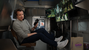
Making the Grade: Why Colouring Has Never Felt Like a Job with Taylor Black

Taylor Black has worked in post-production and colour correction since 2004, working with both long and short-form content, including narratives and commercials. While pursuing his education at Montana State University and the Los Angeles Film School, he gained experience as a newspaper photographer and went on to explore cinematography and collaborate with top cinematographers.
His professional journey has been enriched by training under the industry's leading colourists and contributing to renowned studios such as Company 3 and Local Hero Post before landing at Apache nine years ago. He has colour graded for an impressive array of brands, including Levi's, Google, Subway, Honda, Toyota, Samsung, Nissan, Infiniti, Activision, Air Jordan, Mazda, Bare Minerals, and Pac Sun. Additionally, he has lent his expertise to numerous music videos for artists like Billie Eilish, Gojira, J Balvin, Tierra Whack and Doja Cat and high-profile productions including Netflix's 'Chef's Table,' Hulu original 'McCartney 321,' and HBO's 'Shaq.'
Beyond his professional career, he's a classically trained violinist and a hockey player of over 25 years. With a well-rounded list of hobbies, his diverse interests include cooking, tattoos, black metal, photography, video games and classic rock music. He's an avid artist/illustrator who enjoys spending time with his wife and pet pig, Ramona.
LBB> What was your first experience with the world of colour grading – and when did you decide that being a colourist was a role that you wanted to pursue?
Taylor> I became a runner for a few editorial houses in Santa Monica after school ended and I was tired of the on-set grind. It didn't take long before I knew this was exactly what I wanted to do. Being able to have a hand in the final look of a piece had me hooked. I immediately approached several of the commercial dailies colourists who graciously allowed me to come in before my shift started to learn how to do dailies transfers. From there it was into DI scanning, then assisting for a handful of years under some truly amazing artists, to finally being in the chair. Colouring has never felt like a job. It’s just something I truly enjoy and am lucky enough to be paid for it.
LBB> What was the project that you felt really changed your career?
Taylor> I don't think there is single project that has changed my career drastically. It’s been more about the journey and the growth that expands my skillset for the next job. I go into every project, no matter the size, full throttle. If I had to pinpoint a few highlights, I'd say 'When the Party's Over' by Billie Eilish and McCartney 3, 2, 1. Most recently, Bono and the Edge and the Shaq docuseries, which both earned HPA nominations for Outstanding Documentary Colour Grading, which is a little surreal.
LBB> How/where did you hone your craft and did you have any particular mentors?
Taylor> I learned much as an assistant. It allowed me the time to dissect the grades during layoff. If I ever had any questions, there was always someone to explain things out. One allowed me to handle pickups on commercials and eventually finishing additional episodes of several long form projects. Doing side projects on the weekends or after hours always helped too.
LBB> Tell us more about your creative process
Taylor> Initially, I just like to sit back and absorb everything the client has to say about the job and footage. What they hope to achieve and any inspirations they might have. Then we'll discuss references, what drew them to the ones they picked and how we can best incorporate them into the project. When grading music is a must. Black Metal to Explosions in the Sky to Chuck Berry, Little Richard and James Brown. Always keep them guessing.
LBB> From experience, we’ve found that colourists often love art and photography - when you’re out of the studio, what inspires you?
Taylor> Much of my inspiration comes from cinema and music. I do enjoy photography. As a young skate rat, I loved Giovanni Reda's photos in all the skate magazines, so getting to do a documentary with him was a bit of a treat. James Nachtwey for his incredible war photography (I worked as a newspaper photographer in my hometown right out of high school and initially wanted to follow his path) and David LaChapelle for his iconic imagery. The work of my favourite cinematographers is what truly inspires me, however. There are really too many to name, but everything Jeff Cronenweth does is gold to me. I really am enjoying the amazing work that Hoyte van Hoytema and Greig Fraser have been putting out. Truly inspiring work.
LBB> Colour grading is largely a digital affair, but there’s also been a resurgence of film over the past few years in commercials and music videos. What are your thoughts about working on film versus digital formats like 4K? And what are your favourite techniques for capturing a vintage or tactile feel?
Taylor> They're both great formats, it’s just which one is right for the project at hand. I love getting work that was shot on film and glad it’s having a bit of a resurgence. Quite often I'm asked to do some sort of film emulation which I love to do. Film is such a moving target as far as quantifying any specific look. Generally, I will add layers of grain and halation through several methods. Trying to recreate the shoulder and toe roll off that the references may have and add in any subtleties like gate weave, chromatic aberration and any other minor analogue imperfections go a long way.
I finished a short that was shot on RED Komodo that premiered at the Clermont Film Festival in France. The director called me to let me know several directors and cinematographers had approached him to ask what stock they shot on and were blown away when he told them it was digital. That put a smile on my face.
LBB> When working in commercials, what role can colour and a grade play in enhancing a brand’s assets and what sort of conversations do you have with creatives and clients about that (e.g. is there often a strategic/consistent ‘look’ for a brand? Can these be too heavy handed?)
Taylor> Colour is extremely valuable in commercials. The end goal is always to make the product and brand as appealing as possible. Communication in commercial is an absolute since its going through an agency with their own intentions and back to a client who has the final say so. Everyone needs to be on the same page. Being given boards, past campaign references and any hex codes/swatches/physical items that may be applicable to the spot always help. Their looks can be heavy handed sometimes so it’s up to us as artists to show them what does and doesn't work and how to apply their ideas in a more palatable way that makes everyone involved happy.
LBB> How do you ensure that each colourist-director partnership is a success?
Taylor> Listening and communication. Making them feel like they are heard and are in the most capable hands. I like to joke that colour sessions sometimes border on therapy. I consider it a success if they are leaving happy and enjoyed their hours on a couch in a dark room with me enough to come back and do it again.
LBB> What advice would you give to budding colourist?
Taylor> Work hard and colour anything and everything you can get your hand on, no matter the size. Watch as many things as you can and absorb it all. Don't get discouraged, you only get better with experience. It's the really difficult jobs that teach you the most. Finally, don't take yourself too seriously, have some fun with it.
LBB> In your opinion, what's the difference between a good grade and a great grade?
Taylor> What's good vs great is all a matter of taste in my opinion. A good grade is passable, you might notice things here and there, but it generally does its job. A great grade will shape a scene or project in such a way you don't notice it, yet something sticks in the back of your mind saying 'wow.' They're memorable even if you can't initially put a finger on it.
LBB> How is the craft and trade of colour grading changing?
Taylor> I think it has become immensely approachable to what it used to be when I started. Back in the day you needed a million-dollar telecine suite with a wall of tape decks. Now, with Resolve being as cheap as it is and information at our fingertips anyone can start grading. There is no longer a sole reliance on the big box facilities. Now you have all kinds of small boutique colour houses that can compete with and exceed what the larger facilities do.


