LRXD Adds Flavour to Honey Smoked Fish Co. Packaging

Health and happiness advertising agency LRXD has created new packaging for Honey Smoked Fish Co. after extensive research with current and prospective customers. The brand’s POV? 'Life at full flavor'.
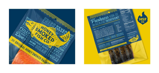
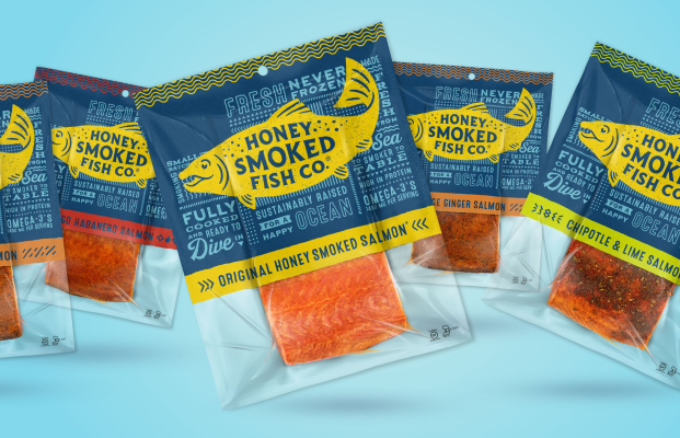
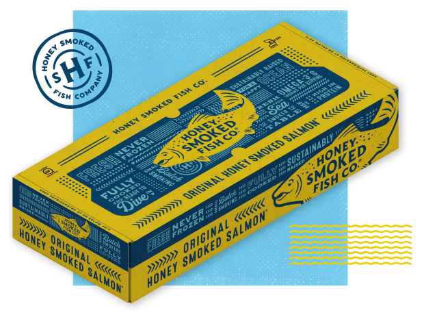
LRXD designed packaging for Original Honey Smoked Fish and five other flavours in the product line: Garlic & Herb Salmon, Mango Habanero Salmon, Orange Ginger Salmon, Cracked Pepper Salmon and Chipotle & Lime Salmon. The new design delivers more product information to shoppers in a look that better captures attention and represents the brand’s personality - which is bold, modern, health-conscious, convenient, caring, authentic and a little bit weird. It will begin hitting store shelves in September.

“Honey Smoked Fish Co. comes with a rich history, stemming from the founder who had a big personality that was ingrained into the quirky packaging and marketing,” said creative director Andy Dutlinger. “The new owners wanted an update to the brand that kept some of that personality alive, while modernising it. The new packaging is highly inspired by the original, with a design that takes its cues from old fish market signage.”
Research found that consumers valued Honey Smoked Fish for its quality, healthy, taste and company values. Full flavour was a strong brand driver and differentiator, and people also cited factors such as fresh from the ocean, never frozen, boneless, full of omega 3s and committed to ethical/best practices as reasons they bought it.
After testing four very discrete design treatments, LRXD created a final design that considered the consumer feedback. The new packages are two tone - sea blue and a contrasting colour - with a different hue corresponding to each SKU. Since research showed relaying information was essential, it was treated as key art, with bold pronouncements about flavor, freshness, convenience, health benefits and sustainable practices gracing both sides of the packages in sharply written, decorative-type treatments reminiscent of vintage painted signs.