


Life Unbalanced

Before the pandemic started on this side of the globe, I found myself in a complicated situation. Many aspects of my life seemed out of whack. My mom was not well and I lived far away from her, my husband and son lived in a different city, and I often travelled on weekends to see them. The more I tried to keep a balance in my life, the more I grew tired. I finally came to the conclusion that seeking balance is futile. A utopian concept.
Society expects us to lead a balanced life - between our profession and family, physical and mental fitness - and if you abide by this belief, it can become a tyranny.
In the midst of the current crisis, balance has taken a massive hit. Many of us are juggling a variety of responsibilities and are being forced to change our ways. While it pressed us to move forward differently, this change has also forced us to stop and take stock. It allowed us to contemplate the ugly, the scary, but also the beauty all around us in the smallest, most mundane details: sun rays hitting a glass door knob, creating hundreds of tiny rainbows; the way the afternoon light changes the colour of a wallpaper. Things we did not notice before.
Throughout the years, observation has led me to identify a constant factor in images, objects, places, and structures that have a magnetic visual quality: imbalance, imperfection.
Take vintage 1930’s advertisement posters by Cassandre, for example. What makes them special and visually appealing? The colours slightly out of register, the dots of the screen print, and the visible, palpable layers of ink on the paper. Or take things in nature that are seemingly perfect but, with a second look, prove not to be. The barely perceptible asymmetric shape of an egg, or a face, for example.
Imperfection creates a tension that stands out and commands attention. It can be a powerful tool in visual communication. It makes one stop and look.
As a teenager, I would walk by a jewellery store almost everyday. The owner would change his window regularly and I started to look forward to seeing what he would do next. One time, he had carefully hung a painting upside down over the artfully arranged necklaces and rings. Hanging from thin fishing wires, there was the portrait of a character, with his head towards the floor, his eyes at merchandise level. Incongruous, and oddly harmonious. It made me stop and wonder. No other shopkeeper would ever do something like this. What he did was disruptive.
As creatives, we are rarely asked to let go. In fact, we are trained to leave nothing to chance, to control our environment, with the goal of mastering our craft. In our quest for perfection, we tend to forget that during the creative process letting go of that control is necessary to allow “happy accidents” to happen.
So, how does one foster imperfect design thinking? There are as many answers as there are people, but here are some of the questions I ask myself when feeling stuck:
Is it too comfortable?
As a friend of mine once described it, Maurizio Cattelan and photographer Pierpaolo Ferrari’s Toilet Paper magazine “hurts to look at, but is irresistible to look at.”
While not visually alike but similar in its subversive approach, our edition of Wayward Arts magazine, pokes fun at the power of influencers.
Is there any contrast or tension?
Counterintuitively, the contrast in shapes and sizes in a composition will make it stronger. Go ahead, disturb that perfect symmetry.
Spanish footwear company Camper epitomizes this effect perfectly with its Twins edition: a mismatched shoe design that is self-described as “opposite yet complimentary.”
Does it contain, have, or convey movement?
Movement is closely linked to imbalance. Take walking, for example: to move forward, you need to shift your weight and create an asymmetry in your stance. When something moves, our brain is hardwired to notice it, so we pay close attention to it. In a static image or structure, the idea of motion is still possible. The work of Canadian architect Frank Gehry demonstrates this clearly: The Lou Ruvo Center for Brain Health in Nevada evokes pieces of fabric floating in the wind.
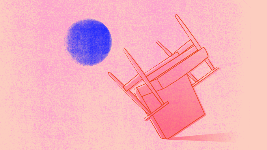
Have all angles been explored?
A former boss of mine was famous for solving creative challenges when everyone was stumped. She had this way of taking the problem and turning it on its head. Literally.
A successful example of this kind of solve is the 'Shake' poster for Heinz, that could be seen around Toronto a little while ago. Another instance of playing with angles from a few years ago: McDonald’s flipping its iconic arches upside down, turning into a W for International Women’s Day.
Does it fit within the category conventions or does it go against the grain?
When mandated to come up with something that would refresh the perception of the Toronto Symphony Orchestra, we took an orderly music symbol - the lines of the musical staff - and broke it apart, as if cut up with scissors. We added a touch of electric blue, breaking away from the formal black and white combo usually found in the category.
The fact is, human beings love to solve a riddle. Messages that incite us to “play”, make a deeper impression on us. Things that are a bit “off” are more likely to be visible by the way they stand out.
Embracing chaos and imbalance does not only alleviate a disabling pressure, but it can also take us on an unprescribed path leading to unexpected and delightful ideas.
Nathalie Cusson is creative director of design at Le Parc and Juniper Park\TBWA


