Jonathan Santana and Xander Smith of Saatchi & Saatchi
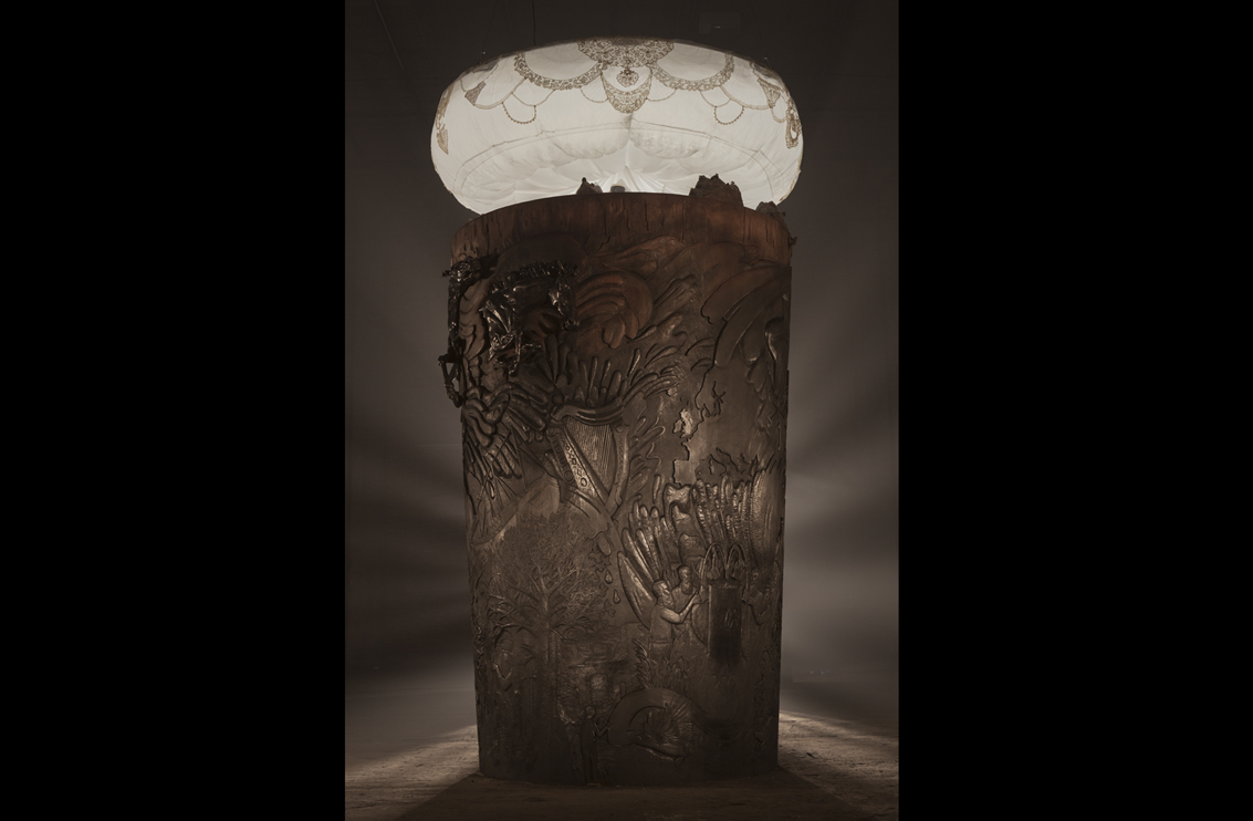
Your Shot… Jonathan Santana and Xander Smith of Saatchi & Saatchi talk to Gabby about their amazing creation and re-branding project for Guinness.
Guinness asked Saatchi & Saatchi, their global advertising agency, to bring the concept to life and demonstrate how and why Guinness exemplifies the idea of MADE OF MORE.
The brand and the agency have chosen to tell this story in a way that exemplifies the idea of MADE OF MORE - through an art installation and film depicting key moments in the story of Guinness, starting with Arthur Guinness signing a 9000 year lease on the brewery in 1759.
Read the full story about this project here:
LBB visited the sculpture when it was in progress and then had a chance to talk to the creative team of Jonathan Santana and Xander Smith about the project.
LBB > Talk to us about the new Guinness work. You’ve made a sculpture! How did this all come about. What is it in aid of?
Jonathan > It’s the culmination of a year or a year and a half’s work on a new strategy and a global launch for Guinness. That’s essentially where it derived from. And then we needed a tool…a vehicle…to sell to all the markets – the new line, the new positioning.
Xander > We can say that it is based on ‘MADE OF MORE More’
LBB > So it’s been a year and a half of work because Guinness is re-positioning itself as a brand?
Both >Yes.
LBB > What was the challenge that was set for you guys? What were they asking of you?
Xander > For us, personally, as a team, the biggest challenge was to do justice to that new positioning, which is ‘MADE OF MORE’. So we wanted to do a project that echoed that thinking, and that thought, on all levels. So it made sense, a) to do something that was beyond the norm, more than just a TV spot and, b) to do something that would visually bring that thought to life as well.
LBB > Can you go back to ‘MADE OF MORE’ and give us a short synopsis of what that really means?
Xander > It means two things…
Jonathan > (Laughter) Do you want to do it?
Xander > Firstly, it is about the drinker being ‘MADE OF MORE’, stepping up to challenges and living life boldly. Secondly, it talks about Guinness as a drink, being ‘MADE OF MORE’ because there’s a lot more craft and science and soul that goes in to making Guinness compared to just ordinary lagers. So, on that level, it justified all the stuff that we were doing.
Jonathan > It’s a very distinctive beer, compared to any lager out there, essentially because of its colour, because of how long it takes to pour, the head of it. All of those attributes are assimilated within the pint standing right in front of you. So that makes, like Xander says, a lot of sense to the pint itself. And then, when you start to take that into the drinkers and the man who made the beer…it’s easy to pull all those attributes across to a more personal state of things.
Xander > If you look at a second pint of Guinness on a bar table, it immediately stands out, I mean it’s full of life, it’s full of a magical unspoken something, isn’t it? It’s just completely different to normal lagers. So we wanted our sculpture to echo that as well. If you look at it closely, you can see that it does look like a second pint of Guinness. It’s black at the bottom and then kind of goes up to the earthy brown tones and then the white head of the pint at the top.

LBB > How and why did you come up with the idea of the sculpture?
Xander > We wanted to create something physical, something with gravitas, something with presence, something that is tangible. Something that would mimic a second pint of Guinness on the bar table.
Jonathan > And the fact that it’s over 250 years of heritage, all put in to one. ‘250’ was celebrated two years ago. This is the 253rd year of Guinness. They celebrated ‘Arthur’s Day’ (a series of musical events to mark the anniversary). This has nothing to do with that, in a sense. What’s important is that the story that circumnavigates the pint is the story of Guinness, from Arthur (Arthur Guinness, founder) himself, to its advertising heritage, to what’s arriving in the future.
Xander > The structure is built in such a way that it starts off with the story of Arthur, then it goes on to how his endeavouring led to this global phenomenon called Guinness. And how that took over the world and how that spirit still lives on in every single person that drinks the drink, who makes the drink, who partakes in this whole ritual, etc. So the whole narrative does make sense in that it starts with Arthur and ends with the drinker at the top.
LBB > So it’s about the gravitas and the physicality of the pint itself, and obviously the history is involved in this. Has that been inspiring to you both?
Jonathan > Yeah, absolutely.
Xander > Absolutely. And lots of the artists also found inspiration in the past as well. Ben Hughes, who created the horse sculptures for us did a lot of research about Irish racehorses and there was one horse that was apparently besotted with Guinness and he was known to drink Guinness - little touches like that inspired the artists to name each horse after a famous Irish race horse. So, I think everyone involved found inspiration in the past of Guinness, without it being too naff! It’s almost like we wanted to take things that were good from the past and combine it with something that is contemporary. From today, if you know what I mean.

LBB > I suppose the sculpture will live on. So it is the future.
Xander > Yes, absolutely.
Jonathan > Also, Guinness advertising, historically has been really big, hasn’t it? These big seminal moments, from the Toucan and those old school drawings, to ‘Surfer’ to ‘Swim Black’, and all of those things…there’s a huge heritage to follow on. So when you’re doing a new global positioning, you want to be able to put something that can stand next to all of that.
LBB > How did you choose the artists that were involved in the project?
Xander > It was initially curated by the visual arts editor of Dazed and Confused, who presented a long list of 30 or 40 artists though BlinkArt, and once David Wilson came on board we all collectively decided on the artists that…
Jonathan > …would work well together. We wanted to create enough of a range of illustration and disciplines in art to create something that, as an entire piece, worked together but showcasing slightly different kinds of skills and ways of doing things without them being completely different. So you had to feel it was one piece and not just sporadic artists who were just throwing things out there.
LBB > It’s quite harmonised.
Xander > Definitely, and that was David Wilson’s main job. He wasn’t directing, per se. His main job was to curate the whole thing, making sure that it’s homogenised and that it doesn’t feel like a fruit salad. That it actually works. So he was very key in terms of planning ahead making sure that each piece fit in to the main structure in the exact way so that everything would tie in together.

LBB > The sculpture is now over in Dublin, at the factory.
Xander > Well, at the storehouse, with the museum.
LBB > And to accompany the sculpture, there is a film that has been made?
Jonathan > That’s right.
Xander > Which we are in the process of finalising. It’s not 100% finished yet.
LBB > Where will that be showcased?
Xander > We’re going to launch online but there will also be content on the ground, in the storehouse which will tell the story to viewers and then there is going to be a digital strategy as well,
apart from just the film online.
LBB > And within the digital?
Jonathan > We’ll be showcasing that story we spoke about, the story of the history of Guinness and Arthur, and it will also be showcasing the artists who worked on the sections and the story behind what they did to bring that part of the story to life.
LBB > And is there any print to accompany this?
Xander > Not at this point, no. but there could easily be
LBB> Yeah, it would be beautiful.
Xander > Yeah, absolutely.
LBB > Give everyone a mini replica
(General laughter)
Jonathan > I think the potential is there for all of that to unravel but that’s not entirely in our hands, is it?
LBB > But it does accompany the idea of the re-positioning.
Jonathan > We’d love to. I think that’s probably a few months down the line.
LBB > You have so many different aspects within that actual sculpture that can be drawn in to…
Xander > That is the thing, to create an object that will live, stand for a very long time, and then you can just draw different content from that. And that always sits in the middle, the centrepiece of the campaign. And to add to that point, for us it was so refreshing to do a launch campaign by creating something with our hands and almost using old world techniques to bring something very contemporary to life and we love that balance between the old and the new, and that came together. And it feels right in terms of Guinness as a brand because of the art and craft and science that goes in to a pint of Guinness gave us the ingredients for our sculpture as well.
LBB > Are you both happy with the work that’s been done?
Xander > Very excited.
Jonathan > I think, well, you were there, watching, and just walking in that first day and seeing the huge ash, American ash, just stood up and there was nothing printed on it, nothing carved out yet.
LBB > Was it the shape of a pint at that time?
Jonathan > It was basically that shape, that wooden shape, and we thought, okay, we’ve actually made this thing, now let’s see what’s going to happen. A couple of days later we went down and we saw the first bits of carving that were being done and myself and Xander said ‘we’re actually making this thing?’ Actually watching people chip away at it was hugely gratifying. You just don’t do that anymore because people do stuff in CGI. Doing something on that scale and having 10 carvers around it all day long and the amount of artists that were involved. When you stood in front of it, you realised what we were doing.
LBB > When I went in, the lights were on it and everyone was standing around it. Silently.
Xander > Yeah, it was like a sacred totem pole. It was a bit nerve wracking because we really didn’t know if this was going to work. I mean, you always have faith that something’s going to work but there is always a part of you that thinks ‘shit, is this going to look okay?’ and when it all came together that day, we were quite relieved and excited.
Jonathan > I think what illustrates how, I think, we both feel really excited about it is the amount of detail and craft that has gone in to producing it and that you can spend a lot of time in front of it, not being bored. Looking at every part of that story around the pint is amazing. Looking at the details of how things are carved out and then the light structure at the top and the little figures. There are just so many points that your eye fixates on and, of course, the horses.
Xander > Also, the fact that nothing was gratuitous. Every single detail on that pint is part of the story, as it will be unveiled. Nothing is gratuitous, everything has its purpose. And to add to that point, once you start digging deeper in to the creation process as well, you’ll find out little details, like, for instance the lace that was used to decorate the head of the pint was dipped in to Guinness to give it a brown hue…
Jonathan > …where you’d normally use tea.
Xander > So many little details like that make this thing so interesting.
LBB > It must be pretty rewarding when a client as big as Guinness is brave enough to actually give you the opportunity to do something like this.
Jonathan > I think that was the catalyst. On the client side, the woman at Guinness who started the process wasn’t able to finish but her faith in it made it really exciting for us to endeavour to push forward to give her something, and eventually give them something, that we would all be really excited about. It was essential that there was buy-in, particularly in the early stages when it’s very hard to imagine. And having faith in the kind of artists that we’d chosen and all of those little parts where that part of the production process can be horribly slowed down and red-taped and not get moving forward enough. That initial process was quite seamless and great, actually. It made it work.
Xander > For a few weeks, no one really knew what this thing was going to look like. We were having meetings about this intangible object and systematically it came to life. Once we started seeing technical drawings and layout of exactly how all the seams would link up, everyone starting seeing what it was going to look like. I think the moment that everything came together was when it was decided we should carve it out of wood. Because before that there was talk of doing a mixed media piece, so illustrations combined with sculpture combined with live images on screens. And that sounded okay on paper but then when we started doing it, we realised that it was going to look horrible.
LBB > It’s almost the return back to craft, and Guinness has a history with craft, so it makes sense.
Xander > Definitely. We’d love to show you content but we can’t yet.
Jonathan > The film will be coming out third quarter, later in the year. But the monument itself is now live in the brewery.
Xander > We are in the process of putting the content for the film together. It’s a tough one because we’ve got a lot of markets involved, from Asia to Western Europe to America, so…
…Stay tuned!
Credits
Agency: Saatchi & Saatchi
Agency Team: Creative Team – Jonathan Santana and Xander Smith. Executive Creative Director – John Pallant. Account Team – Andrew Bell and Miles Burton. Producer – Marie Hughes.
Featuring: Village Green, Jethro Haynes, Benedict Hughes, Robert Hunter, Bradley Jay, Corin Johnson, Mark Judges, Micah Lidberg, Alex Simpson, Jason Bruges Studio.
Carvers: Tom Ball, Chris Burbidge, Orlando Campbell, Saena Koo, Julius Lightfood, Artsem Malakhouski, Clementine Nuttall, Maureen Otwell, Joseph Stokes.
Director/Curator: David Wilson
Produced by James Stevenson Bretton and Jennifer Byrne at blinkart
CREATIVE/ARTIST INFORMATION FOR THE OTHER PEOPLE MENTIONED ABOVE AND INVOLVED IN THIS PROJECT:
JONATHAN AND XANDER – CREATIVE TEAM:
Jonathan Santana and Xander Smith met years ago in Johannesburg where they worked for rival agencies, Network BBDO and TBWA/Hunt/Lascaris, respectively.
In 2005 Erik Vervroegen hired Xander at TBWA/Paris where some of his campaigns helped the agency win the Agency of the Year award at the Cannes Festival for 4 consecutive years. In 2007, Jonathan won the outdoor grand prix at Cannes and a D&AD yellow pencil for his work for Nedbank, which saw the agency create the world's first solar powered billboard to generate electricity to power a local school. They teamed up in that same year in Paris, but decided in 2008 that the pull of Kate Stanners and Paul Silburn at Saatchi & Saatchi London was much stronger than Gauloise and poodles. They are still at the London office today, with the Visa “Football Evolution” World Cup Football spot and the Saatchi & Saatchi New Directors’ Showcase 2011 event being the two most recent projects they’ve done.
Collectively, they have 46 international awards between them.
_ _ _ _ _ _ _ _ _
DAVID WILSON – DIRECTOR/CURATOR
David Wilson is a director who has created a very unique visual style.
Among his highly successful music video work, David has created acclaimed videos for artists such as We Have Band, The Maccabees, Keaton Henson, and David Guetta. In 2009 he picked up both “Best New Director” and “Best Budget Video” at the UK Music Video Awards, and this year, was nominated in the “Best Director” category. His films for Moray McLaren, Japanese Popstars, and Metronomy have also landed him In Book inclusion at the D&AD awards for 3 years in a row.
He regularly VJs with his home-made visuals at clubs, performing shows with artists such as 2ManyDjs and at festivals including Glastonbury and Latitude, as well as an exhibition at ATP’s London festival “I’ll Be Your Mirror”. His recent Advent Calendar project saw collaborations with bands including Spiritualized, Woodkid, Caribou, Van She, Battles, and Jon Hopkins, and was widely celebrated in the arts and music press.
_ _ _ _ _ _ _ _
VILLAGE GREEN
Village Green is a creative studio and workshop. A group of designers whose disciplines include graphic art, image making, art direction and moving image. They are responsible for designing art work for many seminal bands and record labels, as well as a range of editorial illustration and design commissions for brands including Nike and MTV.
JETHRO HAYNES
Jethro is a very unique illustrator, sculptor and designer from the North of England. With a background in skateboarding art, his career has seen him work with brands including Carhaart, Dazed and Confused, Frieze, Orange, Red Bull, Pointer, Vans and The Guardian.
BENEDICT HUGHES
Benedict Hughes is a very promising young sculptor, who was shortlisted for the Creative 30 competition, organized by the Independent and Vice Magazine. Born to Irish parents, Ben learnt his craft working in various foundries. He was recently commissioned by Weiden and Kennedy to design an impressive sculpture of all their British Arrow advertising awards, which in on display in their London office.
ROB HUNTER
Rob graduated from Bristol in 2007 and has been working as a freelance illustrator since. He currently works in a studio with a group of friends creating books, films and animations. He is part of the Nobrow collective and has just collaborated with Orlando Weeks, the lead singer of the Maccabees, on a stunning new book called ‘The New Ghost’.
BRADLEY JAY
Bradley Jay is a 22 year old freelance illustrator based in the UK predominantly working in detailed ink drawing, collage and photography.
Bradley was born on October 3rd 1988 in Bristol, England and moved to Brighton in 2008, after completing his Art Foundation course, to attend the University of Brighton where he graduated in 2011 with a BA(Hons) in Illustration.
Bradley’s work includes themes from religion, alchemy, astrology, botany and folklore and is reminiscent of macabre art and medical illustration. His illustrative style takes influence from such artists as Gustave Dore, Harry Clarke, William Morris and Albrecht Durer with the outcome being a style which is uniquely his own. He is a hotly tipped illustrator who has recent designed a line for menswear for Topshop.
MARK JUDGES
Mark is a very exciting young artist who is making waves in the contemporary art scene, for his edgy, satirical type based work. He currently works as part of the Illustrators Elbow collective. Mark is bringing a sense of magic to this Guinness project.
MICAH LIDBERG
Micah is an American illustrator based in Kansas, He works with a variety of media often combining digital aspects to several types of illustration and painting. Micah adores pattern, colour, and the notion that image making is one of the many straight forward and native modes of communication. Micah’s work has been exhibited at ‘Illustrative 08 in Zurich, Communication in California, Open Space Gallery, NYC and “It’s Nice That” London. He recently did a stunning commission for high end online arts platform NOWNESS.
ALEX SIMPSON
Alex Simpson is a multi disciplinary artist based in London who works intuitively across painting, sculpture, printmaking and animation. Her work centres around personal narratives that are played out in worlds of melancholic children and strange creatures exploring their relationships with loss, fear and the unknown.
At the core of Simpson’s practice is painting – a dialogue between artist and medium – in which she invites spontaneity to bleed out her delicate figures into washes of ink. More recently Simpson has begun to work with ceramics – sculpting three dimensional counterparts to her gouache apparitions – rigorous experiments with glazes has helped her retain the textural flow of painting in this new medium.
JASON BRUGES STUDIO
Jason Bruges Studio in all its current work produces innovative installations, interventions and ground breaking works creating interactive spaces and surfaces that sit between the world of architecture, site specific installation art and interaction design. They have created work for the likes of the Victoria and Albert Museum, Amnesty International, The BBC, Becks, Aston Martin, Kinetica Art Fair, W hotel, The Hospital Club, Southbank Centre and many more. We are absolutely thrilled to have them on board.
BLINKART
blinkart was founded in 2009 as the non-traditional division of Blink Productions, in response to the increasing desire of brands to interact with consumers through innovative methods. blinkart represents twelve artists creating work across several disciplines including print, installations and exhibitions. Some of blinkart’s clients include Wallpaper Magazine, Wired Magazine, Dazed and Confused, Victoria and Albert Museum, Nike, NOWNESS and Louis Vuitton.


