INPHANTRY Solves Your Fear of Going Out with New Brand Identity for Tapster
Digital experience agency INPHANTRY recently created the new brand identity and launch campaign for alcohol delivery service Tapster. In addition, INPHANTRY designed and developed a new mobile app for the Boston-based startup, which aspires to be your friend when the occasion calls for alcohol. The launch campaign is rolling out in two phases, with print, digital, and OOH advertising targeted in the Boston area.
INPHANTRY was first brought on board to spearhead the rebrand of Tapster (formerly known as Frat Tap). The agency coined the new company name to reflect its pivot in the marketplace from a keg delivery service to a more mature demographic of social drinkers.
With only a handful of companies holding a significant share in the fledgling alcohol delivery market, brand loyalty is still up for grabs. INPHANTRY developed the rebrand and campaign strategy with this in mind. A key differentiator from Tapster’s competitors was its concierge level of service and high standards for hiring and training drivers. Their findings ultimately led to positioning Tapster as the premium brand in the marketplace.
"While competing alcohol delivery services tout speed and convenience as their biggest selling points, we saw an opportunity to position Tapster not only as a best-in-class product, but a lifestyle brand," says INPHANTRY Creative Director Regi Jacob.
The team developed brand guidelines to help Tapster stake its claim on premium, focusing on quality of service, having fun, drinking responsibility, and exploring the untapped world of craft beer, fine wine, and spirits. INPHANTRY reinforced these pillars with a brand voice that is friendly, clever, wise, and playful -- all of which is encapsulated in the Tapster slogan: “Booze Wisely.”
“INPHANTRY's stamp of creative genius permeates in every aspect of the new Tapster brand, says Abigail Erkes, CEO and Founder of Tapster. “We started out with a great business idea — and a lot of passion — but we needed an agency partner to help put it all together. Thanks to INPHANTRY, we are better positioned as a company, with more clarity in our business goals and who we are as a brand.”
The new Tapster logo is a visual embodiment of the Tapster brand and namesake, which is an old-fashioned term for a bartender. A mustachioed man is incorporated into the sans-serif wordmark, striking a balance between classy and playful. The eye-grabbing purple and white brand palette accentuates the visual language of Tapster with elegance, simplicity, and clarity.
Tapster is launching to market with the Fear of Going Out (FOGO) campaign, a clever turn-of-phrase based on the FOMO phenomenon.
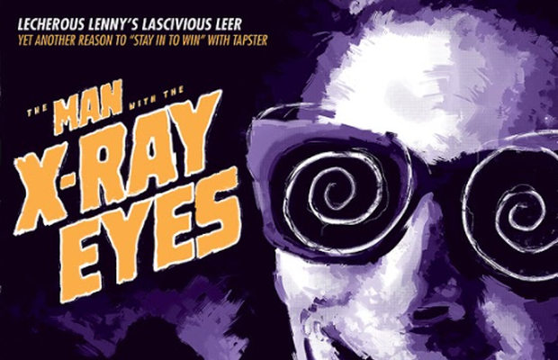
Featuring cinematic, 50’s pulp-inspired key art of various characters representing the “horrors” of going out, the campaign humorously riffs on the dark side of busy clubs and bars: long lines, rude doormen, and overpriced drinks. Characters like Invisible Barman represent bad service, while Lecherous Lenny typifies creepy meat-market patrons. The tongue-and-cheek campaign tonally aligns with the irreverent spirit of the Tapster brand, while also playing into the Halloween season with its October 14th launch date. The key art will roll out as wild postings and on social media, and in some executions has been animated in the style of classic horror movie titles. It will also hit the streets, guerrilla style, with wall projections on buildings in Boston’s busiest nightlife quarters. The visually arresting key art was illustrated by concept artist Michael Powell.
“We enjoy a night on the town just as much as the next person, but in the age of social media, fear of missing out has become a real anxiety, especially for Millennials and Gen Z, who feel the pressure of going out to be seen and chasing the 'Gram," says Jacob. "Then you end up spending a lot of money and come home unfulfilled. So, in promoting Tapster as an alternative to going out, we saw an opportunity to shift the lonely and boring narrative of staying in to one that is positive and joyful. By bringing the party to the intimacy of your own home or private venue with Tapster, you get to be social with the people you actually want to be social with. This campaign is all about celebrating that.
For the awareness campaign, phase two of bringing Tapster to market, INPHANTRY focused on clearly defining what the service is while showcasing its benefits in personal, irreverent, and memorable ways. In one wild posting, the slogan “DRINK NAKED” is prominently placed with the caption: “Delivering alcohol is our business. What you do with it is yours.” This artwork will be playfully animated for social media as well.
“Beyond the luxury of convenience and Tapster's quality of service, our messaging strategy needed to equally express the social advantages of the service,” says Jacob. “ With Tapster, you're free to enjoy your wonderful, weird selves in ways that you just can't when you're out in public.”
The team leaned on typographic, minimalistic, and colorful designs in keeping with the launch strategy of raising overall awareness, educating consumers, and differentiating Tapster from its competitors.
INPHANTRY designed and developed the front and backend of the Tapster mobile app to improve the overall user experience while inflecting the new Tapster brand with purpose and style.
“Our roots as an agency are in designing digital experiences that engage and entertain, so we’re constantly challenging ourselves to leverage digital media and technology in a way that sparks genuine emotion and empathy,” concludes Jacob. “Having this perspective really helped our team distill the Tapster brand and create a campaign that connects with its target audience in a meaningful way across all of the key touchpoints.”


