


Hue Is Your Audience? Why Advertisers Have the Power to Shift Stereotypical Colour Ideals

Forget what you think you know about colour psychology, according to Saddington Baynes’ latest white paper, things are changing. The neuro-creative studio’s findings dismantle long-held assumptions associated with gendered colour palettes, encouraging creatives to reconsider their advertising and marketing practices.
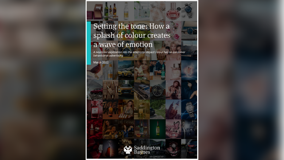
Using their state of the art Engagement Insights® visual optimisation service, the London-based studio explores the impact colour has on consumer behaviour. Keen to identify and dissect the metrics of traditionally gendered content, the neuromarketing team conducted an in-depth investigation into emotional responses to different colours and tones. The eye-opening project offers amazing insight which promises to help the industry produce the most effective and captivating content for their desired demographics.
To learn more about how the work of this neuro-creative production studio serves to advise agencies and solve creative problems, LBB’s April Summers speaks with Callum Gould, head of insights at Saddington Baynes, to find out how to utilise neuroscience for creative pursuits.
It Pays to Consider Colour
“If brands really want to be successful, they have to speak to their customers”, states Callum plainly. “Something we have found time and time again is that brands who design content with the help of their audience are more successful”. Callum oversees the consultancy service at the award-winning creative studio, a role which requires him and his team to analyse nonconscious emotional responses to specific brand attributes and marketing metrics against visual content. As the world's first production studio to harness the power of neuroscience, Saddington Baynes is an authority within the industry. The company has built a vast internal hub of consumer engagement knowledge which is used to determine a deeper understanding of a creative campaign’s potential value. A key part of this knowledge hub is their benchmarking study - the Perception Index.
Using the Perception Index, Saddington Baynes decodes visual ingredients to identify what contributes to the emotional effectiveness of different content, providing bespoke neuromarketing insight into how consumers truly feel. For this white paper, the team investigated the colour psychology attributed to consumer’s emotional responses. “We went into the Perception Index with an open mind, as there were a number of ideas that we wanted to explore and colour, as a key pillar of creativity, was one of those,” explains Callum. “It has long been known that there is a link between colour and emotions, however, there has been little direct research to fully understand these correlations.”
Defined as “the study of hues as a determinant of human behaviour,” colour psychology is thought to date back as far as the Ancient Egyptians. While many modern creative briefs consider the psychometrics of colours and tones, exploration of less narrow, binary gender parameters, has been limited. For this reason, a lot of brands continue to employ outdated colour ideals - often conforming to traditional gender roles and failing to embrace the fluidity reflected in modern society - an area Saddington Baynes’ hopes to remedy with their enlightening research.
“Two main areas of gender colour psychology were explored in this white paper. The first was the difference in perception between men and women and the second was understanding the metric of femininity,” Callum reveals. “The stereotypical approach to colour coding is almost unacceptable now and this is reflected in advertising,” he continues. “There has been a lot of work to move away from needlessly gendered products and campaigns so we sought to understand what consumers' actual reactions were to specific palettes. Using the Perception Index, we were able to put specific tones to specific metrics, with each of the metrics having been carefully selected to represent key emotional pillars that are required for effective marketing.”
Dismantling Bias Colour Codes
Throughout history the colours chosen for an advertisement have dictated how people react to it. Different colour profiles evoke different emotions - which is also a result of the cultural atmosphere - and Saddington Baynes is eager to present deeper insight that encourages more diverse representation in advertising. “It is all about giving specific targeted tools to marketeers. Brands can take this insight and make the shift to more diverse campaigns, with the confidence that this shift is not going to negatively impact brand performance. We can never rest on our laurels and have to constantly adapt to change”.
Crafting content which panders to gender stereotypes, without understanding the emotional impact of the colours used, is where Saddington Baynes believes brands are going wrong. “If you take a very simplistic and dated view of gender specific colours, there are two camps you are likely to find; Pink vs blue and light vs dark, with women preferring the former of the pairs, and men preferring the latter,” explains Callum. “However, audiences react more positively to content which they have some familiarity with, and if women have been exposed to lighter content consistently, there is an increased likelihood they are going to have a preference for lighter campaigns. We believe these results are validating preconceived ideas and this is something we would love to explore more in the future.” Marketing content to a specific gender can alienate potential consumers by exhibiting a lack of deeper insight about the audience.
An example of deeper insights is illustrated in the white paper’s findings of the correlation of male audience and light imagery. “Men also had an emotional preference for lighter content, something which goes against the old archetype of dark, bold, strong equals manly, that used to exist in advertising,” says Callum. “This suggests that if brands want to move audiences away from stereotypical colour ideals, the power is in their hands to push that shift. Brands need to create for the consumer, irrespective of gender,”
The Customer is the Key
Given the fast-moving carousel of content produced by the industry, advertisers cannot afford to misinterpret the impact of colour psychology, especially when it comes to campaigns based on gender demographics. It is in these cases that Saddington Baynes’ Engagement Insights service really shines. “When using neuroscience focused methodologies, you are understanding how consumers’ brains are reacting to things, without the filter of them trying to understand what they are feeling. Approaching research in this way is a means of reducing the bias that comes from more traditional research. Previously, this type of insight was much less accessible and was reserved for the lab but now we are able to bring it online and insights can be delivered swiftly at a cost effective rate.”
Saddington Baynes believes brand decisions should be based on consumers’ genuine interests rather than gender stereotypes and the best way to acquire this information - without conscious bias - is through a neuroscientific approach. “Using neurocreativity is an amazing way of uncovering what your customers respond well to. Review why you are using certain colour palettes and tones, and create a distinct set of brand assets using the colours that align emotionally with your customers.”
“Brands are being much more careful to ensure that ideas are tested to ensure the lowest amount of risk is being taken on their investment. When thinking about gendered colour, it was amazing to see some of the campaigns that tested ‘new’ palettes were more successful.” Callum finishes on a pensive note: “The work has to come from brands to be bold and create content in the palette that is the most effective. This is one of the first (if not the first) explorations of its kind and we would love to continue the research over time.”
***


