


How This Board-Game Inspired OOH Campaign Is Helping NYers ‘Win the Game of Real Estate’

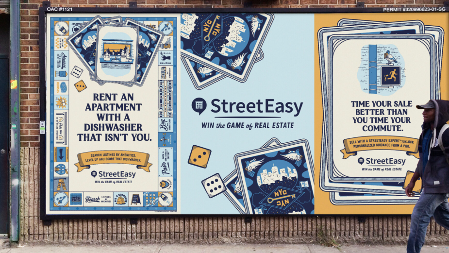
Following an initial partnership in 2019, creative agency Preacher recently helped New York-based real estate marketplace StreetEasy with a new out-of-home campaign, based on the stylings of retro board games - all with an unmistakable ‘New Yorker’ attitude and sense of humour. Designed with a traditionally limited palette of five colours and including features held in high regard on the NYC property marketplace - such as a disco elevator, radiators and an ACTUAL dishwasher - the campaign includes a variety of beautifully hand-drawn billboards, subway posters and taxi toppers.
To ensure the campaign had a vintage, find-the-box-in-the-attic style to it, Preacher partnered with illustrator and New York native, Jon Contino. Jon is famous for his unique, artisanal hand-drawn illustrations that combine the aesthetics of the modern and retro design worlds - a Cannes Lions winner who has worked with the likes of Coca Cola, Nike and the New York Times.
To help New Yorkers discover how they can ‘Win the Game of Real Estate’, StreetEasy’s OOH campaign spreads the ‘board game tiles’ across the city, both above and below ground, filled with inside jokes, Easter eggs and Jon’s gorgeous designs. To discuss why the agency and brand rolled the dice on a board game aesthetic, how Jon fought his urges to “punk rock-ify” everything and some of their favourite designs, LBB’s Ben Conway spoke with Jon, Rob Baird, founder, CCO of Preacher, and Nicole Savdie, director of marketing at StreetEasy.
LBB> When did the collaboration between StreetEasy and Preacher begin and where did the initial creative spark for ‘Win The Game Of Real Estate’ come from?
Rob> We’ve been fortunate enough to have been partnering with StreetEasy since 2019 and in 2020 launched our first joint effort ‘It’s OK to Look’. This new brand campaign effort kicked off in 2021 Q2. In our initial ideation phase, we noticed how much New York real estate feels like a game. There are relentless competitors, countless counter offers and a constant shuffling of the deck that keeps you on your toes. So, like many games, it’s pretty daunting to try to win on your own. But it becomes much easier when you’re playing with someone who knows the rules and has helped countless people win the game. That analogy really hit home for us.
Nicole> It was a true collaboration. We came to Preacher with a lofty goal which was to capture the breadth of tools and resources that StreetEasy offers New Yorkers at all different stages of their real estate journey to help them succeed - whether they’re buying, renting, or selling. As we talked through all of the high’s and low’s and lessons learned along the way, the idea that real estate is a game of skill (and not of chance) started to come together.
LBB> How was the process of creating this slogan and the copy for the campaign? And what was the direction StreetEasy wanted?
Rob> New York City is filled with some of the smartest consumers in the country. They are tough critics and deserve ads that match their intellect and wit. So, we approached the writing process with the utmost scrutiny. When writing headlines, we wanted each one to not only be informative and clever, we also wanted them to feel like action-oriented cards you’d pick up in a board game. We’re lucky to work with intelligent, creatively-inclined clients who are open to how we speak to our target audience. That really allowed us to explore how we approached our tone-of-voice. We knew we wanted to harness some of the same energy as previous StreetEasy campaigns, which meant being uniquely New York in our tone.
Nicole> StreetEasy's mission is to unlock the excitement and opportunity of NYC by helping people into a home they love. We aim to capture that sense of possibility and strike a tone that is at once empowering, energising, and transparent. This year, our strategy is focused on expanding our product offering to go beyond the initial search and help streamline the entire real estate transaction for NYC renters, buyers and sellers.
LBB> When did you get Jon Contino involved? How involved was he in the creative process?
Rob> We brought Jon in once we landed our creative concept and had a basic idea of what the visual world could be. Jon then took our ideas, came up with many of his own and brought the whole world to life in his iconic style and NYC flare. There are so many details in the game board spaces and card illustrations, things that only he would think of. He was incredibly collaborative and just a straight-up pleasure to work with.
Jon> Before the holiday break of 2021 StreetEasy and Preacher reached out with a crazy idea for this campaign and I was totally into it. I was ready to do the whole project that night once I heard the details, but in actuality, the whole thing took almost three months to complete. Forget about waiting until the brief was over, my brain was flooded from the very beginning. I absolutely love the design of old board games and the type of thought process that goes into creating them. Not only that, but having to create a playable story like that while still being informative and stylish at the same time? It was such an enticing challenge. When you think about New York City, especially from a day-to-day perspective, there are so many unique things you encounter without even realising how accustomed you are to them. It’s stuff that only New Yorkers can understand, like sun-bathing on a fire escape for example. That sounds ridiculous to almost anyone else in the world, but to New Yorkers, it sounds like paradise. A lot of ideas similar to that were running through my head almost instantly.
LBB> Rob, why did you choose Jon and what is so special about his designs?
Rob> We’ve admired Jon’s work forever, both in what he creates and the way in which he creates it, but had never had the chance to work together. It was one of those situations where we reached out with our fingers crossed but our hopes in check. Jon’s illustrations and hand-lettered type work always seem to bend eras together in a really amazing way. They often feel like something that could have been found in some archives, and yet they’re completely contemporary in their content or voice. Once we decided we were going for a classic board game with a little bit of a nostalgic vibe, we knew he’d be a perfect fit. There’s usually an underlying playfulness or humour both in his work and in the board games we love - of course, we still wanted to keep that undeniable NYC edge Jon includes in his designs and illustrations too. It was important to keep some of that grit and wit even when talking about co-op boards.
LBB> How was the ‘Monopoly’-style design concepted and developed? Why does it work so well for this brand?
Rob> As soon as we had the line ‘Win the Game of Real Estate’ in place, we knew we wanted to take the campaign in a board game direction. We took inspiration from all kinds of board games both modern and classic to create something that hopefully appeals to everyone. The fact that we needed to talk to consumers who were in every stage of their real estate journey - whether renting, buying or selling also served as a major factor in how the ads felt. Our goal was to make them feel vintage yet timeless. We found that the game board design worked great as a background for the headline-driven executions. Once Jon and our team started digging in with the team at StreetEasy to identify the most compelling motivators for people, most common searches, and the ups and downs of the game, it felt like there was more than enough content to populate the board and visual playing cards as well.
Jon> I did some quick concept art of fictional game boxes using iconography and a broad narrative to try and present a bunch of ideas all under a single roof. This way we could get a feeling for how to explore the vignettes that popped up throughout the campaign. Once we all discussed what was working, it became an extremely collaborative process to grow the game board world from there. Being a New York native, I had endless references to pull from and the team at Preacher kept throwing out scenarios to interpret, so it was just a matter of putting a fun, New York City lens on a variety of scenes.
The basic layout of the board was developed by Preacher. Their team had begun to craft a foundation for me to work within. Once I was able to see the plans of how we could lay it out, we started to discuss plans for how to break it up and use it in places like the subway, on taxi toppers and things like that. In terms of inspiration, a good portion of it was memory and experience-based. Things that happened to me or friends and family in real life. As for stylistically, I felt like there was a nice combination of ‘60s and ‘70s illustrated print advertisements that had a similar type of ‘fun yet filled with attitude’ type of style I wanted to nail down for this. And then of course the streets themselves always play a huge role in my work, so of course, it was no different for this project. Street signs, corner store awnings, graffiti - it all has a place in our mood boards for this project.
LBB> How did you decide on the colour scheme, it’s quite a limited palette that has a real retro feel!
Jon> This was a ‘destiny’ moment for us. We had this game board concept and we knew we wanted it to have a classic feel to it, but we also needed to make sure we stayed within the brand palette of StreetEasy so that it would be super recognisable once it hit the public. Pulling all that together and not allowing ourselves to reach beyond our self-imposed limitations of no more than five colours actually gave us the opportunity to get really creative with it. I always tell my designers that if you really want something to feel authentic, you have to play by the same rules as those who have inspired you. You can’t create something that truly feels retro if you work outside of their limitations, it’ll look wrong immediately. So with this, I wanted to make sure we used limited spot colours, the same way an old comic book or newspaper might a few decades ago. It’s a minor thing, but it really goes a long way to sell the concept.
LBB> Jon, what do you think it is about your style and designs that worked well with the concept and the brand?
Jon> Part of my brain is definitely stuck in an era that doesn’t exist anymore, so when the game board concept was described in the briefing, that part of my brain lit up. I think back to the board games I played as a kid, and all I can remember is the beautifully hand-drawn layouts, illustrations, lettering and logos plastered all over them. It was all made by hand out of necessity, not by choice and you can pretty much feel the sweat that the original designer put into the work. I’ve always loved that approach to design - being able to feel the creator’s strain. To me, that’s the best way to connect a viewer to the work and draw them into the message you’re trying to communicate. Make them feel it.
LBB> How does the campaign reflect the resurgence of the NYC market?
Rob> There’s inherent optimism in gameplay. Yes, real estate has been insane of late, but we’re not here to commiserate on how hot the NYC market has gotten or how difficult it seems to find your place. The tagline hits it on the head: we’re here to help you win the game, not get played by it. We chose the game analogy to show that, like a board game, there’s a start and a finish. There are rules you can learn and the more you play, the better you get at it. Agents in the StreetEasy experts network are called ‘experts’ for a reason. They play this game for a living and are here to help you get to the finish line and into your next place.
LBB> How did you first react to Jon’s designs? And do you have a favourite?
Rob> In most cases, we concepted illustrations with Jon, so we had a pretty good idea of what they would be, but he always came back with something that had his twist on it. We were constantly amazed by what he’d send us, even when we knew the concept. Sometimes he’d reimagine a scene in a whole new way and others just add that perfect New Yorker touch.
And that’s like being asked to choose your favourite kid. There are things we love about all of the designs and illustrations. One of our favourite spaces on the board is the radiator with ‘House warming’ made out of steam coming out of it. The type Jon created for that is insane. But perhaps our favourite piece overall is the card back design. Jon truly went above and beyond to make that stellar. It’s such a great microcosm of the campaign, you instantly get games, NYC, and real estate from it.
Jon> Wow, that’s a tough one. I like them all for different reasons, but I might lean towards the elevator scene as my favourite. It was actually one of the toughest ones to figure out, mostly because I know how valuable an elevator is, especially to new parents. I wanted to make sure we did it justice. The disco ball idea is something I just decided to put in there, not knowing if it made any sense, but for some reason it really made me smile to think of getting into an elevator that felt like a dance club - probably because it has that VIP feeling to it compared to walk-ups. It took a few tries to get it right, but once we did I added what I think might be my favourite detail in the whole campaign: The baby throwing up the ‘peace’ sign from within the carriage. It’s a little bit of an easter egg in the design, but it’s my favourite part for sure. I thought the idea of a baby, who’s already being chauffeured around, telling everyone else ‘peace’ in a taunting manner was hilarious.
LBB> The OOH ads are in lots of different sizes and locations - what is there to consider with so many ‘canvas’ sizes and types?
Rob> We really had to consider how to make quick-hitting ads that would live on buses or wild postings, while also thinking about how we’d entertain people on the subway who see our ads for 20 minutes every day. So we created messaging that you could get upon quick glance and also filled the ads with enough detail that you could catch little easter eggs the longer you look at them.
Jon> Every project I start alone or with my team always consists of trying to define the broad strokes first. My illustration work always starts with pencil sketches, so why should the design of a campaign be any different? I think it’s vital to make sure your plan is laid out ahead of time before you make any sudden movements in the creative process. If the project doesn’t start out with a steady foundation that allows for the natural evolution of ideas, then the amount of problems that stack up as it develops can be maddening. It sounds very much like a ‘duh’ statement to make, but sometimes an idea sparks and you get so excited to explore it that you don’t stop to comprehend how far you can actually take it. For the StreetEasy campaign, we decided right out of the gate how far we’d be able to stretch it and how we could use the little game board components to continuously add more content in a variety of locations. Using the boxes of the game board to stretch across the upper display areas on the subway is the perfect example of planning ahead of time for a flexible yet still identifiable campaign.
LBB> What was the most difficult challenge you faced on this campaign and how did you overcome it?
Rob> The biggest challenge was trying to create ads that easily conveyed ‘game board’ and our StreetEasy messaging in different sizes while still keeping a consistent visual system. The long horizontal ads that are placed high on the subway walls, near the ceiling, were a puzzle to us at first. But then we came to the realisation that it was the perfect placement for a continuous game path throughout the train. So, we designed ads that look like you’re moving along that game path.
Jon> This is kind of a funny challenge to have, but the toughest part for me personally was making sure to keep the vignettes feeling positive. That sounds funny, but hear me out! We wanted to focus on the enjoyable parts of the real estate process and what New York City offers, not so much the frustrating and even gross experiences that occur at times during the search. The punk rock illustrator in me just wanted to design this campaign as gritty as my favourite hardcore club I frequented growing up. Still with humour, but with much darker humour. I’ve always been in love with the raw edge this city has and I love how the personality flows so effortlessly. All the things that some people might attribute negatively to the city are what gave this place an edge that I felt proud to explore as a kid. Whenever I get a brief to design for the city of New York, I instantly want to punk rock-ify it because I have so many fond memories attached to that whole aesthetic, but as much as I hate to admit it, I have been an adult for quite some time now and I understand trying to find the perfect place for my family to live. It’s not that it was hard to overcome that idea, but I can’t help but want to just dig my heels in and say, ‘This is New York Fuckin’ City!’


