


How Pepsi Designed Its New Logo

To celebrate the brand’s 125th anniversary, Pepsi has recently unveiled a new 360-degree visual identity featuring a striking, refreshed colour palette, pronounced typeface and energetic ‘pulse’ design element. The new visuals were pioneered by Pepsi’s in-house creative team PepsiCo Design & Innovation and is the company’s first brand refresh in 14 years.
The new design combines modern elements with equity from Pepsi’s history to create a unique but familiar aesthetic that caters to all of its global consumers. And by blending the ‘Pepsi globe’ and its watermark, the soft drinks giant hopes to unlock more flexibility for the branding to reach these consumers wherever they are - with seamless use in both physical and digital spaces. The new Pepsi persona will debut in North America this autumn, followed by a global rollout in 2024.
To discuss the design choices around this new revitalisation of the brand and how Pepsi wants to be seen in its next era, LBB’s Ben Conway spoke with PepsiCo’s chief marketing officer Todd Kaplan, SVP and chief design officer Mauro Porcini and the Pepsi team.

LBB> Why was now the right time for a visual refresh?
Pepsi> As one of the world’s most recognisable brands, Pepsi is updating its iconic globe logo to reflect its unapologetic stance and bold vision for the future, in time for the brand’s 125th anniversary. Throughout our history, we’ve consistently moved at the speed of culture, remaining timely and timeless at once. The new brand identity system is aimed at building and strengthening visual distinction through the bold type, energetic palette and unified logomark that is optimised for today’s digital world, from stadium screens to the metaverse.
LBB> How does the new design take inspiration from the previous iterations and Pepsi’s 125-year history?
Pepsi> As a brand that is beloved by many generations, we designed the new logo and visual identity to pay homage to our heritage and look to the future to create something current, and undeniably Pepsi. We asked ourselves: how do we take everything we love about Pepsi and its past, and create something that transcends?
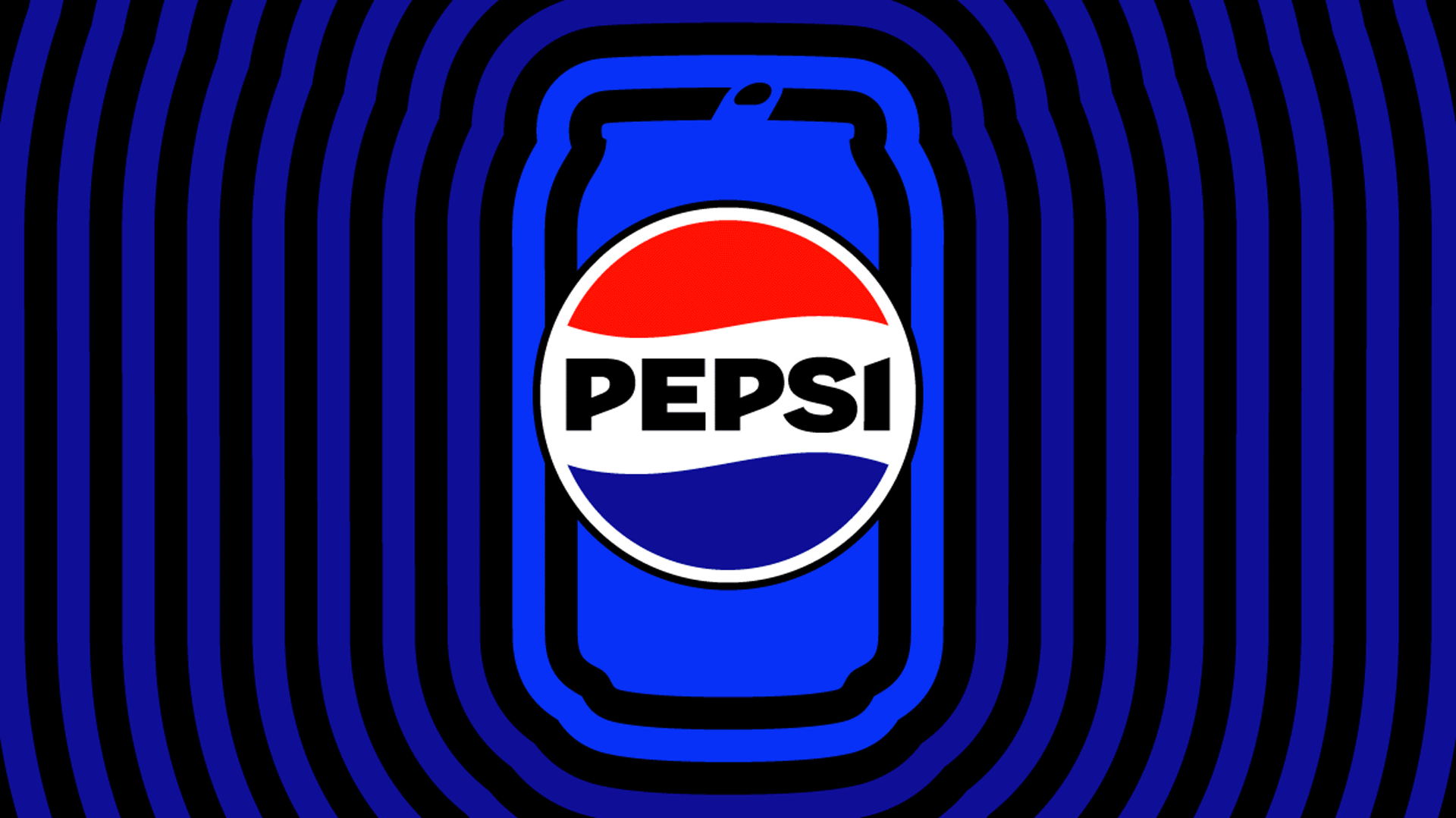
Among the key updates is the addition of the colour black, an ode to Pepsi Zero Sugar, and the new ‘pulse’ – a living and breathing design asset that allows Pepsi to flex and customise its look to any setting, platform, or partnership to reach customers in new and exciting ways, every day. These updates allow Pepsi to better flex in today’s digital world.

LBB> Did you do lots of customer research and workshopping during the design process? How long has the entire process been so far?
Pepsi> An exercise that we do periodically is to ask people to draw the Pepsi logo from memory and we increasingly found that they put the word Pepsi inside the circle. Although that’s not exactly how we redesigned the new logo, that insight was something that we couldn’t ignore. Once we firmed up the design, we conducted research globally as we tested out the new iteration and received a positive response. Specifically, people applauded the attractive colour palette, distinctiveness and overall modern look. This was a labour of love several years in the making, and we’re so thrilled to finally share it with the world.
LBB> How would you describe the new design compared to the previous one?
Pepsi> The new logo and visual identity better reflects our bold Pepsi persona and will help drive momentum for the brand, now and in the future. Pepsi is consistently reinventing itself to move at the speed of culture – timely and timeless at once. It was time for the Pepsi brand identity to evolve to better evoke the brand’s bold future while paying homage to its past.

LBB> The Pepsi globe and wordmark have been combined in the new logo - what opportunities does this enable from a marketing perspective?
Pepsi> The Pepsi name carries a lot of influence around the world and continues to show up in people’s lives within food, sports, music, gaming and beyond. From a design perspective, having a unified wordmark and logomark offers more flexibility in how we can show up in different settings. For this next era of the brand, we’re proudly unifying our name with the Pepsi globe in a vibrant way.
LBB> You’ve used a new colour palette - combining blue with black - what decisions went into the new colours?
Pepsi> The colour black is bold and creates a beautiful contrast with the electric blue. Black has also always signified Pepsi Zero Sugar, which is a huge growth driver and part of the larger master brand strategy.

LBB> A new typeface is also part of this refreshed identity - what does the custom type communicate?
Pepsi> The modern, custom typeface reflects the brand's confidence and unapologetic mindset.
LBB> What is “the signature Pepsi pulse”? How does this element add to the new identity in various formats?
Pepsi> The pulse is an idea and visual principle that can flex to tell different stories for the brand, our product, fan moments and more. The signature pulse depicts energy and outward movement, and the patterns evoke the ‘ripple, pop and fizz’ of Pepsi-Cola with movement. We now have a logo that can live and breathe in the digital world – across social, the metaverse, streaming and other emerging media platforms.


