


How FCB Tied Reese’s and Sunsets Together

If you’re in Canada, you probably know Reese’s. After all, unless one has a peanut allergy, it’s hard not to enjoy the one-two punch of chocolate and peanut butter. And, when it comes in a bright orange wrapper? Absolutely unforgettable. Whether you’re a kid getting them in your trick or treat bag, or an adult seeing them line the shelf at the nearest convenience store, chances are you know Reese’s.
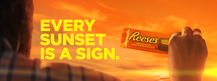
But did you know that since the dawn of time, the universe has been giving humanity a natural sign to consume this treat? Thanks to the recent work of FCB Toronto, which highlights the obvious colour association between sunsets and the iconic packaging, we’re now able to decipher the meaning of this end of day tradition: it’s time to indulge in a Reese’s PEANUT BUTTER CUP.
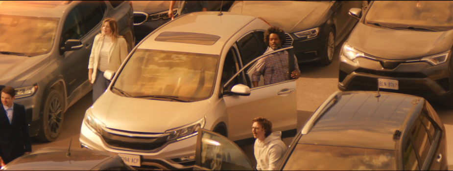
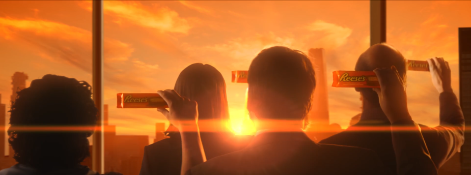
Directed by FRANK Content's Rodrigo Garcia Saiz, the film dramatically shows people reacting to a sign from above and raising packs of Reese’s to the sky, before revealing that what they're looking at is the setting sun. It’s comedic, fun, and serves to kickstart future Reese’s work that will see the brand continue to double down on the significance of the candy’s orange wrappers.
LBB’s Josh Neufeldt sat down with FCB Toronto ACDs Joe Vernuccio and Cody Sabatine, group account director Melissa Paulino, Reese’s marketing manager Andie Doan, and Rodrigo, to discuss how this campaign came to be.
LBB> Highlighting the association between Reese’s orange-coloured wrapping and the sunset is super clever! How did this idea come to pass, and what made it the right choice for the creative?
Andie> When you’re looking for breakthrough work, you look for work that is clever and unique. You look for work that is ownable, and there’s nothing more ownable than one of our strongest brand assets: Reese’s orange. So, the idea of connecting something that occurs every evening - like the sunset - and spinning it in a way that drives behaviour in an important consumption moment made it an easy choice.
Joe> As with most ideas, it started with the cliché ‘What if?’ question. This sort of evolved into ‘What if we created a billboard that matched an orange sunset to the orange wrapper?’, which evolved into the idea that the universe is telling us something every evening when the sun sets. It grew organically, and started from a ‘that’d be a cool execution’, transforming into a cool idea with some legs.
Ultimately, the idea was right in front of our faces - we just had to look up. The thought that there’s a sunset every evening sending us a sign to eat Reese’s nightly made it a winner, for sure.
LBB> Let’s talk about the spot itself. What was the writing process like, and how did you go about selecting locations to include?
Joe> It took some exploring before we got to where we landed with the ‘Signs’ spot. We played around with the notion that for the last 4.5 billion years, the universe has evolved to tell us one thing - ‘Eat Reese’s’ – which we really liked. But then, we had this really dumb thought of how people might start to develop a sore neck from looking up at the sky waiting for the sunset every night. Then the spot wrote itself from there.
The locations for the spot started with the traffic scene, in which we wanted to lean into the cinematic feel of something like ‘Independence Day’, or ‘Arrival’. We then expanded out from there, making sure that it felt as big and as grand as the whole city, country, or planet waiting for this one event - stopping to observe it and sharing in that savoury moment together.
LBB> The spot was directed by Rodrigo Garcia Saiz. What made him the right choice for the job?
Cody> We were looking for a director that could bring the scale and cinematic universe that we wanted to life, but who also had the comedy chops to bring out the absurdness of the idea. Once we saw Rodrigo’s reel, specifically his Skittles work, we knew we’d found the guy. From the get-go, we were aligned on the scale and vision that he wanted to bring to the spot.
LBB> Rodrigo, what was the script for this campaign like? What immediate ideas came to mind when you first saw it, and why was it something that you were keen to get involved in?
Rodrigo> When I read the script, my first reaction was to go outside and see the sunset. It was a really fun concept and I was really excited to present on it and to direct it. I loved the comedic tone paired with the cinematic visual approach, the agency was really receptive to ideas from the beginning, and we were all on the same page: excited to have some fun and create something unique. So, it was a dream job!
LBB> Going into this, did you have a plan for how you were going to bring the sunsets to life? And did that pan out exactly as expected while shooting?
Rodrigo> The DP, Mat Barkley, the creative team, and I chatted a lot about the different ways we could bring the sunsets to life, exploring what would be best for the idea. Generally, I like to do everything I can in-camera, as it is always the best way to do it. That said, we did talk about doing it in post, but in this case, the light was part of the story so we chose to create a perfect sunset with our lights and match the colour temperature. All the art was also based on the same palette to push the Reese’s tone even more, and the rest was done via camera and colour correction.
LBB> How was the production process? Do you have any anecdotes to share from on set?
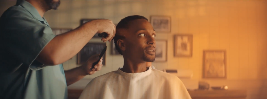
Rodrigo> We shot this at the White Studios backlot. We chose the backlot as it enabled us to have control of the lighting while keeping it in the real world, and it was also perfect for logistics because we could move with the sun and shoot the interiors when the exterior light was not good for us.
Cody> This being FCB’s first Reese’s spot, we had no clue how hard unwrapping the perfect Reese’s cup would be. There’s a certain technique and skill involved in making it look great on camera. But a few (dozen) PEANUT BUTTER CUPS later, we were able to nail it!
LBB> Building on this, how many packs of Reese’s were used in the making of the spot?
Cody> I think we had a few hundred on set. It’s hard to find the perfect, camera-ready cup!
LBB> What was the casting process like? What were you looking for, and what led to you making the choices you did?
Rodrigo> I always participate in the casting for any project I work on. We wanted to have diversity, and I always try to choose actors who give more than intentions, so we chose a cast not only based on looks, but great acting skills as well. That is always key for me, and the agency and client felt the same way!
LBB> When it came to aesthetics and the look and feel, what were your main aims and ambitions, and how did you achieve them through lighting and colour?
Rodrigo> I wanted this film to be super cinematic, leaning heavily on a colour palette related to the Reese’s colours. From there, we tried to stay within that, to really hone in on the tones of the sunset. We did a lot of prep - all of the production and art teams worked together to create a plan to capture everything we wanted for this film. Scheduling our day around the best light for each scene was the biggest hurdle, but we did it!
LBB> Tell us about the post process! Was there any additional work required for bringing the sunsets to life?
Cody> The biggest thing was ensuring that we had the right Reese’s orange in each scene. We tried to capture as much as we could in camera, but we had to push the colour in post. Here, I tried to channel my inner J.J. Abrams, seeking to achieve the largest number of solar flares as humanly possible within the 30 seconds.
LBB> Since release, how have people responded to this campaign?
Melissa> The campaign hasn’t been in-market for too long, but so far, the social response indicates it's been well-received!
LBB> This campaign will be continued with additional consumer engagements throughout the summer. Can you tell us more about this? And how does this fit into Reese’s branding for 2023?
Melissa> We are excited for what’s coming next, but everyone will have to wait!
Andie> This campaign will anchor all communications in 2023. You’ll see Reese’s orange and sunsets across the full funnel, from cinema pre-show to in-store point of sales materials.
LBB> Are there any elements of the project you’re particularly proud of? And why?
Rodrigo> I am really proud of the final film. It’s visually beautiful, quite comedic, and because of that, I hope we have started a new trend!
Aside from that, I’m delighted with just how strong the idea was, even from the beginning. My EPs at FRANK Content are always looking towards pushing creative and working together on great ideas, and this one was one of them. I am really proud of how it turned out, and proud to have been a part of it!
LBB> Most importantly, do you enjoy Reese’s as a nighttime snack?
Melissa> Let’s just say a lot of Reese’s have been crushed post-sunset since we started working on the brand.


