


How Creativity Unleashed Farrow & Ball's True Colours
Mizzle. Mole’s Breath. Brinjal. Calamine. Lichen. Pigeon. Incarnadine. Ammonite.
If the above line reads like a strangely cosy spy code, welcome to the world of premium British paint brand Farrow & Ball, where each colour in its carefully curated palette carries an idiosyncratic name, laden with meaning and story. If, on the other hand, you thought, ‘hmm, yes, I was thinking about Pigeon for the kitchen’, then gather close. You’re in good company.
Founded in 1946 by an entrepreneur (Richard Maurice Ball) and a chemist (John Farrow), the brand has grown to become a moodboard favourite for aspirational home decorators. Its mystique has even crossed the Atlantic, becoming the subject of a Saturday Night Live sketch. And, ultimately the brand is a case study in how storytelling and creativity really do have the power to up-end the most unlikely sector.
Take those distinctive names. From Sulking Room Pink to Nancy’s Blushes, each title carries a story and the unexpected quirkiness of those names have become a brand asset in their own right, proving that a bit of clever copywriting goes a long way.
“Every colour name has a story behind it,” says Mary Rochester Gearing, “Sometimes the colour creation starts with the name, sometimes it’s the other way around, but both are equally important. Quite a lot of the names come from nature, or our home around Dorset, some are inspired by places, buildings, or architectural features. So, a delicate white-like Wevet, takes its name from Dorset dialect for a spider’s web. It creates an association for the colour and makes each one a discovery. We find that our fans love to reference them and some of the colour names are recognised even more than the brand name is.”
For Matt Lever, chief creative officer at BMB, Farrow & Ball’s creative agency, those names are a gift - and one of the reasons that the agency team was already in the F&B fanclub before they’d even started working on the brand.
“The colour names are brilliant brand assets – they’ve created a mystery, romance and desirability around the company that other brands would kill for,” says Matt. “We’ve loved working on the brand from day one. It’s been fascinating to help our brilliant clients work out how to widen the appeal of the brand, beyond its traditional heartland. It also helped that Mel, Jason and I were already loyal customers when the relationship started…”
For a brand that embraces storytelling through its product and marketing, Farrow & Ball has an interesting story itself. Mary explains that the brand was founded when the eponymous Mr Farrow and Mr Ball decided to set up a company to build a new life for their families following World War Two. Things rumbled along nicely for a few decades until an unexpected twist occured.
“It really became known across the UK in the ‘90s when decoration adviser to the National Trust, Tom Helme, discovered a tin of paint whilst working in a historic property,” says Mary. “Tom was apparently so impressed by the quality he persuaded his friend Martin Ephson to join him in buying the company.”
As Farrow & Ball has grown in popularity, it’s strived to innovate, belying the heritage influence that runs across its range. It’s managed to turn the image of decorating paint from something stacked high on metal shelves in DIY stores to something expressive and aspirational and has created new ways to help people, such as their Colour Consultancy. “Farrow & Ball was the first to make paint a lifestyle statement, selling directly to customers in welcoming showrooms that felt more like fashion or lifestyle spaces than trade paint stores with design-led staff,” says Mary. “More recently the brand went on to become early adopters of web and social media. Our carefully curated palette of shades created a new energy and conversation around choice of colour for your home.”
At the heart of it all, beneath the evocative names and stories, is the product itself. The range of colours is only occasionally added to and remains carefully tailored. For Matt, the product itself is the cornerstone of the brand’s success. “First and foremost the product itself is incredibly high quality. Add to that a colour palette that’s just much more covetable than any other brand’s. Then there are the distinctive, ownable assets, like the paint names and the company’s artisanal Dorset provenance.”
Indeed, the marketing team is as close to the product as can be and there’s a close sense of collaboration between marketing, the lab team and development. When it comes to developing a new colour, it means that an old colour must be retired to the archive and so it is a decision that must be taken carefully.
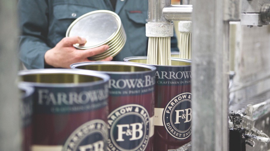
“Our lab, factory and offices are all on a surprisingly small, single site so we work closely together. Colour direction is led by Joa Studholme our colour curator and Charlie Cosby our head of creative,” says Mary, outlining the creative process. “They brief the lab on a specific colour, but then it will take months of development and refining between the teams to make sure the outcome was exactly what they had envisaged. Then the lab team formulate the colour to be stable under all light sources and across our different paint finishes, from walls to trim and exteriors. With so few colours compared to a mass brand, each one must really earn its place on the colour card. When we launch new colours into the main palette we also archive the same number so that the palette remains a curated reference to contemporary colour for the home instead of becoming overwhelming. Archived colours are still available to order directly, but our core business is always the 132 colours.”
Every now and then, they will collaborate with an outside partner to help bring new perspectives. Most recently they paired with Liberty to pair its distinctive fabrics with colours from the Farrow & Ball to build a stylish English country vibe - while Californian celebrity designer Kelly Wearstler brought ‘crisper, sun-soaked colours inspired by the light and lens of the Pacific’, which popped out compared to the more muted tones of the main palette. “The partnerships always start from a mutual respect and genuine connection, and we hope by working with others we can share the story of what we do more widely,” says Mary.
Although Farrow & Ball has cultivated a keen fanbase, it’s also generated a perception that it’s a bit fancy. Over recent years, together with its agency BMB, it’s been working to tweak its positioning - to keep that sense of desirability and quality but make it all feel more accessible. And the key to that has been a healthy dose of self-deprecating humour.
“We made a very deliberate decision to use humour in the ads,” explains Matt. “It wasn’t something the brand had really done before, but it became clear that to some consumers the brand was a bit posh and upper class. More Downton Abbey than Down to Earth. It felt like our job was to make the brand (and therefore the paint) more accessible to ‘normal’ people and perhaps to people who hadn’t considered buying the product before.
Relatability has underpinned the humour in everything we’ve done. Making our new audience see themselves in the situations and characters in the ads, so they can see that the brand understands them and that the products are designed with them in mind.”
What the humour also allowed the brand to do was to recreate a sense of self recognition and connection in viewers - and it certainly inspired in fans a very memeable feeling.
“The direction was inspired by one of those relatable quirks of human behaviour. Specifically, the anxiety that your beautiful newly decorated room might get damaged by the very people you want to show it off to,” says Mary. “People really recognised themselves in it, a lot of the comments on social media platforms were people exclaiming ‘this is me!’ or tagging a friend it reminded them of. The team at BMB did a great job. It let us make a serious point regarding the fantastic quality of our product in a relatable way. To recognise that anxiety with a focus on our Modern Emulsion finish, our durable wall paint.”
In terms of the range of paints, this drive for accessibility has seen the marketing focus on that hardy Modern Emulsion range, proving that the brand’s beautiful colours can withstand the rough and tumble of life in the 2020s.
“We’ve been concentrating on taking the brand slightly beyond its traditional fans. Giving people who perhaps haven’t used a premium paint before benefit-led reasons to try the product. For example, our Modern Emulsion campaign was about the paint being hardy - washable and wipeable enough to withstand real life in real homes (not show homes or stately homes) – life with errant kids, mucky dogs or red wine-wielding guests. Hopefully all delivered in an entertaining, relatable and memorable way, but with a benefit at its heart, designed to give people the confidence to choose a more premium (and definitely more beautiful) paint than they’ve perhaps gone for before.”
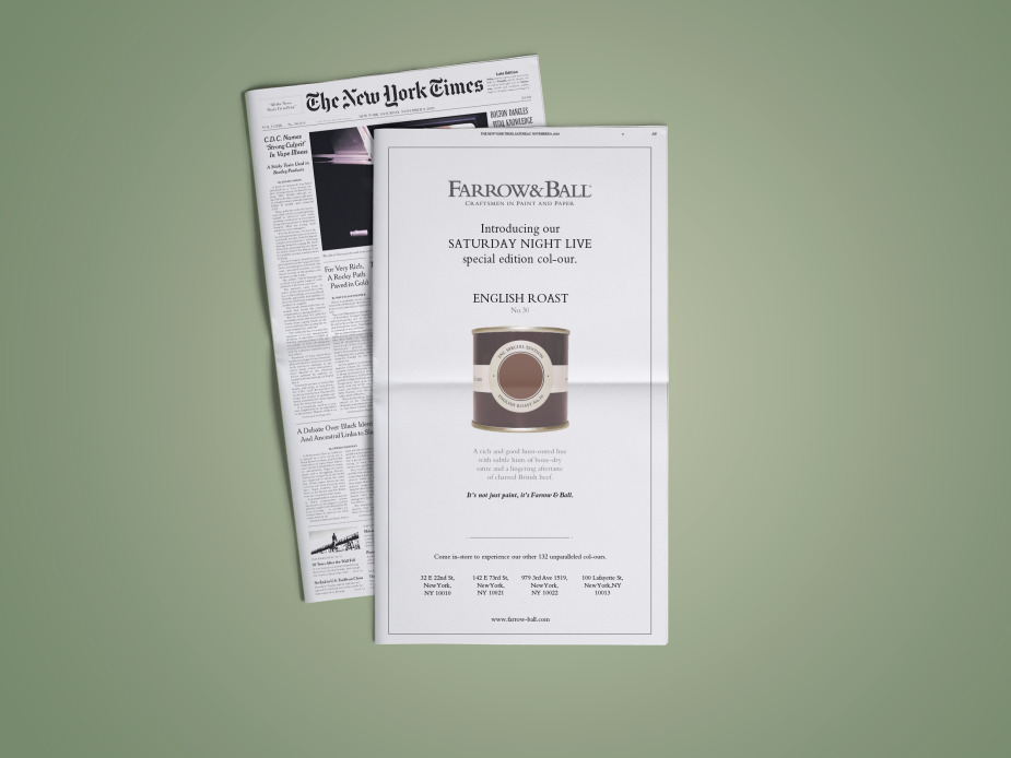
That humour also came into play when the brand reacted to the aforementioned SNL sketch, where an American F&B fanatic is confronted with her obsession over the brand’s ‘col-ours’ which has seen her spend her whole inheritance on the range. In response, Farrow & Ball popped up in the New York Times with a tongue-in-cheek full page ad featuring a newly-created ‘col-our’... English Roast.
Another way that the brand has really sought to reach a broader audience is by consciously engaging on social media, where they’ve found an active fanbase keen to show off their clever design choices online and to discuss the brand’s colours.
“Social media is hugely important to us,” says Mary. “It keeps us connected to our community and also gives us insight into what colours people are engaging with or rooms they are struggling to decorate. The campaign for Modern Emulsion was our first time creating something for TV, and we’ve placed it through video on demand services.”
When it comes to engaging with the fanbase, Mary says there's a lively, fluid, and creative conversation. “No two homes look alike. By the time you layer in style of house, colour choices, furniture, accessories, there are endless options – it makes decorating an adventure! Spaces should be about how they make you feel and how you want to use them. As a result, people want to have a range of conversations, sometimes they are looking for advice to find and combine colours for a particular room or light, sometimes they just want to share their love of a particular colour. We try to be available to help, whether that is on social media, live chat on the website or with the staff in our showrooms.”
And what are these conversations revealing about how people are thinking about their homes in 2022? Mary has seen a significant shift in the past year in terms of new design challenges (the perfect WFH background!) and style trends.
“Post covid people are placing a lot more importance on their homes. It’s a combination of the fact it might be a workspace as well and your colleagues are beaming into it, but also a need to feel safe, protected and uplifted,” she says. “As a result we are seeing shifts to warmer neutrals and more colour coming in, whether as feature walls or whole colour drenched spaces.”
Ultimately, Farrow & Ball is a business that is innately creative and revolves around design - and that creativity is reflected back in the way that the customers choose to use the product to express themselves or manifest their dream living space. For Mary, that sense of creativity informs everything she and her team does.
“There is definitely a huge amount of creativity and passion about colour and people’s homes. I’m lucky to work with an amazing team, but I’d say that’s across the whole company not just in marketing,” she says. “My career otherwise has been in the wine industry and while that can be equally emotive, there are more norms that define consumer engagement. The world of interiors comes with limitless variety, so creating a consistent style and tone that can be recognised and recalled is probably the biggest daily task.”


