


How Comic Sans Challenged the Design Community’s Inclusivity

Not surprisingly, fonts seem to be one of those things that everybody can be a snob about. And although we all have had the odd quarrel over Serif and Sans-Serif fonts, or have relentlessly defended the one typeface closest to our hearts, it seems that the entire typing community can agree on one thing - Comic Sans is funny. Lately it has been reserved for some deep internet memes and you can find it on animal pictures in the depths of Instagram. And although undesirable for designers, this dreaded font might just have its renaissance with the help of Dyslexia Scotland.
Their team got together with Innocean Berlin and WeTransfer to launch an international campaign, at the seed of which was one simple truth - Comic Sans helps people with dyslexia focus on texts that otherwise overwhelm them. Simply put, the font that nobody wants to use on their website, is the font that makes the lives of people with dyslexia a bit easier - and they are a group which web designers should definitely not be neglecting. According to Dyslexia Scotland, today people with dyslexia take up 10% of the population, which is a whopping 780 million people around the globe. October is Dyslexia Awareness Month and therefore the perfect time to be reminded that - with the right access to information and assistance - those individuals can go on to become “40% of self-made millionaires, 10% of MIT students, and one in five astronauts at NASA,” according to Dyslexia Scotland’s press release.
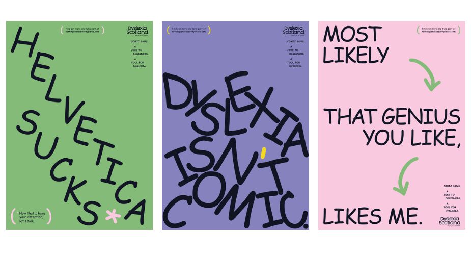
Named ‘There’s Nothing Comic About Dyslexia’, the campaign is here to remind web and print designers, as well as consumers, that there is nothing comedic about accommodating people to achieve their full potential. And although Innocean are aware that the campaign won’t suddenly make all designers switch to Comic Sans, they hope to remind them of the responsibility they carry everyday, which will in turn hopefully plant the seed of a more inclusive mindset from a design perspective, both in print and online.
When it comes to inclusivity, Maso Heck, creative director & head of art at Innocean Berlin, thinks we still have a long way to go. “There has definitely been some commendable work done in that area like the new rebranding of the BBC, which is more inclusive. However, there is still a huge field to explore when we talk about inclusive design. That’s the beauty of the campaign. We want to remind designers that they have a bigger responsibility than just creating beautiful designs,” says Maso.
This responsibility increases even further with the rise of immersive experiences and the metaverse, where typography can be a deal breaker for some. Maso says, “There’s the responsibility to be inclusive in the way we approach design. Typography is an important asset regarding accessibility and the goal, in the end, is to have more options for designers to choose from. It’s really a win-win situation. Beautiful design and being dyslexia-friendly are not mutually exclusive statements.”
Katie Carmichael, lead of creative and digital at Dyslexia Scotland, believes that a more inclusive future in design is possible through training and education. “If inclusion is built into designers’ training, there’s more possibility that it will be integrated with their planning and process, across all creative disciplines. It’s an exciting thought,” she says. According to her, Dyslexia Scotland’s vision for the campaign was ‘gently provocative’, and something that could motivate the design community to begin considering inclusion as part of their processes.
Maso agrees and adds that the campaign is far from aiming to fully change Comic Sans’ deeply rooted reputation of a comedic font. “We are using Comic Sans to get the attention of the design world, but we won’t aim to turn their hate for it into love. Instead, we hope they can turn their dislike of it into inspiration and create more dyslexia-friendly fonts, that nobody finds comic or unworthy,” explains Maso. And according to Katie, this is exactly what the campaign is succeeding at doing. “It’s awakening the realisation that design for dyslexia is important - and that it can be fun,” she says, “There will never be a one-size-fits-all font, that’s not the point of this campaign. The point is to ask designers to be inclusive in their approach to design, so that information can be both accessible and beautiful.”
When it comes to actually reaching the design community, the two teams knew that working with WeTransfer would be extremely helpful, as the buffer between them and creatives. “It’s been a pleasure working with them,” shares Maso. “As we are targeting the design community, WeTransfer is the perfect media partner. Their motivation to spread the message and generosity in offering digital wallpapers and workflow features to help spread the word amongst the WeTransfer international creative community of more than 87 million creatives is something we really appreciate.”
In terms of reach, the campaign can be found on various channels, such as the website, social media, print ads, OOH posters, and postcards. “All the touchpoints are strategically thought out to best reach the design community. It’s a direct campaign to them, that’s why we decided those were the best mediums,” says Maso.
If you would like to learn more about the campaign or you are a designer who wants a crack at creating a new dyslexia-friendly font, follow the campaign font guidelines on their website, and get creating!


