


How Coffee & TV’s Rebrand Showcases Their Meticulousness and Magic

In 2012 when Coffee & TV began, they were a creative studio with a team of four. Today, they’re a B Corp Creative Studio that has worked with numerous global brands such as Sky, Amazon, Louis Vuitton, Dior and many others. With a diverse collective of artists who work in traditional as well as modern media, it was no surprise that they wanted their branding to reflect their change since initial conception.
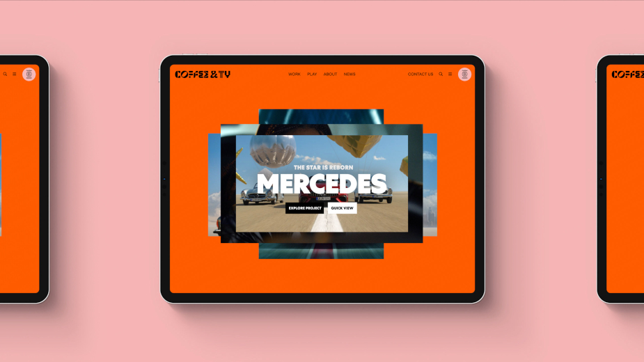
In 2021, Coffee & TV approached branding agency Ragged Edge and the two began the process of telling the creative studio’s story - and their evolution over the years. With the range of skills and creative offerings, it was only natural that their new logo plays on the ‘different’ - with unique, custom created letters that make up their own font, a bright orange theme that sets them apart and a bold visual identity to keep them relevant. Following the creative process, the new logo and branding launched in February of 2022, delivering something modern and unique.
Coffee & TV’s CEO Derek Moore describes creativity as a ‘team game’, and together with the studio’s creative director Steve Waugh and Ragged Edge’s co-founder Max Ottignon - the creators of the brand’s new identity speak to LBB’s Nisna Mahtani.
LLB> Talk us through the evolution of Coffee & TV over the last decade. What did it start out as, what has it become and why did you want to rebrand?
Derek> We started as just four people who frankly were a bit worn down and disillusioned with the industry at the time. We were simply trying to do good work with people we cared about. We started fully remote back in 2012 which has now come full circle during the pandemic.
As we attracted better work and more and more talented people, we often felt that we had outgrown our boutique feel and original branding. We wanted a visual identity that truly reflected our newfound confidence in our ethos and values.
LBB> Why was this the perfect time for a change?
Derek> I’m not sure there is ever a perfect time, but we had worked really hard through lockdown on our vision of where we want to be and the values that will take us there. So having more clarity on that really helped us to have the confidence to take the plunge with the rebranding process.
LBB> What was the story you wanted to tell and how did you go about achieving it?
Derek> We know we are different from most other companies in our sector, for example, we’re the first B Corp Creative Studio, so we wanted our branding to reflect this. It would have been easy to have followed the crowd and created a lean, mean, industrial, cool-looking identity, but that wouldn’t have stood out or been particularly authentic. We wanted to celebrate the craft and the process of creativity that goes into every one of our projects. We realised that unlike some of our competitors, we stand behind the great work, not in front of it. There is a much greater focus on what happens behind the scenes in our studio that leads to such great imagery, rather than just showing the finished product. We have tried really hard to get this across in our new look and feel.
Steve> We also realised that we are confident enough to open up and be transparent about how we work. Shining a light that may help others better understand what we do and whether we might be the right creative partner for them.
LBB> The brand logo is very striking, can you tell us the discussions behind using several different fonts? And how does it reflect the Coffee & TV brand identity?
Derek> Creativity is definitely a team game. Especially at the scale of the projects we work on. So everyone’s voice is important, and the result is much greater than the sum of the parts. The glyphs in our typeface represent the coming together of all of the different identities, and also our aspiration to promote much greater diversity and inclusion in our industry.
Steve> The bespoke characters represent our diverse skills and our broad range of creative offerings. To me, it speaks of individual talent and self-expression coming together in one coherent form.
Max> As the centrepiece of the visual identity, we needed the logo to be instantly recognisable. It needed to feel a million miles away from any competitors, while simultaneously communicating Coffee & TV’s unusual combination of meticulousness and magic. Organic forms are juxtaposed against the precision and rigidity of other characters, to create something that feels both full of distinctive character and perfectly balanced. Each letter was created from scratch, so the result feels utterly unique.
Naturally, the logo needed to move. So we created a set of alternate glyphs that could replace the primary letterforms in motion, or be used independently as standalone graphic devices.
LBB> Let’s talk colour palette. What were the initial conversations you had and how did they evolve through the creative process?
Steve> One of the many great things about Ragged Edge is their desire to differentiate a brand from its competitors. It became clear very early in the process that one way to do that in our industry was to use colour. No one had really engaged with colour as a brand element, instead going with neutrals - mostly white and black. I understand this as it allows the work they produce to breathe and take centre stage. But we wanted to make a joyful statement and present ourselves as the creative studio that we are. The only addition we requested from Ragged Edge was the grey, just so we had a more neutral colour to work with should we need a more subtle way of presenting any message.
Max> This was a category dominated by slick monochrome identities, designed to take a back seat to the work. That gave us an opportunity to break the rules by going ‘behind the screens’. To focus less on the surface, and much more on the energy that goes into the finished product. A bold, bright Orange felt warm, positive and – most importantly – distinctive. And by using it confidently, we could use it as a signal that Coffee & TV stands for something different. We used the secondary colours to exaggerate that energy. The aim was to create the feel of a vibrant creative playground.
LBB> Were there any specific user functionality aspects you were keen to include on the site? Can you tell us about them?
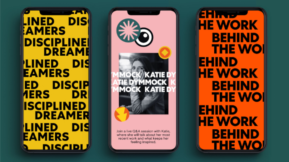
Steve> My favourite page on the new site is the PLAY page. It’s a really great space for anyone to show their personal work and passion projects. It's full of RnD, experiments, photography, painting, drawing. Hopefully, it shows us in a new light and demonstrates how incredibly talented and creative our artists are.
LBB> How long did it take, from start to finish, to complete the rebrand and have it up and running?
Steve> We met Ragged Edge in the depths of lockdown in 2021 and formally began the rebranding process in April. From then the strategy, design and website build took us to late 2021, before Ragged Edge delivered core assets so our artists could play with the animation of the glyphs, create a brand film and design other brand elements to put our personal stamp on the final look. We finally went live with the new site and branding in February 2022.
LBB> What do you think the most successful aspect of the rebrand has been and why?
Steve> The team have always been really proud of the studio, our creative capability and culture but the tired branding did feel limiting. I’d like to think that our rebrand immediately paints us in a fresh light and truly represents who we are.
LBB> What is your personal favourite aspect of the new branding?
Derek> Definitely the glyphs that represent all the individuals and skill sets in our teamwork and creative process.
Steve> The colour palette. It just makes me smile. I thought it might be contentious but actually, it appears to be universally liked.
LBB> Could you share your brand goals for the year?
Derek> We’ve just won Broadcast’s Best Place to Work in TV award for the second year running, so this year it’s all about communicating our creative excellence. We already have the best talent and we make sure they are nurtured and supported, now we need to get the message out that we do the best work as well!
LBB> Is there anything else you’d like to share?
Derek> We’d just like to say a big thank you to Ragged Edge. You were fantastic partners, thanks for making our journey inspiring and smooth.
Steve> I’d like to echo Derek’s thoughts. We really enjoyed the journey with Ragged Edge who were so great to work with, it was a real collaboration, just how we work with our clients.
Max> As a creative agency ourselves, we know how easy it is for creativity to become commoditized. Every decision we made with this rebrand was to fight that – to help people understand the craft and the magic that goes into the incredible work Coffee & TV do for their clients. To succeed, we knew we needed to be bold. And the success of the work comes from the Coffee & TV team’s openness to doing something different, and the way they embraced decisions that felt a little uncomfortable at the time.


