


High Five: The Power of Simplicity

In an industry where campaigns can be filled with all sorts of bells and whistles, sometimes creative success comes down to beautiful simplicity. While a bit eclectic in nature, each of these campaigns resonates at its core with simplicity - which isn’t the same thing as simple. In fact, it’s the opposite. Some of most simplistic elements are the ones that resonate with us the most. Whether it’s the simplicity of ‘still’ visuals in a KFC delivery campaign, the simplicity of music weaving together a span of time, the simplicity of the perfect typography or even, the simplicity of a single message that we can’t be put 'down'. Nothing is ever as simple as it seems...
Fanta - 'What the Fanta!?: The Flavour Informant'
Agency: The Corner Shop
Production: Final Cut
Post: Framestore
Sound: King Lear
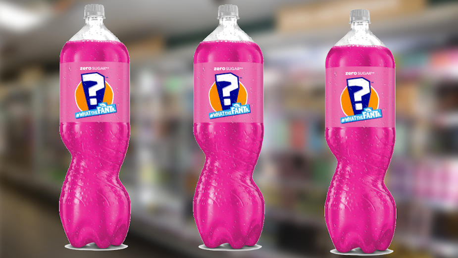
I’ve not chosen this for the advert to be honest, but instead for the sheer depth of the entire experience. For Fanta to go this far with liquid innovation and develop a hugely engaging campaign and ecosystem - right through to eCommerce - feels a great big glorious winning bet on not only their own creativity, but that of consumers too. Brilliant.
KFC - 'KFC Delivery'
Agency: Mother
Production: Biscuit
Post: Electric Theatre Collective
Editoria: Shift Post
Sound: Pitch & Sync x No.8
Things keep changing. The clock ticks, the day unfolds, we rush, life gets faster. Advertising bombards you relentlessly, everywhere, on every device. So, wherever you find stillness, enjoy it and let it feed you - it doesn’t that seem like an appropriate starting point considering it’s for KFC. I just like how ‘still’ these are. It’s clever in its juxtaposition to the usual frenetic imagery we see, and that makes it noticeable. Clever strategy helps too.
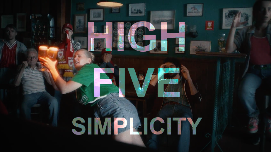
Carlsberg - 'Forever Fans'
Agency: The Network
Production: new-land
It’s the music that makes this. It elevates the work from something good, to something spine-tingly. There are some beautiful moments through the film, with plenty of less eye-catching material which really allows space for the music, song and sound to stitch it all together into something that makes me smile.
London Fire Brigade - 'The Running Towards'
Agency: Studio Sutherl x The Foundry Types
For anyone who loves a typography poster, you couldn’t do much better than 'The Running Towards' exhibition at the London Design Festival. The exhibition celebrated London Fire Brigade's new typeface and design history, appropriately held in the Shoreditch fire station. It’s a great font. It was a gorgeous exhibition of design.
Down Syndrome UK - 'Don’t-Put-Me-Down Syndrome'
Agency: VMLY&R COMMERCE
Production: VMLY&R COMMERCE x VMLY&R Hogarth
Media: Mindshare
Not only did this idea manage to secure free media space with Sky News, Sky Sports, Metro and Zoom (amounting to an estimated 18 million views), but it also got to where it was needed most: The UK Houses of Parliament. The campaign is helping the Down Syndrome UK charity persuade MPs to commit to rewriting protocols and language used when speaking to new parents about down syndrome. Aiming for a change from devastating negativity (which pushes for abortion) to a more balanced view which shows there’s plenty to be positive about down syndrome. It’s not just clever copy, but effective creativity.


