


Health, Hygiene and Nutrition Company RB Rebrands to Reckitt

Today health and hygiene company RB announces that it has rebranded as Reckitt. The redevelopment of the corporate identity is a key milestone in the organisation’s ongoing journey of transformation towards sustainable growth. The new brand identity and iconography is more recognisable and is built on the company’s purpose: to protect, heal and nurture in the relentless pursuit of a cleaner, healthier world.
Miguel Veiga-Pestana, SVP corporate affairs and sustainability, said: “The brand is a visible symbol of our corporate purpose and the change that has been taking place across the business on our journey of transformation. The name reflects the existing widespread usage of Reckitt and is clearer, simpler and more memorable, while retaining positive associations with the company’s heritage.”
Commenting on the new identity, Jo Osborn, VP internal communications and corporate brand, said: “From Dettol to Lysol, Nurofen to Durex and Finish to Vanish, we sell more than 20 million of our trusted products to people every day, yet there is less recognition of the company behind those brands. Our new Reckitt identity will better enable us to communicate our corporate purpose to the world, and to do so in a way that is powerful, consistent and impactful.”
The comprehensive rebrand, including a new visual identity, was created and overseen by Havas’ branding agency Conran Design Group. Rolling out across all of Reckitt’s touchpoints and platforms – internal and external, physical and digital – from today, it comprises:
- A new name and logo – the R at the heart of the symbol stands for our unity, strength and relentless pursuit, inspired by Reckitt’s purpose to protect, heal and nurture. It denotes Reckitt’s role in the world as a partner and a catalyst for positive transformation. The shell-like quality of the symbol evokes a sense of protection and a reference to the natural world.
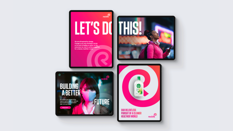
- An evolved colour palette – the highly distinctive and recognisable ‘Energy Pink’ is Reckitt’s primary brand colour, signifying its perpetual energy – while secondary colours reflect its portfolio of products and connection to a cleaner, healthier world.
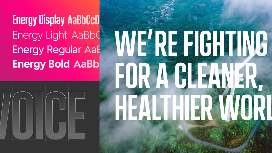
- Bespoke typography – a new, bespoke typeface ‘Energy’ is distinctive, accessible and unique to the Reckitt brand.
- Photography – new photography principles and categories illustrate how everything Reckitt does is connected and has an impact on the world. Authentic, accessible and active imagery will show how change starts with an individual, the tangible impact Reckitt has on people’s lives, the strength of its partnerships and its understanding of a changing world.
The implementation of the new brand will be delivered over a three-year timeline, using the natural replacement cycles of the business to manage an impactful transition in a cost-effective way.
Commenting on the brand redesign, Thom Newton, CEO, Conran Design Group said: “Reckitt has a compelling story to tell. The new Reckitt brand both reflects its 200-year history and provides an active expression of its purpose and ambition. The opportunity to work with the company to redevelop and launch the new brand was an opportunity we relished.”


