


Fred & Farid and JCDecaux Promote Positivity and Resiliency in US with Uplifting DOOH Campaign
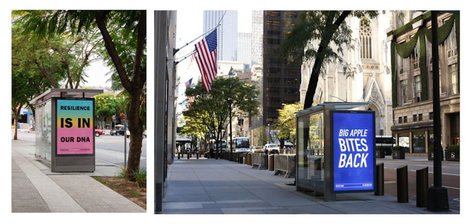
JCDecaux, known for its unique and innovative OOH media, has partnered with the global creative boutique Fred & Farid to develop a campaign using its Digital Street Furniture programs in four major US cities: New York, Los Angeles, Chicago and Boston. The campaign will be displayed across JCDecaux’s Digital Network of 500 displays, as well as on static inventory in Los Angeles (Outfront/JCDecaux).
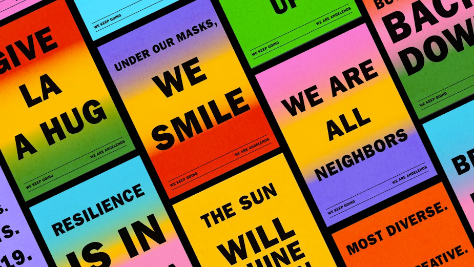
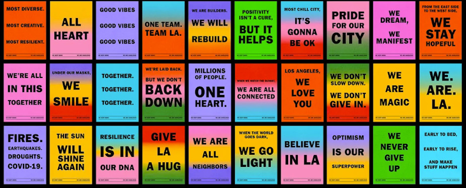
Instead of taking a traditional B2B approach to reach new advertisers, Fred & Farid Los Angeles proposed an alternative initiative to address the emotional weight many Americans were collectively feeling, using Decaux’s inventory to display positive and encouraging messaging, reinforcing the feeling of belonging to these great cities. The agency crafted 150 slogans promoting resiliency and embracing the spirit of the four cities, in an effort to create goodwill. With a simple slogan: 'We Keep Going'.
This initiative was created with the understanding that Covid-19 will have long-lasting effects, many of which we're just beginning to fully understand. Through this collaborative effort between JCDecaux and Fred & Farid, the hope is that these colourful and heartwarming messages will serve to unite the citizens of these cities, enhancing the feeling of being part of a shared community.
For Los Angeles, the posters were inspired by the vibrant colours of the city, taking on a classic printing style that has been used on the streets of LA for decades. The agency created a mosaic of over 60 posters in both English and Spanish language.
For Chicago, the creative teams utilised the colour palette and iconography of the city star, core branding elements from the City flag, as the two leading elements and paired them with an iconic rounded typeface: Avant Garde Gothic. This typeface was used on signage across the city from famous theatres to the Chicago Skyway Toll Bridge.

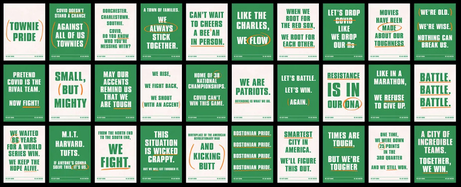
For Boston, some native Bostonians within the agency drafted ‘wicked’ one-liners tying into the rich sports culture of the city, utilising Boston’s beloved 'lucky' green and sporty typography, with handwritten orange accents inspired by a coach’s playbook.
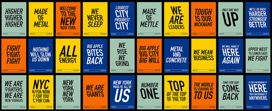
For New York, Fred & Farid tapped its New York office to weigh in on designs and headlines, taking inspiration from the fighting spirit of the city, its towering steel skyscrapers, the brick colour on the walls, the iconic yellow of the taxis, and the zig-zag shape of fire escapes on traditional buildings.
“No big emotional statement. No hashtag or call-to-action. Just a fact: We keep going. Because that’s all we can do." said Fred & Farid founders and chief creative officers.
Jean-Luc Decaux added: “Despite coming from all around the world, we have a shared sense of pride in our hometowns. We believe that we will overcome the challenges that have plagued us this past year, and will come out stronger and more resilient than ever before."
Click here to discover, download or print the 150 posters.


