
“Fierce. Friendly. Fearless.”: Behind Terri & Sandy’s One-of-a-Kind Rebrand


2023 marked US agency Terri & Sandy's 13th year in business. Founders Terri Meyer and Sandy Greenberg wanted to mark the occasion with a celebration; a celebration of the fact that while they may be ‘unlucky’ 13 years old, they've never felt luckier.
The internal team, led by associate creative director Tanya Saliba, wanted the invigorated identity to make a statement and leave a lasting impression. That’s what inspired them to design eight intricately illustrated patterns that communicate the creative and powerful personality of the T&S brand.
Born from Terri & Sandy’s personal aesthetic, these one-of-a-kind wallpapers (created by an all-female creative team) combine bold, modern accents with timeless, lush floral illustrations bursting with intrigue. According to the team, "each one embodies the perfect balance of fierceness and understated elegance — along with hidden Easter eggs that help tell the Terri & Sandy story".
The wallpapers were designed by Katerina (Katya) Murysina, a Berlin-based illustrator and graphic artist who specialises in digital illustrations. Her clients have included Adobe, Nike, LVMH, L’Officiel, YSL Beauty, Vogue, GQ, Esquire.
All together, they capture the agency’s unique personality: fierce, friendly, and fearless.
Lead creative Tanya spoke with LBB's Addison Capper about how it all came to be.
Lead creative Tanya spoke with LBB's Addison Capper about how it all came to be.
Why now
“2023 marked 13 extraordinary years of Terri & Sandy. So to celebrate this milestone, we decided it was time for a fresh and reinvigorated identity.”
Key elements to convey with a new look
“There were three words that guided us through the entire rebrand: Fierce. Friendly. Fearless. Every element of the new look had to call back to those three themes.”
How the look was born from Terri & Sandy’s personal aesthetic
“The look was truly inspired by Terri and Sandy as people. We made sure to infuse the elements of their own personality style into everything. From what they wear—pearls are their signature staple. To how they designed their office—lush florals and bold graphic prints. To the way they lead their agency—with fierce, understated elegance that exudes creativity and leaves a lasting impression.”
Why Katya was perfect to bring it to life
“The visual style we wanted is very intricate and unique, so it turned out harder than we thought to find the right designer. We had to get creative with our search. We looked everywhere—Instagram, Pinterest, Etsy, even wallpaper companies.
“We went through what felt like hundreds of portfolios until we came across Katya. Her hand drawn intricate patterns immediately caught our attention—they aren’t overly structured or repetitive, but feel organic and rich with depth. Her work has the balance of quirkiness, edginess, and femininity that we were looking for. And as a bonus, she already had a strong background in drawing florals.”
The creative process
“Katya was amazing to work with. She was so collaborative and found ways to build upon our initial concept.
“As for the process, we pulled together a detailed brief for each illustration. We talked through it in detail with her, brainstorming and collaborating all along the way. Then she sketched out rough illustrations to get a sense of the forms, structure and elements.
“Once we nailed the sketches, it was easy for Katya to create the detailed linework and digitise everything. We worked closely to find the right Easter eggs and nuances to add to each pattern. Katya had some really clever ideas that helped elevate the illustrations even more than we could have ever imagined.”
Inspiration behind the various wallpaper elements
“Each one-of-a-kind illustration has a purpose and truly captures our agency’s essence, culture and personality.
“Some examples:
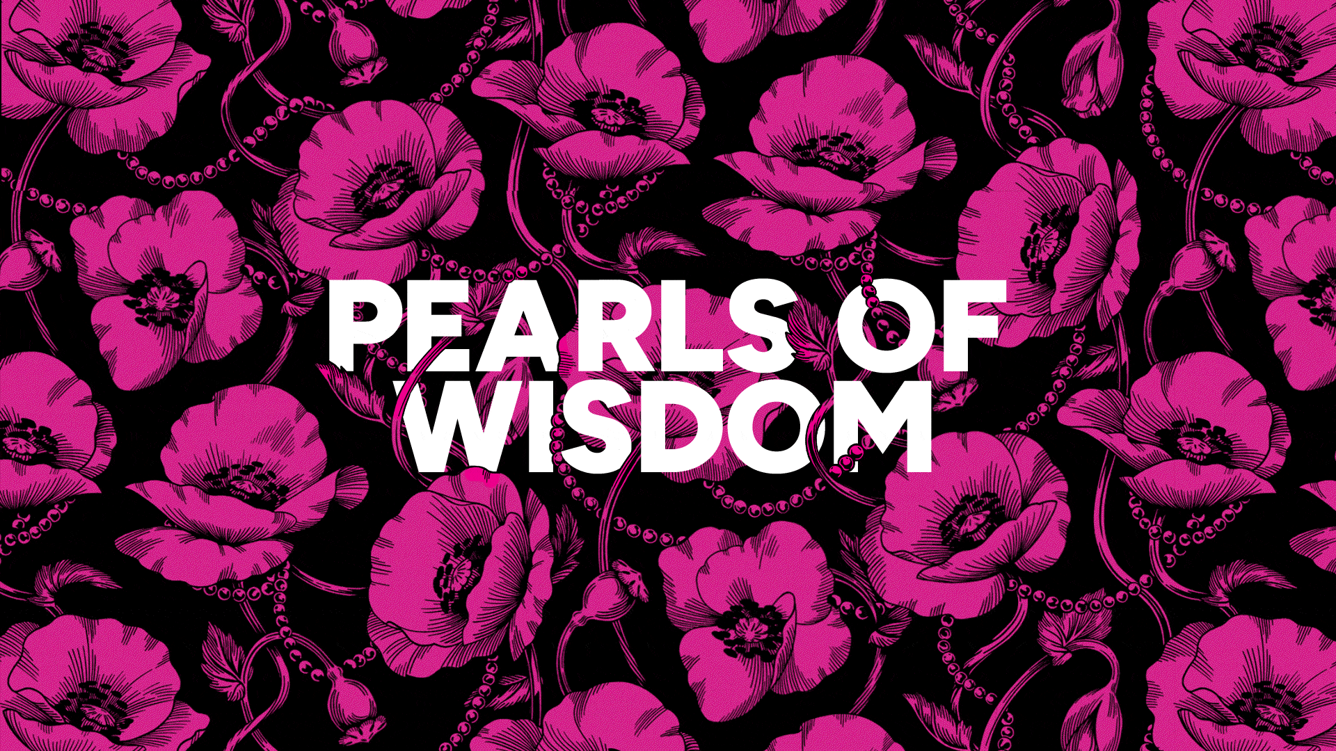
According to the 4A’s, there are 14,000 advertising agencies across the United States. Less than 1% are owned by women. The sheer badassery of being a member of that 1% is undeniably worthy of a pattern. The Pearls & Florals wallpaper leans into feminine imagery with gorgeous florals and subtle strings of pearls—a Terri & Sandy signature.
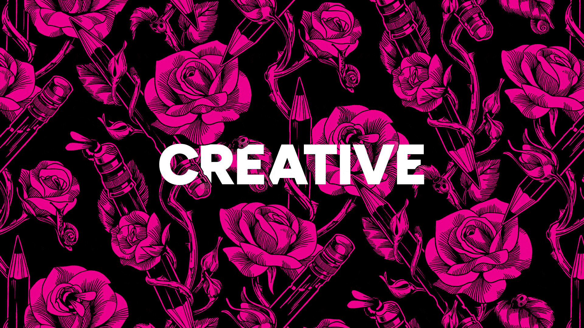
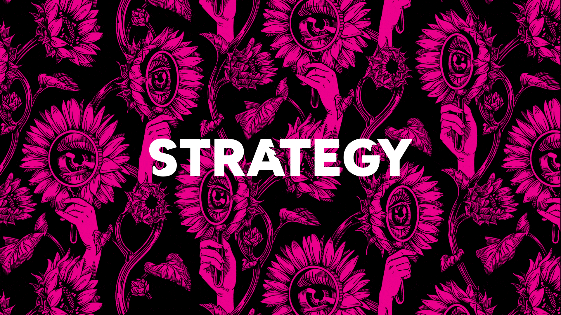
“The Pencils & Roses wallpaper is dedicated to our creative team, featuring sharpened, worn-in pencils wrapped in roses and bursting with intrigue. The Sunflowers & Magnifying Glasses wallpaper shows off our insight-building capabilities and celebrates our award-winning strategy department.
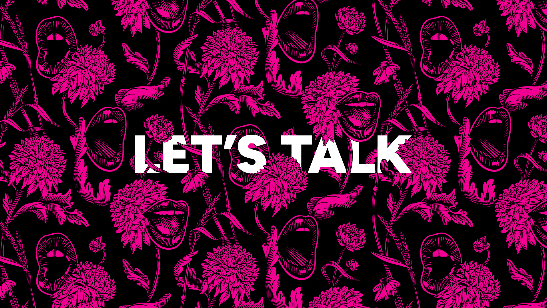
“The Mouths & Blooms wallpaper communicates how we are in the business of storytelling and pride ourselves on creating work that is smart, simple and loud. Our company is proud to give brands we love a distinct fearless voice.”
Easter eggs
“I won’t give everything away, but here are a few hints to get you started:
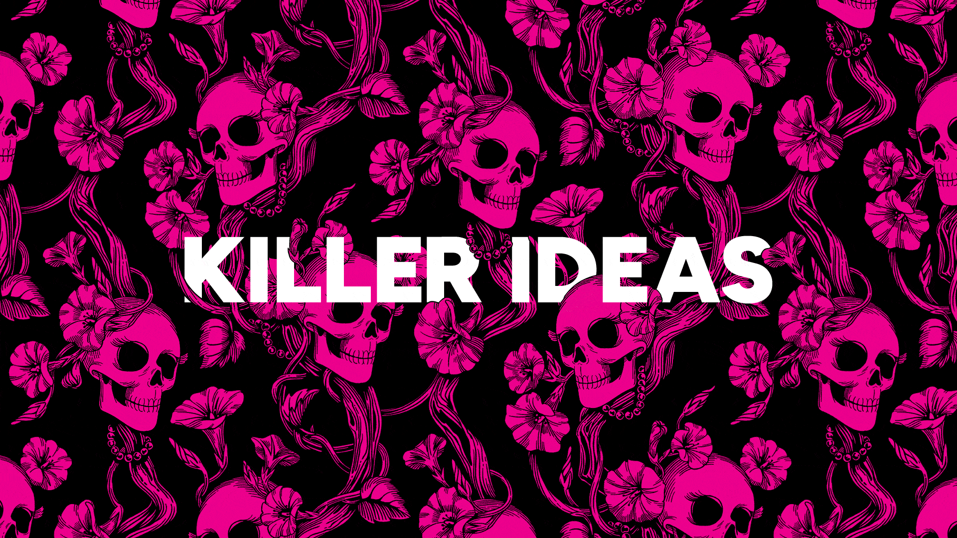
“If you look closely at the Skulls & Vines wallpaper, you can see the skulls are smiling and have eyelashes—hinting at our sharp-witted employees who are always working towards killer ideas.
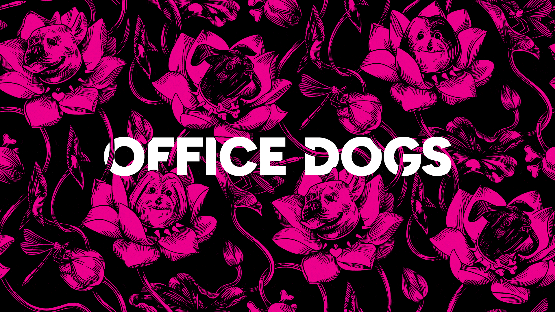
“The Dogs & Water Lilies wallpaper, in particular, has some fun Easter eggs. Dogs are not just allowed but are encouraged in our office. On any given day at 40 Fulton St. you'll find a handful of pups frolicking through our conference rooms, so it only made sense to have an illustration featuring them. You can find Terri & Sandy’s own dogs featured, along with some edgy dog collar accessories.”
Challenges, as a creative agency, to rebrand yourself
"When Terri & Sandy asked me to lead the rebrand, I knew it was going to be a fun challenge. They have built one of the most successful and highly regarded independent agencies in the industry—this rebrand would only work if it matched their high calibre.
"To do this right, I had to treat Terri & Sandy as if they were a real client. I started off by doing a brand audit where we talked about their strategic needs and goals, then I put together a creative brief that would be our guide throughout the entire process. We presented three wildly different directions to Terri & Sandy, and they fell in love with one right on the spot!
"And for good reason—the new identity truly communicates the creative and powerful personality of the Terri & Sandy brand."