


Energy Drink A SHOC Shakes Up the Category with Charged by Nature Campaign, Brand Identity and Design
When we think of energy drinks, we typically lean towards intense, neon packaging and supercharged gym sessions, but one brand is determined to change this frame of thinking.
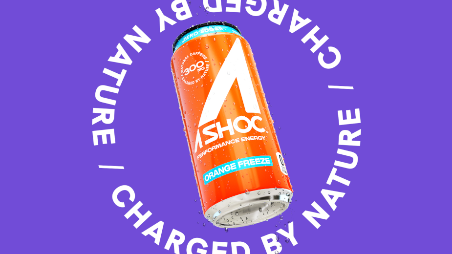
A new client for creative agency Deutsch LA, A SHOC is making waves in the energy drink category. Out this month with a new campaign, 'Charged by Nature,' and a new brand identity and design, A SHOC touts a West Coast way to energy.
The energy category is the second largest category in the beverage space, with performance energy leading category growth, with 269% growth over the past three-year span. With this kind of growth, A SHOC saw an opportunity for a different kind of brand – one geared toward young, independent, frequent energy drinkers who lead active lifestyles and enjoy belonging to communities focused on fitness, wellness, and other hobbies.
“Unlike other energy drink brands, we break away from stereotypical energy drink conventions, such as using an energy drink for an all-nighter or a rage," said A SHOC chief marketing officer Taylor Whisenand. "We wanted the creative work for the brand to feel fresh and vibrant for the next generation of athletes who embrace the outdoors, train in nature, and reach their peak, fuelled by a better way to energy.”
Made in partnership with creative agency Deutsch LA, the 'Charged by Nature' campaign and packaging redesign includes digital video, out-of-home, print, digital and social elements. A SHOC works in partnership with KDP for its national distribution of products.
“With the new brand positioning, our design approach was to revise the logo and the can labels with the west coast lifestyle in mind," said Adhemas Batista, EVP, head of design at Deutsch LA. "California is the place where culture, entertainment and technology converge. We wanted the design capture that same energy while also feeling more approachable."
Inspired by the brand’s distinct ethos that exists in stark contrast to the conventions of the energy drink category, the design team set out to achieve a look that’s markedly different from the intense and aggressive style of other cans in the market. The result is a custom design, typeface, and visual manifestation of the A SHOC brand that leans into the powerful light, natural colours, and refreshing vibes of California design.
Adhemas went on to say: "working on the hierarchy of information, we created a simple system that values the content and focuses on the core information for a quick read that balances the negative space. Lastly, we introduced few new fonts, then we chose a new body copy font for support, both designed by the same studio, Hanken.co.”


