


CommBank's Brand Refresh Celebrates Customers with New Creative Platform
This week sees the launch of a nationwide campaign for Commonwealth Bank, evolving the bank’s visual identity and creative platform in Australia via M&C Saatchi and Re Agency. The new creative platform, ‘Can Lives Here’ is a reminder to Australians that our unique country is perfectly positioned to unlock opportunities, plans and dreams – no matter how big or small, and it celebrates the Australian capacity to not only thrive, but to stay optimistic even when optimism is under threat.
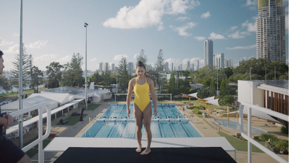
The ‘Can do’ spirit is exemplified not by actors, but by real Australians from all walks of life and from every corner of the country. Alongside a complete brand refresh, the campaign reflects the bank’s evolution after a tumultuous year for the country.
Cam Blackley, chief creative officer, M&C Saatchi, said: “In the early parts of creative development, we spoke directly with customers and front-line staff and we heard over and over again about that shared resilience, the 'can do' attitude and positivity that Aussies have always shown. The ability and willingness to get on with it no matter what life throws at you. We wanted to create a campaign that celebrates and showcases the achievements and attributes of these people, on television, in print, on outdoor sites and social media. Each are real stories of Can about real customers showing that Can really does live here.”
Executive creative director of M&C Saatchi’s design business Re Agency, Andy Thomas, added: “CommBank’s diamond is an iconic and significant asset, and the single asset that is most recalled by its customers. We wanted to ensure that the new visual identity was rooted in the brand’s strong heritage but also serves as a beacon of positivity and measured optimism of a brighter tomorrow.”
Monique Macleod, CMO, Commonwealth Bank of Australia, continued: “CommBank’s transformation as a bank acknowledges that we needed to take meaningful action to deliver change that put the needs of our customers front and centre. Our brand is a symbol of who we are, what we stand for, and the experience our customers and communities can expect from us. With the work we are doing to reinvent the organisation around a new strategy and values, now is the right time to refresh the iconic diamond, making it lighter, brighter and more dynamic, and inject new meaning into the Can platform. A symbol of optimism fit for the future and one that represents the work we’ve done to be better, the work we still have to do, and the brighter future we are committed to helping Australia achieve.”
The full brand refresh campaign launched with teaser OOH executions and then a full rollout on Sunday 11th October, consisting of a "60, "30 and "15 second film OOH, press in all major publications, as well as across social platforms.


