


“Colourful Fun for All”: Inside the M&M’S Makeover
If, like us, you’re a sucker for a good makeover story, you’ve likely seen the news that Mars-owned candy brand M&M’S has given its six mascots a fresh new lewk. But while the big brand refresh is grabbing headlines by and generating a great deal of buzz and debate, take a moment to look closer and it becomes apparent that the whole exercise is a lot more nuanced and pragmatic.
The six polished-up mascots are just one part of a push for the brand to be more inclusive and ready for the future. It focuses on personality over things like gender. By emphasising universal human drives, such as the need for belonging, that helps the brand makesure that its platform can have a globally relevance. There’s also a vibrant and eye-catching redesign of the other brand assets, which make smart use of the bold colour palette and typography.
It was, it’s fair to say, a mammoth undertaking for the team at Mars Wrigley and their partners at BBDO and JKR. Certainly, it’s not the kind of project one takes on lightly. So what was the catalyst for the tasty refresh?
Rankin Carroll is Chief Brand & Content Officer at Mars Wrigley and he says that there was no single moment that spurred the team to act, but that it was the result of an ongoing desire to protect the brand and ensure its longevity.
“As a brand that has been around for over 80 years, it’s imperative that we continue to evolve to reflect the more dynamic, progressive world that we live in,” says Rankin. “So, while there was no pivotal moment that spurred this move, we’re always assessing our brand to ensure it connects with our fans in meaningful ways. M&M’S has long been committed to creating all kinds of colorful fun for all. This purpose serves as a more concrete commitment to what we’ve always believed as a brand: that fun is the most powerful way to include people and help them feel that they belong.”
Often, marketers and strategists that work with brand mascots have a deep and detailed understanding of who those characters are, including all sorts of things that would never make it into the final assets and content. What do they eat for breakfast? Who’s their favourite musician? What do they get up to when the cameras stop rolling? And that is certainly the case with M&M’S. According to Rankin, the team dug into the existing character frameworks with an eye to making them feel more concrete and relevant, and distilling what it was that really made each one distinct.
“M&M’S is really fortunate that our six characters are so beloved, and each already has a robust ‘back story’ informing how they ultimately show up in our content,” says Rankin. “As we geared up to make our commitment to creating a world where everyone feels they belong more concrete, we knew our characters would be one of the most powerful ways we had to bring that commitment to life, and we wanted to make sure we were future proofing them as we look towards the next 80 years and beyond. We took a deep look at our characters, both inside and out, and have evolved their look, personalities, and backstories to be more representative of today’s society. For some, like Green, the changes were more noticeable, while for others, like Red, they’re a bit more nuanced.”
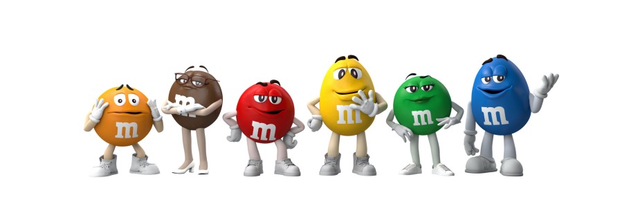
And yes, the two traditionally ‘female’ M&M’S have had the most visible changes. Green has swapped vampish flirtatiousness for confidence, is wearing sneakers rather than Nancy Sinatra go-go boots, and is more one of the gang. Meanwhile bookish Brown has ditched the dizzying heels for something a bit more walkable. It speaks to a wider rethink on gender and a desire to focus more on personality.
“A longstanding mainstay within our brand, our characters were assigned gender at the time of their creation. As society has evolved to put less of an emphasis on gender, our characters have also evolved, with titles becoming less important than celebrating each of their dynamic personalities,” says Rankin. “With our evolved cast today, we have addressed gender by: Removing the prefixes from their names, like “Ms.,” to shift the focus to their personalities rather than their gender; Ensuring all characters play more modern, progressive roles in our stories despite their gender; Featuring the full cast more often across all of our content, to ensure a more representative presence of our dynamic characters.”
While some commentators have jumped on the outrage wagon, for Rankin, the reasoning is a lot more prosaic and practical. “It’s important to note our spokes candies are just that – chocolate candies – and do not have assigned race, ethnicity or sexual orientation. Our characters will continue to evolve as our brand does and we think fans will be excited to see what’s in store.”
The makeover and the brand refresh is really a statement of intent, a manifesto for M&M’S. It’s designed to put ‘belonging’ and inclusiveness at the heart of the brand - or rather, bringing those elements out more explicitly. Unpicking that, the team found that the human desire for belonging was universal and something that could resonate on a deeper psychological level.
“Studies show our desire to belong is as strong as our desire to be loved and that desire is common for all people irrespective of culture, race, ethnicity, geography, or location,” says Rankin. “M&M’S has long been committed to creating all kinds of colorful fun for all and has always believed that fun is the most powerful way to include people and help them feel that they belong. This purpose isn’t so much new as it is a more concrete commitment to what we’ve always believed as a brand.
Since the launch of the brand and makeover, there’s certainly been a lot of engagement online and in the media. Some have embraced what M&M’S is doing, while others have bemoaned it for being ‘woke’. But for the team, it’s less about politics and more about being able to do more with the beloved characters and allow their personalities to resonate better and feel more real.
“It’s certainly been exciting to see all of the thought-provoking responses rolling in,” says Rankin. “As I mentioned before, we know how much people love the characters, and expected the changes to resonate with fans. The response was exciting to see and I think it reinforces not only the power of this iconic brand, but also how truly engaged and invested our consumers are. It’s important to also highlight how our characters are multi-dimensional and how they’ll continue to show up in the world in a variety of ways. They each have many different facets to their personalities and fans are going to see that evolution come to life over the next year and beyond.”
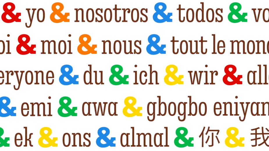
Aside from the headline-grabbing mascot makeover, there’s also been a big design project underpinning the launch. The distinctive chunky serifed typography has been elevated and given greater prominence, particularly the logo’s ampersand. It’s the perfect vehicle to emphasise the feeling of belonging and togetherness that the marketing team are keen to push.
Within it all, there’s also that classic design challenge of creating something new and fresh but that still leverages everything that keeps the M&M brand so distinct.
“As we launched our M&M’S purpose strategy of creating a world where everyone feels they belong, we wanted to ensure all assets across the brand supported that mission,” explains Rankin. “As an iconic brand, we have the benefit of having a bank of distinctive assets across our brandmark, including our beloved characters, product lentils and the M icon – all of which were reassessed to ensure flexibility and meaning to infuse our brand purpose at every touch point.”
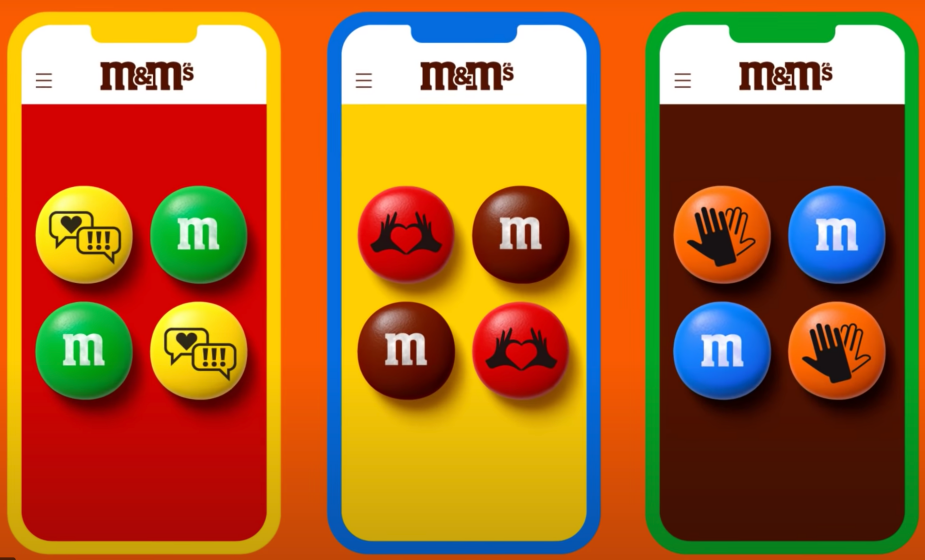
The changes will filter out and see the brand embrace its purpose more explicitly but also have a bit more fun with all of the pop art bright colours at its disposal. “Beginning this year, fans of the brand will notice several changes rolling out in M&M’S branded content, properties, experiences and products, to show how the brand will assert its purpose and reflect a world where everyone feels they belong, including: An enhanced focus on the use of the brand’s iconic color palette, expanding beyond yellow and brown to offer an array of colors with our delicious candies; Use of a variety of different shapes and sizes of M&M’S lentils across all touchpoints to prove that all together, we’re more fun, regardless of our differences.
"An added emphasis on the ampersand – a distinctive element within the M&M’S logo that serves to connect the two Ms – will be used more prominently to demonstrate how the brand aims to bring people together.”
One thing that’s definitely not going anywhere is the brand’s love of humour, which Rankin describes as a ‘signature jester wit’, but now everyone gets to be in on the joke. “Our signature jester wit and humor will still be at the heart of our brand but going forward we will have an even bigger focus on helping more people feel they belong, through a more inclusive, welcoming, and unifying lens,” says Rankin. “Our characters have evolved personalities and back stories to allow them to tell more modern and progressive stories. Our storylines used to focus on the consumption of the characters but will now center around using fun as a way to help people feel that they belong.”
Before the wide launch of the makeover last week, the team had already rolled out the new design and brand purpose at the Berlin flagship store. Unusually for a confectionary brand, M&M’S has a network of flagship stores all over the world, and one of the benefits is being able to try things out with customers on the ground. And the response in Berlin was exceptionally positive. “That’s correct; the M&M’S brand purpose is already on full display at the new M&M’S store in Berlin, which features multiple languages on signage as an invitation to all and our most diverse Associate base that celebrates those from different cultures, backgrounds, and generations. Since opening in early October, the people of Berlin have embraced us with opened arms and seem really pleased with what we have in store for them. These changes will show up in our other existing stores over time, as we continue to roll out our new brand purpose across every element of the brand.”
Ultimately, the new look allows the brand to display its purpose but also, more practically, talk to a broader range of people. The team is less interested in what’s trendy now but in what will be beneficial for the brand for many years to come. “The new look and feel of the global brand, reflects our evolved focus to be built for modern storytelling and to ensure today’s consumers are represented in how that story comes to life.”


