


Brands, Be Authentic About WorldPride

Lions and tigers and bears… oh my, it’s World Pride and our beautiful city has donned its best rainbow suit and welcomed thousands from interstate and overseas. As a gay man, I love seeing the city embrace love and acceptance. But the creative director in me does apply a healthy dose of cynicism to the proceedings.
Don’t get me wrong, if you’re a brand that’s actively creating inclusion policies for your staff and promoting queer rights in general throughout the year, then crack out those rainbow flags people and fly them high. But if you’re a brand that’s just jumping on the bandwagon to capitalise on the event, then expect to get called in on it.
Think about it. If you’re a Brit, you wouldn’t fly an American flag just because you eat hamburgers. Okay, bad analogy. But you get what I mean. Flying a flag is a big deal. It’s imbued with meaning, and importantly, it needs to be done with authenticity.
Paper Moose is in the heart of Surry Hills so it’s no surprise that it’s been awash with ‘Pridevertising’ (trademark pending) these past few weeks. But one bus shelter in particular had in rotation only pride ads so I thought I’d do a little review of each as we head on into the weekend’s festivities.

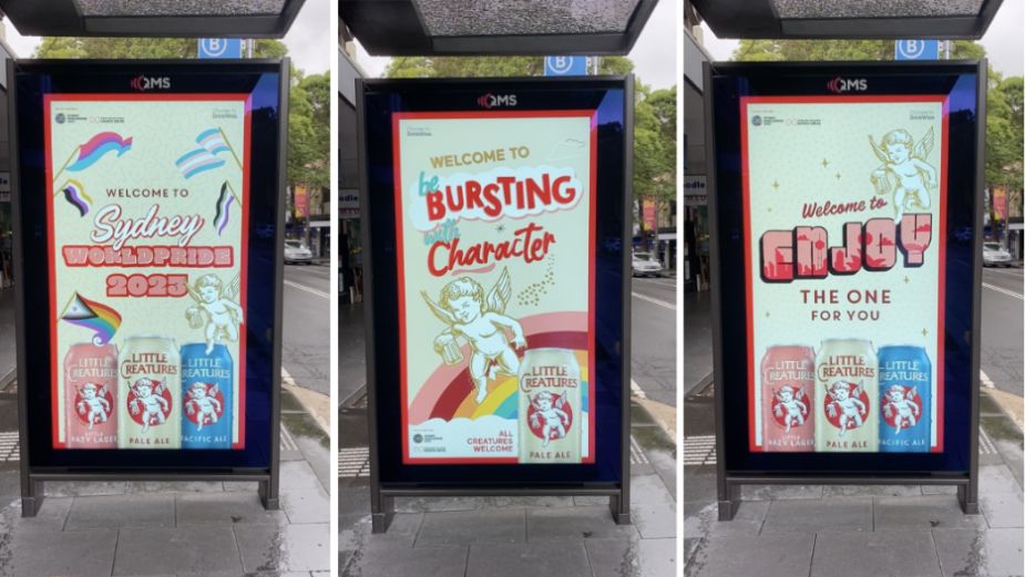
Little Creatures – ‘All creatures welcome’
The first placement [picture on top] introduces us to a generic ‘Welcome to Sydney WorldPride 2023’ which is fine but those looking a bit closer will see the rather tokenistic inclusion of a bunch of community flags that seem to loosely align to their product line up. Was this intentional? If so, it’s pretty icky.
Viewing the second ad, you see a clunky platform emerge using ‘Welcome to…’ as the mechanic. In this case ‘Welcome to be bursting with character’, which isn’t even English.
The last ad is even worse with the message ‘Welcome to Enjoy the one for you’. All right, Little Creatures, thanks for that.
Verdict 4/10
Little Creatures has embraced the queer community in Sydney with a big presence at Fair Day and Mardi Gras so it’s a shame to see advertising like this. Their tagline ‘All Creatures Welcome’ is great and should have been elevated proudly front and centre (like they’ve done on their tram wraps). It’s the perfect line for this time of year and doesn’t need dressing up with a clunky platform.

Optus – ‘Pride starts with yes’
Optus is a Premier Partner of Sydney WorldPride and are well known for being an inclusive and diverse workplace. So it makes sense to show your pride with a campaign that showcases Optus staff in your ad campaign. I even recognised someone I knew in one of the ads (who works at Optus) so I know it’s authentic. My only issue with this campaign is that they’ve shoehorned ‘yes’ into it. ‘Yes’ is a word with varying connotations for the queer community. Marriage equality. Consent. Drug and alcohol use. For me, the word ‘yes’ is still too broad and in this context, it could actually be perceived very differently (especially by those from out of town).
Verdict 6/10
An authentic campaign that would be better without the inclusion of the brand platform.

Johnnie Walker – ‘Keep walking proudly’
In this campaign, we have some, I’m guessing, influencers striding past the camera taking a quick glance to the camera. The poses feel super awkward to me and the quotes similarly so. The tagline ‘Keep walking proudly’ is fine, but is getting overshadowed by a confusing creative idea. The brand itself is also strangely recessive so I’m not sure this is doing much of a job of anything.
Verdict 3/10
An overly stylised ad without much substance.

Durex – ‘Own it’
I think this campaign is bang on the money. The photography is sexy and authentic and the art direction drew me in. They’ve embraced the X in Durex which gives them a nice device for photography and copy. The headlines are a little generic to be sure, but overall, this feels right for the brand and right for a pride placement. I’m pretty sure this campaign runs throughout the year and rightly so. We should be seeing images like this throughout Australia as a way to further normalise seeing queer people in our communities.
Verdict 7/10
A sexy campaign that can run all year.

American Express – ‘Express yourself’
This is a poor effort from AMEX, who seem intent on shoe-horning a creative platform into their ad placements. Chef & Proud. Athlete & Proud. It doesn’t make much sense to me. I guess the people photographed are queer, but I just don’t really see the connection to the brand. ‘Express yourself’ as a line is getting towards a more interesting place but the execution is lacking. That rainbow ampersand…. Ew.
Verdict 3/10
A generic execution with very little to say.

Peloton – ‘Lead with love’
Peloton?? What’s going on here? This glum ad really isn’t working for me without some kind of context. Why is this Peloton team member being quoted with this message? Why is there no photography or art direction to speak of? Why is that lovely line ‘Lead with love’ relegated to 8 pt? A fail all round in my book. Sorry.
Verdict 1/10
A missed opportunity for this tech brand to stand for something.
I’ll leave you with a little thought from the remarkably wonderful Eddie Izzard who has something to say about flags.
Happy WorldPride everyone!!!


