


Bolts From The Blue: How Filmmakers Enrich Their Work Through Colour


For all but the most scholarly movie experts, the name Edward Raymond Turner is unlikely to be instantly recognisable. But, over a century ago, the pioneering British inventor changed filmmaking forever.
From the advent of the first moving image, the world’s creative minds would regularly go to extraordinary lengths to include colour in their films. In 1903, the makers of the silent French film Vie et Passion du Christ painstakingly crafted hand-painted stills which would become frames over the course of the 44-minute silent epic. Creators resorted to these stupendous efforts - primitive now but ground-breaking for their time - because, until that point, technology had simply not yet landed on a way to capture moving images in colour. Fortunately, for filmmakers and audiences alike, that was all about to change.
Whilst Turner himself suddenly passed away in the same year that Vie et Passion du Christ was released, his transformative work in colour was picked up and adapted by, of all people, an eccentric stage hypnotist and part-time inventor named George Albert Smith. Shortly after, in 1906, the first successful colour picture motion process - Kinemacolor - was released upon the filmmaking world.
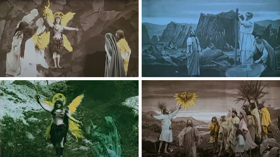
Above: Stills taken from Vie et Passion du Christ, which used rudimentary hand-painted images to provide groundbreaking colour backdrops in one of the first examples of colour in film.
Kinemacolor’s trick was to photograph and project a black-and-white film between alternating red and green filters (each made of dyed gelatine). The effect - as premiered in the short British film A Visit To The Seaside - was revolutionary. Here, for the first time on a screen, were humans and environments moving and existing in colour. Although Kinemacolor would later be replaced by the more sophisticated Technicolor, Turner’s work - guided to market by Smith and others - represented a point of no return for film. Colour, undoubtedly, was the future.
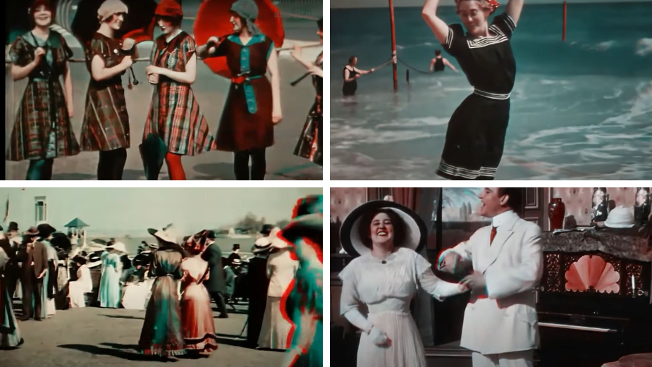
Above: Digitally remastered stills taken from 1908's A Visit to the Seaside and 1912's Atlantic City, which both used the Kinemacolor system.
If that potted history shows us anything, it’s that filmmakers have always strained to imbue their work with colour. Whether by hand-painting individual frames or inventing entirely new technologies, no means were seemingly too great in order to bring chromatic vibrancy to the silver screen. Whilst the modern world of filmmaking would probably represent an alien planet to the likes of Turner et al, there is at least a unifying thread between those pioneers and today’s creatives. In 2022 and beyond, colour remains an utterly crucial creative tool.
To find out how - and why - our current generation of filmmakers is incorporating colour into their work, Nice Shoes has combined research with original interviews to present our clearest insights yet into the relationship between colour and filmmaking as it exists today.
Filming With Flying Colours
“Colour is a huge part of what I’m focused on when I’m on-set”, says Gear Seven DP Justin Wylie. “It’s not just the composition, but also what those colours are doing. For example, are they complementing the talent? Are they drawing the viewer’s eye towards where we want it to go? The same goes for when you’re working with colour in post-production, but that thought process should begin before you get to the set itself”.
Just as in the early 1900s, there’s an extraordinary depth of detail to which filmmakers will go to achieve the precise balance of colour needed for a given project. “One of the first things I look for is how the light is bouncing off the performers themselves”, notes Nice Shoes’ senior colourist Sal Malfitano. “For example, what’s the difference in your own skin tone when you’re in a supermarket, at night under a street light, or when you’re on a beach at sunset? It’s the same skin, but it looks different. When it comes to capturing the feel or sensation of a place, it’s not just the colour of the setting you need to keep in mind, but also the relationship between quality light sources and what we see on-screen”.
Because of the importance of achieving the right colours on-set, filmmakers have for decades been in conflict with a particularly powerful enemy: the weather. With sunny skies seen - particularly by Western audiences - as associated with feelings of happiness and enjoyment, the tones and lighting imparted by the natural world often have a notable effect on even the most high-budget productions. But, with the right expertise, there are ways to achieve a desired tone in spite of any resistance from the natural world.
“We've been in situations where we've shot ‘summer scenes’ in the cold and rain, but with some simple camera trickery, lighting and a talented colourist, we can still create the effect of a warm summer's day”, says Geoff Manton, founder and producer at Boldly. “One example that comes to mind is our Okanagan Spring Brewery Campaign, which we shot in the Okanagan in early April. The snow had only melted a few weeks prior, so colour played a huge role in achieving the iconic heat and warmth of that region. That, and the bravery of our actors who were able to make us believe that they were plunging into ‘warm’ water!”.

Above: With its deceptively warm tones, this spot for Okanagan Spring Brewery was in fact shot only weeks after snow and ice had covered the landscape. Colour, inevitably, was crucial to imparting the required feeling.
There are other - perhaps surprising - ways, particularly in the commercial world, where it pays to have a mastery of colour. “Often, a brand will come to the table with colours they'd like us to incorporate”, says director Louis Browne. “I recently worked on a spot where the brand was adamant that none of their competitor's colours were showing up in any frames - which can get a little tricky!”.
So often, however, the key to achieving the right balance of colour - both on-set and in post production - is originality. Whilst reference points can be helpful, there will always be an original balance which most helps any given scene to pop.
“Films inspire all of us, and are often cited as references for creatives when planning their own projects”, notes Lenny Mastrandrea, a senior colourist at Nice Shoes. “But what we must keep in mind is that what works for one film might not work for another. These references should act as an inspiration for a project and not simply a blueprint to replicate. When that perfect - and original - intersection of colour and content occurs, it has a huge impact on an audience”.
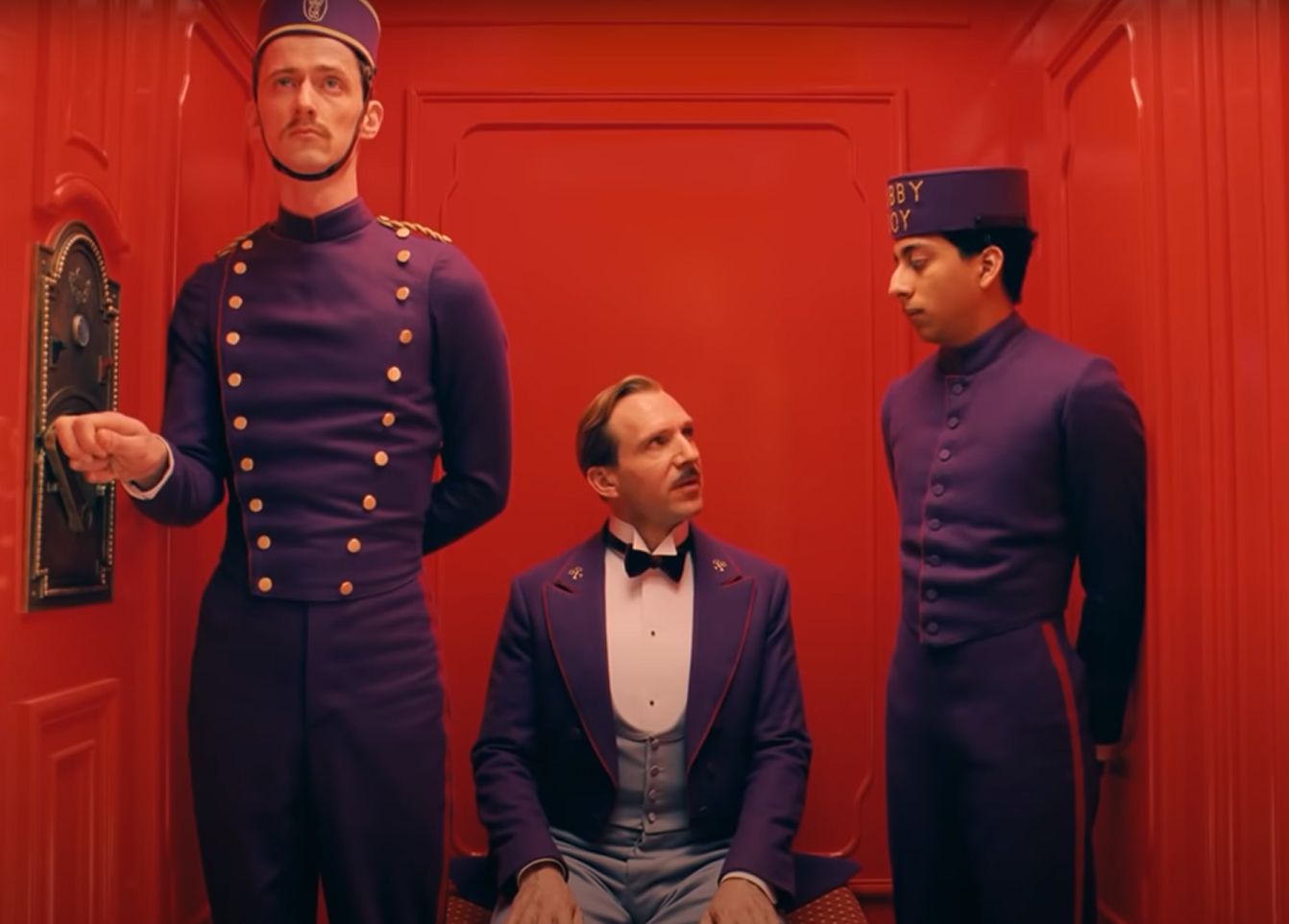
Above: 2014’s Grand Budapest Hotel has its own original (and often-referenced) look and feel. The best lesson creatives can take from its cultural impact, explains Lenny, is the importance of developing their own distinctive style.
Perhaps, then, there’s another lesson to be learned from those early days in the relationship between colour and film. At its best, on-screen colour has always arisen from a necessary mixture between art and technology. And, looking to the years ahead, it feels as though technology might be about to exert an even greater influence over the creative world. Through a suite of innovations including virtual production, immersive tech such as AR and VR, and the advent of the metaverse, the world of colour is not immune to the changes transforming the creative landscape around it.
Colour Us Curious
“Colour has an important role to play in immersive worlds”, explains Ninaad Kulkarni, Nice Shoes’ creative director for XR. “When the exact world you live in - for example the concrete jungle of New York - is put into the metaverse it’s not a comforting place where you want to escape to. You need to build an environment where people want to exist, using colour to play on emotions”.
In that sense, colour can be a helpful tool in embedding users into digital worlds with which they may be unfamiliar. “There’s a huge potential for augmented and virtual reality to provide meditative spaces”, continues Ninaad, “but we must accept that there are some colours we simply can’t use when building those spaces. Sharper reds, for example, are not conducive to a calm or welcoming environment. As always, however, the precise colour palette we work with will be dependent on the nature of the project”.

Above: The video game Tetris Effect, which is available in VR, has won plaudits for its use of colour in creating an immersive environment.
Even for more traditional projects, however, virtual production technologies are offering creatives more options and control over colours than ever before. “It’s cool to see a predetermined look for a scene on the monitor while I’m shooting”, says Gear Seven’s director JT McCreery. “If nothing else, it’s helpful to have some semblance of where the final shot is going to end up so that we know we're hitting the right tone. If it’s supposed to be a family enjoying their morning together in a living room, you want to know that you’ve achieved a warm and sunny look for example”.
For Justin Wylie, the rise of virtual production tech is also changing the way he approaches his work on-set. “You want to make sure that you’re using pre-production effectively. If you’re working with LED volumes, know that you’re only going to be able to capture as much as the walls can display”, he says. “That being said, the tech has also given us access to unlimited possibilities. You can plan ahead and design environments with the flexibility to change color and lighting in real time on set so that you know that your visual effects are working for what the scene and story needs".
Striking a similar note, Sal Malfitano highlights the effect that technology has had on the chromatic choices available to filmmakers. “Tech like HDR [High Dynamic Range] and Dolby Vision have put more rainbow in the rainbow, so to speak”, he says, “and colourists are taking advantage of that”.
The adoption of new tech, however, hasn’t lessened the importance of great in-the-moment filmmaking. “I do love a good LUT [Look-Up Table] on our monitors while shooting, and feel like it really helps get the client and talent excited about what we're capturing”, says Louis Browne. “But on the other hand I’ve been shooting more on film recently, and being so far away from the final image has forced me to change my process a little. You have to look at the scene as it's happening - the light in the room and the performance of the talent's face, with your own eyes more than through a screen”.
And so the practical approach to colour in filmmaking - stemming from those incredible efforts to hand-paint still images in the early 1900s - hasn’t yet gone away. As Geoff Manton explains, “there are a myriad of ways to highlight colour - lighting, set design, wardrobe, lens choices, and of course in the colouring process itself which can be explored with a DIT [digital imaging technician] on set”.
The more things change, the more they stay the same. That intense effort from creatives and filmmakers - first to recognise the sheer possibility of colour in film and now to realise its true potential - emanates from the same school of thought. Whilst technology is providing more options and making changes to the rules of engagement, the central truth has remained the same: A mastery of colour, then, now, and in the future, is a prerequisite for filmmaking success.


