


Blackmeal Seizes Breakfast by the Horns for Kellogg's

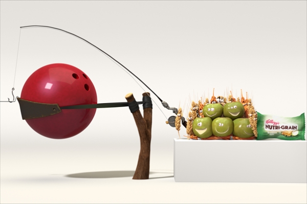
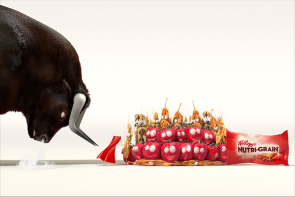
A nationwide 3D illustrated and animated campaign for breakfast cereal giant Kellogg’s shows off how many fruits and grains are packed into every single Nutri-grain breakfast cereal bar. The artwork and character development are the fruit of the labour of production house jelly London’s French crew Blackmeal, who worked closely with London creative agencies Isobar and Leo Burnett in creating the highly lifelike characters.
The campaign went live on 6 October 2014, across 1500 screens in convenience stores, as well as OOH, print, and digital/social. It’s designed to be fully responsive for use across all devices.
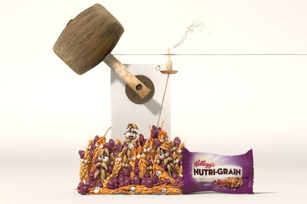
The fruit looks as natural as possible – even if they are little characters with big eyes – because the Nutri-Grain bars contain real, natural ingredients. The executions tell a visual story: there is much more fruit and cereal in your Nutri-grain cereal bar than you would imagine possible.
Making fruit alive with a face and personality and natural looking at the same time isn’t exactly a walk in the park for any illustrator. Blackmeal are a crew with superpowers when it comes to light and colour, which turned out to be good for the apples and strawberries.
Blackmeal creative director and executive producer Mael Francois: “Giving life to a fruity character is very similar to giving life to a CG human: it's all about how you use colour and manipulate expressions in the eyes. Fruit is naturally very colourful, but the way the colour is shown through translucent materials and smooth lighting determines whether it looks alive. Using flat colours will make your fruit character look fake, waxy or worse: dead. The trick is always to find a perfect balance between translucency and vibrant colour.”
“Our brief was to make the fruit and grains as realistic as possible, which meant that to make them convey emotions we had to work mostly with their interaction – how they push and squash to get into the breakfast bar – and their silhouettes. We had a lot of fun playing with their facial expressions as they mainly consist of big eyes and exploring how you can change the personality of a character just by opening or closing its eyes differently,” says Mael.
The typography for the campaign was created by jelly London’s star typographer Alison Carmichael. She is known for her hand-lettering and bespoke type design across many well-known brands. Her work was recently in the spotlights for breast cancer charity CoppaFeel’s latest awareness campaign in which she hand lettered across women’s bare chests to be photographed by Rankin. This time around, she says she was delighted to work collaboratively on a campaign with Blackmeal.
About the typography for Kellog’s she says: “The look and feel for this lettering is friendly and tasty, while it looks like it’s being squeezed into a Nutri-grain wrapper. Legibility for this type is very important when you distort letterforms in this way, especially since ‘Brkfst’ is a squeezed, made up word in itself.”


