Behind the Work: How Nice Shoes Coloured Meaning Into Nike’s Moving Mountains Series

Colour has the ability to transport and mesmerise, which is something Nice Shoes know all too well. In a recent project with Nike and Revery, the iconic creative studio colour graded two Nike films for the Moving Mountains series, which tells the real-life stories of ‘exceptional everyday athletes’ who have persevered and gone on truly transformative journeys.
Here, Nice Shoes dig into their work on two of the films: firstly, the story of Buddhist Monk and runner, Yukai Shimizu, which will be screened at The Telly Awards this month - with Maria also sitting on the judging council - and that of Carlos Brown, golf pro and amputee.
LBB learned how Nice Shoes’ senior colourist Maria Carretero managed to communicate the ‘deep connections between the challenges and emotional landscape’ with a balance of dramatic and soft colouring, all while allowing the audience to reflect on the personal experiences depicted.
LBB>Revery has a distinctive, often people-focused style when it comes to ads. What was your brief for this project?
Maria>Moving Mountains was a very special project to work on. The creative intention behind it was incredibly sophisticated.
Revery gave us the following brief: “Sport pushes us towards a goal, when we go head-to-head against others when we come face-to-face with ourselves. In some ways, sports are a distillation of both the challenges and the achievements we encounter in our lives – and the unstoppable force it takes to bridge the gap between."
Carlos was the first of the two episodes that I graded. I remember the conversations I had with the director Shern Sharma and editor Alvaro del Val about the story; We were looking to create a grading that defined the emotional moments that the film was trying to communicate, where you could feel the deep connections between the challenges and achievements and the emotional landscape around the character.
LBB>These films feel really special as a viewer. What was it like working on them?
Maria>These were inspirational experiences, not only because of the mindful stories but also because we were trying to elevate the documentary look. It was a path of experimentation until we found it. When we were colouring Carlos Brown, we had really deep conversations about how the colour needed to be present in the story, how we mixed the emotions with the palette and how all the reflective moments should be embraced by the colour.
LBB>The colours are powerful. What characteristics did you want to convey in the colour grading?
Maria>The two pieces are different.
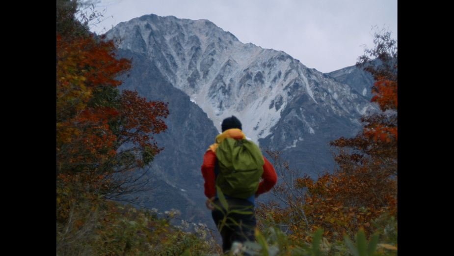
For Yukai, the story brought us to his temple in Nagano, to the trails around Happo Ike Pond and Mt. Karamatsu. As he is running through different landscapes, he moves through different roles, and his journey gives us visual storytelling. The colour embraces these landscapes and creates a visual difference between them. The muted brightness helps to explain the reflective atmosphere that surrounds the character.
For Carlos, an injury leads to the amputation of his leg, leading him to confront who he was, who he is now, and who he’s becoming in order to get back on the golf course.
Here is a story of introspection and overcoming. The colour helps to create the atmosphere that defines his emotional landscape in different moments. It’s all being made with muted tones, but with very rich details on the different highlights. We wanted to bring the feeling of the sun shining on the golf field as a sign of hope, and the silent morning as a moment of quiet reflection. There are very special moments when Carlos explains what Golf moves in him emotionally, and how he connects with his talent.
LBB>The colour grading in these films has a soft, almost muted look, while the topics being discussed are, you could say, harder. Was it important to have that balance?
Maria>I don’t think we can define harder topics with a specific palette. Every single story has its own circumstances based on the light and on the impact you are looking to have on the spectator. Both films are documentaries that invite us to reflect because both are very meaningful stories. The colour is poetic and soft because it needs to be subtle. Also, they're very positive stories so we wanted to do something dramatic with the colour.
LBB>Were you working with the audio too while colour grading? How was that experience?
Maria>The audio is a basic element of the storytelling, it completes the story with the image. The audio helps with the rhythm, the emotions, so it’s really helpful when you can listen to it when you’re grading because you can make the colour engage completely with the full sense of the story.
LBB>What were the influences and inspirations behind the work?
Maria>Nike commercials and sports documentaries.
LBB>Did you face any challenges while working on this project?
Maria>These kinds of projects very often come with a very tight deadline. The pieces embrace a very creative format, because of the mixed format between sports documentaries and commercials.
The look needed to be sophisticated like a commercial, but every single palette needed to be justified by the story. So the balance between sophistication, naturalism, and the short time to achieve this goal is the real challenge.


