


Behind the GSK Rebrand that Brings Science and Tech to Life
Today, GSK is a different company from the GlaxoSmithKline that launched in 2000, and the global context around it has shifted radically.
Following the proposed demerger of its consumer healthcare business, GSK will focus purely on biopharma, with a new purpose to unite science, technology and talent to get ahead of disease together.
To signal the biggest corporate change at GSK for 20 years, Wolff Olins helped redesign GSK’s brand, to bring to life its purpose, strategy, voice and culture. These updates were designed to reflect a GSK focused on driving innovation in the field of biopharma, with new ambitions for patients, shareholders and GSK people.
To find out more, we spoke to Emma Barratt, global executive creative director for Wolff Olins.
LBB> When did you start working on the project and how did you win the work?
Emma> 2020 – it was a competitive pitch. We didn’t show them a new identity, instead we showed them a vision of how a modern biotech brand might feel like, how it might behave, through a series of films. We were told that we won the brief because of this vision, we had gone above and beyond, and importantly, excited them with a vision that went further than they hoped.
LBB> What was the brief from the client like?
Emma> GSK was dividing into two separate companies. The consumer-facing side would be separated, freeing GSK up to become an innovative biopharma business. Our brief was to create a new brand to signal this big departure. Our main client, Emma Walmsley, the CEO, was clear from day one that she wanted something bold, ambitious and iconic, to show the industry how much GSK was changing. A signal of where it was headed, not where it had come from.
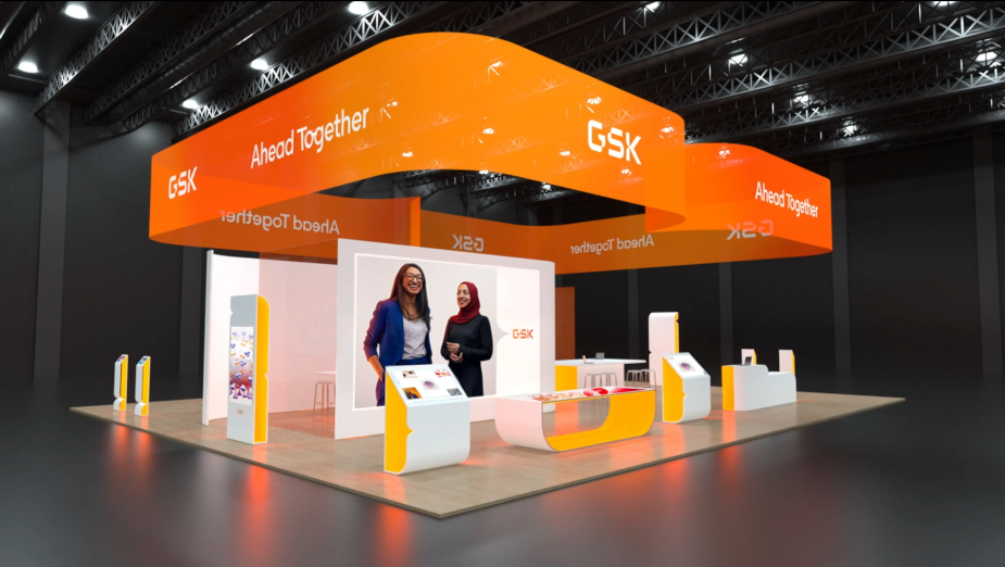
LBB> Why did you decide to retain the former design's orange colour?
Emma> Our approach wasn’t to tear everything up. There is significant equity in the GSK orange, arguably it is the one visual asset people recognise and remember — through early exploration we realised the brand would be more effective if we kept this asset, allowing us to push the rest of the identity. What we did do was evolve the orange though, making it a living asset which constantly moves and adapts, a nod to the way GSK is always adapting to treat new diseases and stay ahead.
LBB> And what was the thinking behind the new logo?
Emma> GSK is a globally recognised name. We were clear from the outset that a new mark needed to change how people felt about the name, rather than try and give it a new symbol. The DNA of the new mark is reflective of the qualities the new GSK is made of. Inspired by science and technology. Incredibly precise, with movement and flow. Its movement is inspired by the shape of DNA.
LBB> What typefaces have you used in the new identity?
Emma> We worked with our partners F37 to create a custom typeface called GSK precision. We brought them onboard to extend the DNA of the logo across the typeface. They did an amazing job, GSK precision mirrors the precision points from the logo, and has ink traps which make it legible at all sizes, from print to screen.


