


As Euro 2020’s Footballing Nations Fall, This Art Project Is Marking the Occasion

For the last month football fans have been wrapped up in the long awaited Euro 2020, and maybe because of the wait (or maybe because an Englishman is writing this having just seen his team reach the final) it feels greater than ever. But while most of us use the football as an excuse to see friends, drink beer and sing, Lee Boulton is using this massive sports event as a source of creative inspiration.
Lee is a writer who studied graphic design and, in the past, has worked as a commercial illustrator. At 72andSunny Amsterdam he’s a senior writer leading a wide range of work with the agency for brands including eBay, Google and Klarna, as well as an art installation for the Amsterdam Light Festival.
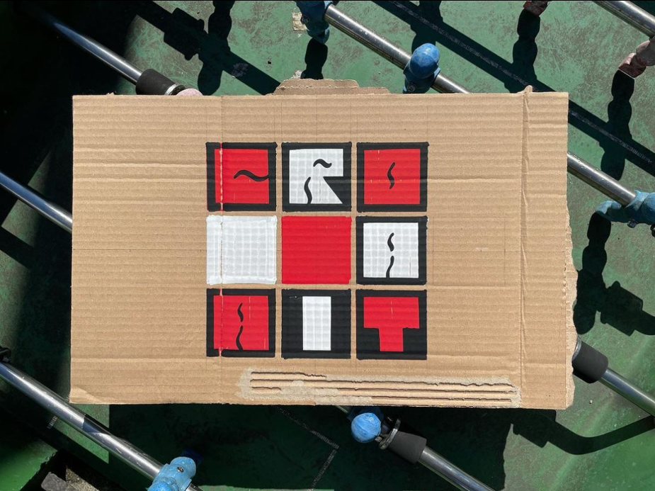
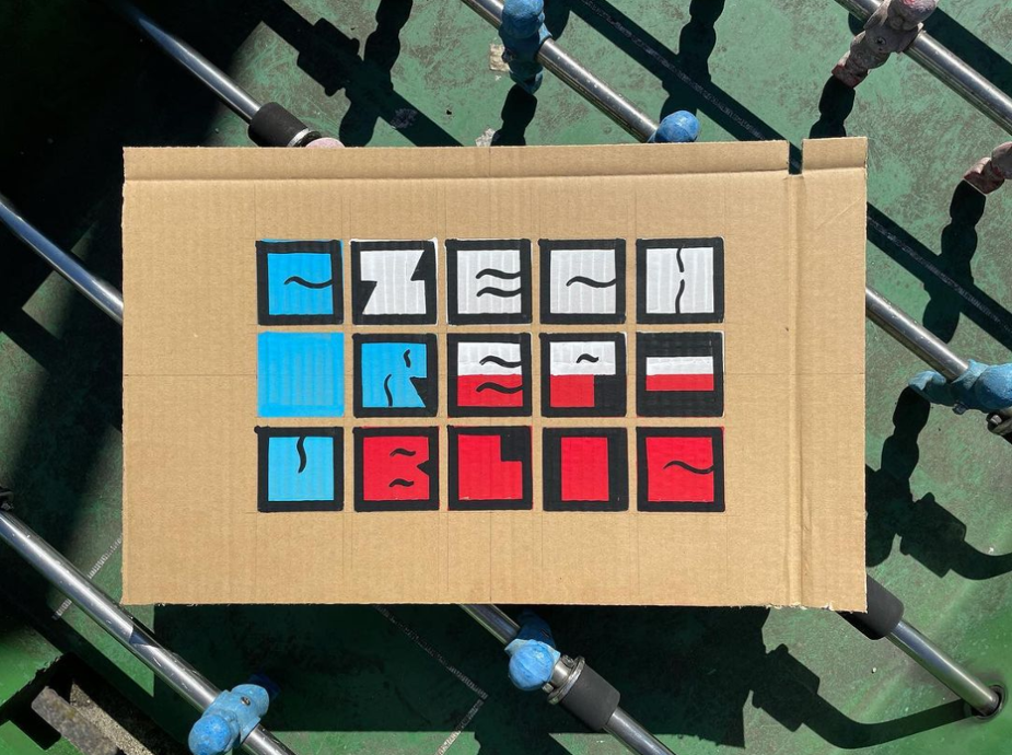
Starting over a decade ago, he has been using major international football tournaments for his continuing design project called: Nations Fall. Taking the associated iconography of every competing nation and deconstructing it, even destroying it. As each football team falls from the Euros or World Cup, so do his designs. Resulting in a surprising collection of drawings, GIFs and other visual representations that upon completion tell the story of the tournament.
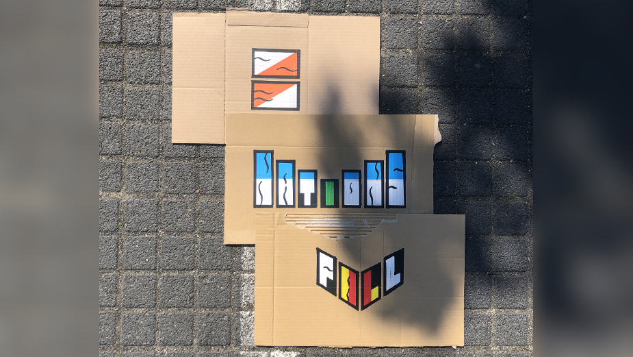
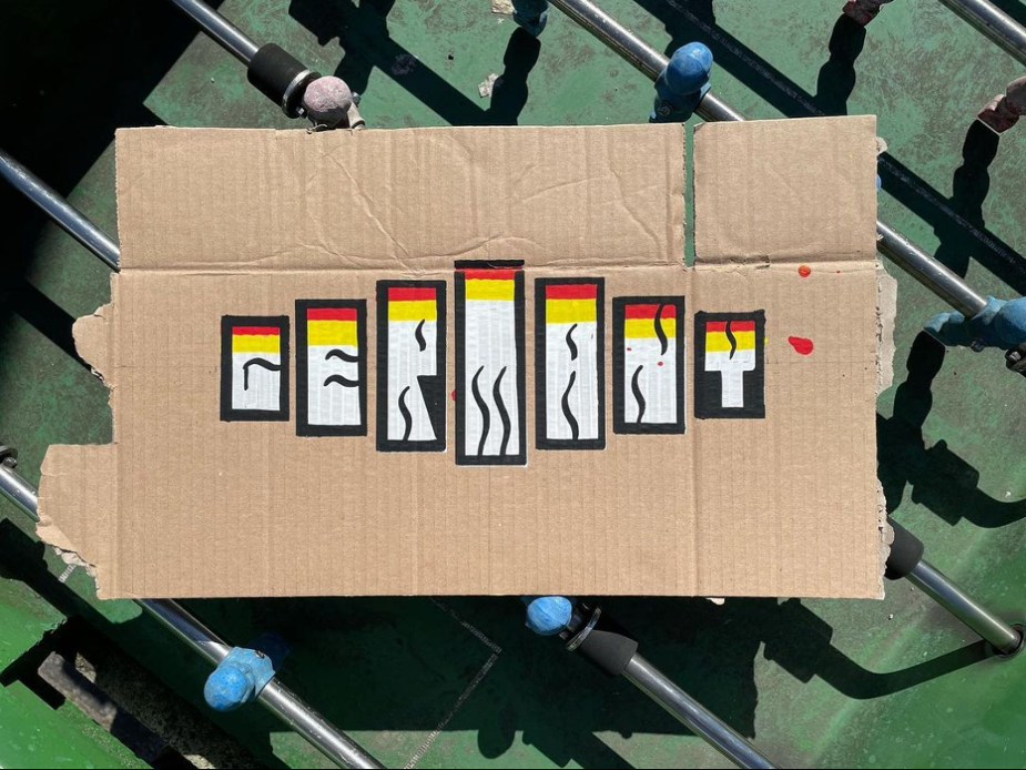
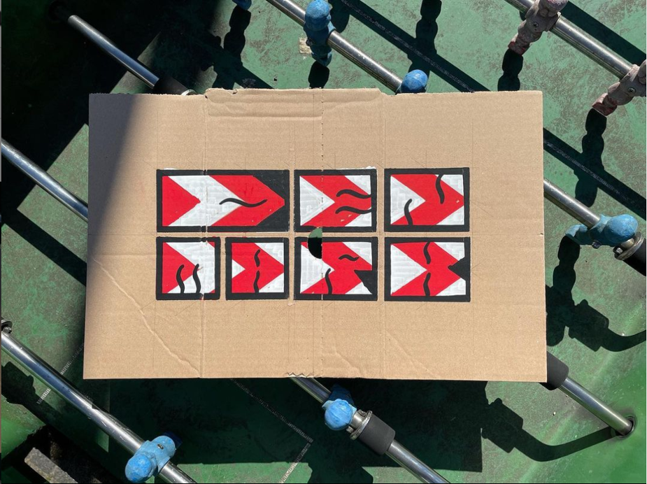
For this year's game he was inspired by the recent fan protests against lower league owners and the European Super League, crafting cardboard signs that fall for each team that exits the competition.
LBB’s Alex Reeves caught up with Lee to hear more about the project.
LBB> What first gave you the idea to start this project?
Lee> The idea for the Nations Fall project came back in 2010 for the World Cup in South Africa. I liked the thought that demolishing the emblems of each country had parallels with the broken feelings experienced by the fans themselves when their team exits a competition.
I found it a thrill to play even a small role in people’s visual experience of an international tournament and it now feels like as much of a tradition as players’ new trims and beer-soaked polyester.
LBB> Why did you decide to start it?
Lee> The beginnings of the project coincided with my early forays into commercial illustration work and the move from pens, paper and French curves to Macs and vector graphics. The first iteration of the project was in part a practical opportunity to exercise some of these new design skills.
Each version since has been largely influenced by my circumstances and head space at the time - whether it’s hustling to turn it into an exhibition, getting back to a more lo-fi hand-drawn aesthetic or, as with the latest version, making it part of the remote office sweepstake I organised.
LBB> From a design perspective, why did you find it interesting?
Lee> I’ve always been interested in the space where art and football meet. After all, it’s two of my big passions colliding. From cutting edge strips and ‘zines to humorous takes on beer mats or sticker albums, I love it all.
At first I enjoyed the task of deconstructing existing iconography like flags and crests. To take something designed a long time ago and mess with it. But as it evolved over the tournaments I embraced the challenge of developing my own new symbols to represent each nation.
LBB> What have been some of your favourite 'falls' from the years of tournaments?
Lee> With my England fan (bucket) hat on I’d be lying if I said I didn’t get some satisfaction when one of our long-standing footballing foes have fallen heavily or at an early stage of a competition.
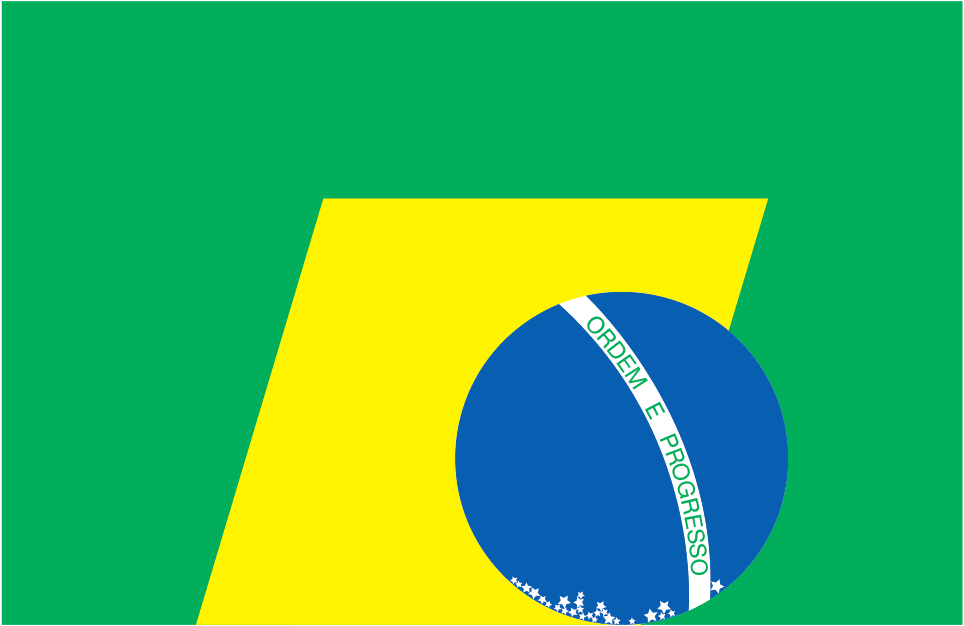
But from a design perspective some of my favourite ‘fallers’ came in my very first version of the project when I deconstructed the flags. It was fun to play with the iconic ones like Brazil, but my number one was the almost comical simplicity of moving the red sun of Japan from the centre of the flag down a couple of centimetres to the bottom. It took about a second to complete!
LBB> What has marked Euro 2020 out as a tournament within your broader project?
Lee> For this edition I was inspired by the visual language of our time - the homemade cardboard placard. As wielded by fans protesting everything from unfit owners in the lower leagues to the greed behind the European Super League. But a bit more typographically considered!
As I now live and work in Amsterdam surrounded by many Europeans from all of the participating countries in Euro 2020(1), I have received much more direct feedback along the way. I have come to realise that my imagery brings both extra joy and despair as a nation falls or avoids falling with every passing match.
LBB> How do you want to continue with it into the future?
Lee> With the delay to this Euros it means we have a World Cup following hot on it’s heels. So I already have a concept for ‘31 Nations Fall - The Story of the 2022 World Cup’. My plan is to start production a bit earlier and hopefully bring a particular production partner in to realise something a little more ambitious.
I won’t give too much away but the intention is to use this controversial tournament to further the call for greater inclusion in the game.
And, inspired by this current version of Nations Fall, I have started work on something for the football team I support. A series of ‘positive placards’ that I hope may hang in the club’s new training ground to both inspire and educate our new 2021/22 squad in all things Bristol Rovers.


