


An Experiential Pop-up at Berghain? Ad Creatives Weigh in on the CIA Rebrand
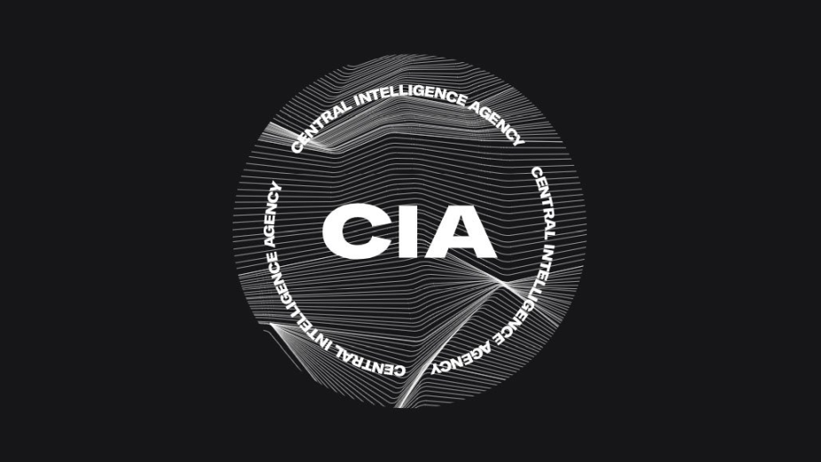
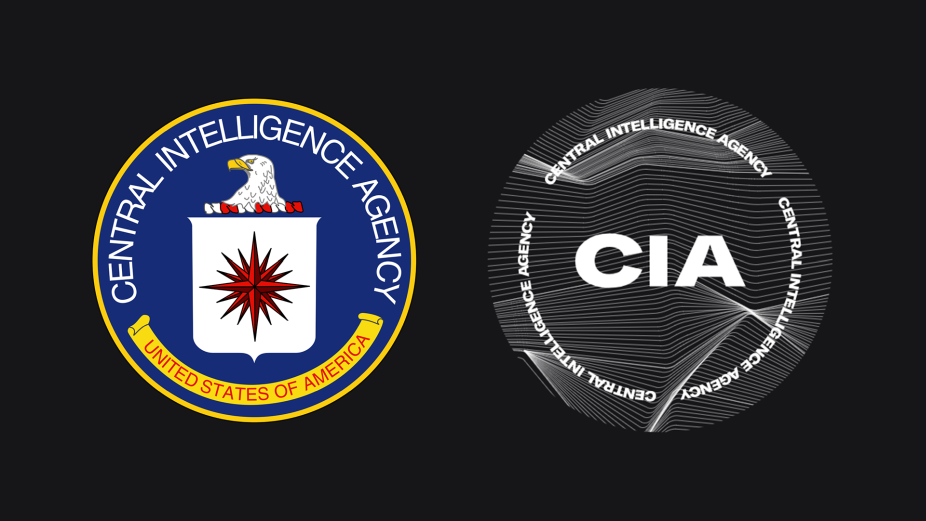
Earlier this week, the US news cycle eased into 2021 with the launch of a glossy new rebrand for the Central Intelligence Agency. The rebranding effort is reportedly part of a drive to encourage more diverse applicants "from people of all backgrounds and walks of life". According to Associated Press, "while the CIA has been diversifying for years, intelligence agencies still lag behind the federal workforce in minority representation". But the internet wasn’t quite buying that, which is kind of understandable because it appears to be some kind of attempt to disguise the CIA as anything other than a government organisation of spies. With its deep black and white visuals, rippled lines and super serious headshots, many have pondered whether the CIA is in fact launching a techno record label and / or music festival or dropping a cover version of Joy Division’s Unknown Pleasures album.
Admittedly, there are now far more pressing things happening in United States governmental organisations. But before a group of Trump supporters broke into the Capitol building on Wednesday, LBB’s Addison Capper picked the brains of five agency creatives to get their thoughts on the CIA’s fresh look.
Claudio Guglieri, Group Creative Director, Huge Oakland
Rebrands are tough exercises. There is a lot of baggage that comes with any brand and the CIA might be one of the best/worst examples of this. Consider what the institution represents in the world, the perception we all have of it historically now merging with their need to look current and recruit new talent. With all that in mind, I think this branding is a bold move. While I think the final mark feels lazy and looks like a template you could very well use to promote a rave, I do admire the intent and see some of the collateral branding artefacts coming to life nicely through iconography, type, and colour on their site. Paul Rand once said, what makes a logo successful is that it’s seen (for many years). Besides everybody’s initial reaction and my own opinion, time, recognition, and what the CIA does beyond updating their identity will dictate the success of their brand.
Romeo Cervas, Creative Director, RPA
Everyone is hating on the new CIA rebrand, but I gotta say, Joy Division was an awesome band and Unknown Pleasures is arguably one of the most iconic album covers of all time. So why the hell can’t a government agency share the same fan love? Personally, I’d pay to see Gina Haspel in a post-punk band and tear it up at CBGB. Maybe the big issue is that at the end of the day, it’s not about the bandwagon of negativity for the rebrand, but that the design just all feels too familiar. Whether it’s some sort of album cover art, EDM festival in Berlin, tech startup, streetwear pop-up, or anything in between, the visual language is something we’ve all seen somewhere before, and it makes the CIA come off as cliché. Sure, all the elements to capture younger recruits are all there: millennial-friendly font, stock imagery showing diversity, and sleek, geometric linework. But does it just feel like a design Grandpa created to try to hang with the cool kids? I’m crossing my fingers that someone from Joy Division reads this and can answer that question for all of us.
Stevie Archer, ECD, SS+K part of the M&C Saatchi Group
Look, change is hard. And it’s the CIA. No matter what they did there was going to be backlash. But that said, SS+K has worked on a number of rebrands for political and issue-based organisations, and in every case the key to changing perception successfully is to do it credibly. This rebrand, and its adoption of a hyper-trendy millennial aesthetic to recruit younger, more diverse talent, is the equivalent of an undercover operative putting on those glasses with the big nose and moustache attached as a disguise. You can spot the bullshit a mile away. Their recruiting efforts will be taken much more seriously if they avoid the trendy tropes and lean into the timeless elements that befit their official capacity and outlast whatever Instagram-friendly aesthetic pops up next. What is successful about this effort is - ironically - the accessibility. It is quite interesting to see a highly guarded and covert organisation publicly sharing job openings. I imagine a massive hurdle in recruiting is that people quite literally don’t know what they do. Simply the act of putting out job descriptions in a clear way can only help their efforts.
Chris May, Executive Creative Director, Elephant
Love or hate it, people are talking about the new design and it has become part of a cultural conversation. I’d say that’s a win for the CIA, since the objective appears to be getting more exposure for recruitment purposes. It’s not a revolutionary design, but they also didn’t play it safe, which must have been a challenge given the nature of the organisation. It also could have been bland (I personally think it kinda still is), however there is just enough of that industrial, techno-flyer-flavour to make it special and ripe for the internet hackery. The fact that people are taking the time to modify the logo and are creating memes makes it even better. I’d love to see the CIA respond - surely an experiential pop-up at Berghain is on the cards! So job well done CIA design team, now’s who up for taking a crack at the DMV?
Adhemas Batista, EVP, Head of Design, Deutsch LA
For the most part the new ID feels like the designer had the CIA literally watching them - I can imagine in my head all the processes this project went through, and it elevates my anxiety. It feels to me like he/she/they had a good start; they started with a great font choice, GT America from Grillitype, which is a relatively new font I love. But then from a set of over 80 font weights, they didn’t quite figure it out. Overall, it feels like it borrowed ideas from lifestyle brands, but the execution didn’t land. The photography is a tad cringeworthy and it gives me cheap Downtown LA apparel vibes.


