


A Deep Dive into 6 Iconic Title Sequences
We’re living through a golden age of television. Thanks to services like Netflix, Prime Video, Hulu, Now TV and Disney+, plus the consistency of old cable stalwarts, life in 2020 is not short of high quality, long-running, beautifully crafted TV. And with all of that TV comes a need for equally endearing title sequences, a sort of repeated ad for a show that sets the tone and introduces themes and characters without ever giving too much away to the viewer.
The creators of some of the finest and most loved title sequences of modern days are the team at design studio Imaginary Forces. A quick look at the company’s website presents you with pages and pages of title sequences for iconic shows and movies of all shapes and sizes - Stranger Things, Mad Men, Seven, The Pacific, Band of Brothers, Jessica Jones, South Park, Boardwalk Empire. Just a few days ago it was announced that they’d handled the opening for ‘I’ll Be Gone in the Dark’, the soon-to-air docuseries based on Michelle McNamara’s best selling novel about The Golden State Killer.
LBB’s Addison Capper wanted to get deeper into the creative process behind some of Imaginary Forces’ most famous work. In an ideal world he’d have the scoop on everything listed above but for the sake of time and practicality he did his best to whittle it down to six. He spoke to Peter Frankfurt, executive creative director; Karin Fong, designer, director, creative director; Alan Williams, designer, director, creative director; and Harshit Desai, designer, director, creative director, to get the lowdown on the process behind the titles of AMC’s Mad Men, Netlfix’s Stranger Things, Apple TV series See, Hulu documentary ‘Hillary’, and Boardwalk Empire and Vinyl, both produced by HBO.
Stranger Things
Peter Frankfurt
LBB> What are your earliest memories of this project? What was your starting point for building these titles?
Peter> I know the executive producer Shawn Levy - we’re friends and have worked together on other things. We’d been contacted by the show and they wanted us to pitch on it, so I contacted him and asked, why are we pitching on this? You know me and our work. He said, these guys are two brilliant brothers and they are very interested in the main titles and they want to talk to everyone. So we suggested just talking to them, not as a pitch, just to see if we would get along. We got on the phone with the Duffer brothers, who were just the loveliest guys, really enthusiastic and positive. And the greatest thing was that they were total main title nerds. What a dream!
Michelle Dougherty [creative director] and I were on the phone with them and they asked if we’d ever heard of someone called Richard Greenberg? Richard Greenberg was the most important mentor in my professional life. I started my career working for him and met him when I was 19 years old. He’s totally under-appreciated in terms of the level and consistency of the quality of work that he did. I was completely stunned and amazed at the fact that these guys were shouting out his name. I went through the whole thing with them and that was the bonding moment. After that, we were in. I called Richard afterwards and told him that these guys, this hot Hollywood duo, think he’s a fucking God. Sadly Richard passed away and they never got to meet but when we won the Emmy, we thanked Richard. And the sequence is an absolute homage to his work. I’m old enough that I worked on things that we were actually quoting in the Stranger Things sequence.
LBB> Can you speak a bit more to that? It’s really just the font sneakily coming together right?
Peter> I’d worked with Richard on a sequence for a Stephen King main title in around 1980, and it was so much fun to talk about things like that with the Duffers. The titles for Altered States were all typographic, Alien was just building on the letterforms very slowly. These are all works of Richard’s so the fact that we could talk about them in detail was delightful for the brothers. They’re just total enthusiasts, and you can tell when someone is just really good - and it makes you really want to up your game, even though what we were doing was super simple.
Everything that is done now is done digitally. But we wanted this to feel as optical and analogue as possible, the way that we would have done it in the ‘80s. No matter how hard we would try then, there would be some error involved. So we ran with that and aimed to make it as though, if we had done this in the 1980s, we’d have been fired because it would be so dirty. Highlighting the optical and analogue aspects became part of the charm and effect of it but the designers working on this had to learn everything. It was like showing a kid a rotary phone with a cord. We had to get people to familiarise themselves with the aesthetic - the technique was all faked.
LBB> Any parting thoughts?
Peter> Well then we got the music. It has a little echo of ‘80s in it but it’s really quite contemporary, and we were blown away. One more thing that’s interesting and essential to the power of the titles is that you move through the type of whatever the episode name is into the show, which is a super retro idea. It was an old fashioned, funny way of doing it but it’s super effective. It very clearly sets up a filmmaker’s authority - you’re in my hands and I’m taking you directly into this story. It’s also charming and weirdly kind of cool.
Vinyl
Alan Williams
LBB> What are your earliest memories of this project? What was your starting point for building these titles?
Alan> Imaginary Forces definitely wanted to win this. Almost all of our creatives were involved in the pitch which brought a large number of concepts to the table. Our main goal was to visualise the '70s NYC music scene in a fresh and evocative way to the likes of Mick Jagger and Martin Scorsese. It was an amazing challenge. How do you create something that moves those who not only lived through that movement, but were lead characters in it?
After brainstorming with editor Jessica Ledoux, we concluded that we wanted to explore the impact of music through the visual representations of vibrations, dissonance, and even destruction. Music impacts mood, shifts ideas, ignites riots. The explosive shift in the '70s knocked New York City, and the world, on its back. Much of the music blaring from these NYC nightclubs was irreverent and out of control. We wanted these titles to feel the same.
On a Sunday afternoon I was in the studio trying to find a visual solution and I walked into the kitchen and found a pound of flour and brought it into our shoot space. I propped up my iPhone and shot my hand slamming down into the powder at 240 fps. As I watched the vibrations send the flour flying, I began to see a visual language for impact in an interesting way. I immediately called our EP, Jon Hassell, and said, ‘What if we saw music? No instruments, no record player, just vibrations. I want to tarp off a portion of the office, buy 100 pounds of flour and baptise someone in a sea of vibrations.’ Jon paused for a moment and replied, ‘I’ll give you a $100… just clean it up.’ It still makes me smile.
I knew that Terence Winter celebrated Nucky Thompson in the Boardwalk Empire title sequence and so I wanted to provide him the option of doing that within our vibrating powder world. I bought a $30 tarp from Home Depot, blocked off a big chunk of our office, bought 12 bags of flour from Trader Joe’s, and asked my good friend, Nate Buchik, to play the role of Richie Finestra. I sat him down in a chair, blasted some Pentagram tracks and asked him to simply react to the music. No inhibition, just feel it. His foot starts tapping, his hands beating on his knees, his head nodding, until eventually, he was dancing in this plastic dark space of our office. All the while we began introducing more and more flour until finally he was completely covered. I shot it all at 240 fps with the iPhone. It created interstitials for a mood edit that ultimately helped us get the job.
LBB> A big part of the sequence is the hyper close-up shots of vinyl production. How did you achieve this?
Alan> Because the show was named Vinyl, the team and I looked for ways we could get around actually showing a record in a traditional sense. Jessica came across microscopic photos of record grooves. I knew if we had to show the record player, we were going to do it in a way that felt just like our powder: cinematic, unique, and brutally raw. Like being in the middle of an aggressive crowd during a rock show, we realised the needle when in motion bangs back and forth between the left and right channels in the vinyl’s grooves. It created this very violent visual, inspiring us to create the jarring shift where the needle bounces out of the grooves, riding atop the connecting top rim, and then skipping downward into a new track. There were various explorations of showing the vinyl as an abstracted graphical element, but the showrunners felt it was this microscopic in-camera look that most represented the show. It felt unique and yet real. The violent needle alongside the vibrating powder and destruction was approved by both the showrunners and HBO giving us the green flag to push forward. Bhakti Patel really led this project in the CG department, creating the majority of the needle shots in 3D.
LBB> There's a lot going on in general though. Talk about all the different components - the shots of gigs, of cities, pills - and the inspiration behind them.
Alan> The explosive shift in the '70s knocked New York City — and the world — on its back. We wanted these titles to feel the same. We loved the idea of disorienting scale shifts, bouncing back and forth between microscopic vibrations to impacts as large as those that brought the roof down on Richie Finestra in the pilot. We’ve all heard music, but we wanted the viewer to really feel it.
LBB> Is much of it stock footage? If so, how do you find utilising stock footage when it comes to developing title sequences?
Alan> There were a few archival shots from the ‘70s but the majority of the shots in the sequence we shot ourselves. We shot on 8mm, 16mm, VHS, and even modern SLRs. Our killer producer, Tess Sitzmann, was a godsend for this job managing all of these various assets throughout each stage. We loved connecting the visuals of vibrating particles and low-fi photocopied flyers to the grain and degradation of Super 8 film. What distortion pedals did to electric guitars, we wanted to do with our film stock. And so we settled on a look of raw, grainy, black and white film. We shot test early on with a Super 8 camera that sold this look to HBO.
LBB> Any parting thoughts on Vinyl?
Alan> When working with a company like HBO there is this hesitation in creating an anti-prestigious title sequence. From the very beginning I wanted the viewer to feel adrenaline racing, disorienting dissonance, like what the crowds during The Stooges might have felt. I am most happy with how frenetic and raw our edit feels. I wanted the viewer to feel the raw guttural reaction that Richie Finestra felt when the club caved in on him. I wanted young and old to be reminded of that first rock show that blew their minds and just how indebted we are to those in the ‘70s that paved the way for it.
Mad Men
Peter Frankfurt
LBB> What are your earliest memories of this project? What was your starting point for building these titles?
Peter> I was really excited about the opportunity because that’s the world I’d grown up in. My dad was a generation younger than Don Draper but he was a great creative star of ‘60s New York advertising. He became the first art director to run Young & Rubicam, which was an agency referred to a lot in the show! My father was completely delighted - he would call me every fourth or fifth show and say, ‘hey, did you watch last night? That whole thing was about me!’
Matthew Weiner contacted us and put forward a really interesting brief. He basically described how he saw the opening of the show. It was all live action where the camera is following behind the shoulder of someone, who we understand to be Don Draper, and he’s getting on the train in the suburb that he lives in. He gets off, moves through Grand Central and onto the street, into his office building - always behind him, never his face. He gets to the office, walks past reception, by his assistant, into his office, closes the door, walks to a window, opens it and steps out. He pitched that and we were like, holy shit. The title sequence is his suicide? Matthew just said, do you think that’s provocative enough?
LBB> So what happened from there?
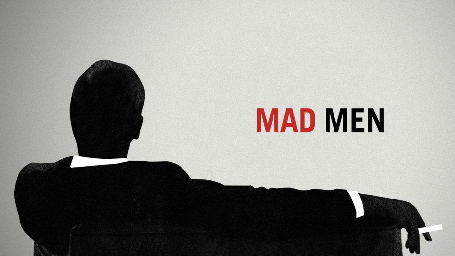
Peter> The budget was quite limited so the possibility of shooting all that was not possible. We suggested taking that notion and creating it as a graphic story. We were inspired by the period, people like Saul Bass. We did five or so storyboards around the idea, one of which included the frame that ended up being the end image for the sequence - the silhouette of Draper sitting on a couch smoking a cigarette. We got to that frame in the presentation and Matthew said, ‘oh my God, that’s my show right there’. He couldn’t have been more definitive. Originally that had been a prelude to him going out the window but we decided to make it the end shot - and that solved a lot of problems, the fact that he doesn’t die. Instead he emerges as this icon for his age. Then it was all about finding the right ads and imagery that he’s falling through. The research process for that was very extensive.
LBB> That shot is so iconic! What was the creative process like for that? How did you land on that? Did you expect it to become what it did?
Peter> No, of course not! So much of this is just serendipity, timing and how good the show is. It turns out that Mad Men was a really fabulous show. But no one thought that it would capture the imagination like it did. But the show almost single-handedly reintroduced the world to the design, aesthetic and fashion of that era, and Jon Hamm embodied it all so well. That silhouette became an icon for something that everyone was discovering for themselves. You could never anticipate that.
LBB> Matthew came to you with that idea of Don committing suicide - did you ever find out exactly why he was keen on that for the opening to the show?
Peter> Well Don is a tortured, layered, complicated person with demons. That’s the whole show and why the sequence, even as a graphic, more abstract way of telling that story of attempted suicide, sets up the show so well. For us one of the most powerful images of the sequence is at the beginning when he’s standing in his office and he puts his briefcase down and everything falls apart, it just dissolves. He doesn’t jump out the window, the room literally disintegrates around him and collapses. That’s a dream image, a totally subjective dream image that so many of us have probably had in some form or another. I remember Mark [Gardner, titles director with Steve Fuller] saying to me, doesn’t that particular moment hit you? And in the context of the full show, doesn’t it feel so true to Don Draper?
LBB> Any parting thoughts?
Peter> The music - which was Weiner’s idea - doesn’t get spoken about enough. It’s this dreamy kind of techno. The sequence is such an evocation of '60s imagery, graphic language inspired by Bass. The music is completely contemporary, which becomes a really wonderful disconnect and helps bridge the sequence and keeps it feeling relevant and modern. It was all Matthew. He told us he loved the track and that we should use it.
See
Karin Fong
LBB> What are your earliest memories of this project? What was your starting point for building these titles?
Karin Fong> I’d worked with some of the people on this team before and they briefed me on the show - it was a post-apocalyptic piece where everybody was blind, and because of that, even though it was in the future, humankind had reverted in many ways. It was a really interesting premise for titles. During the first meeting with the showrunners, I half-jokingly suggested that we just run a black screen for the title sequence, where you can’t see a thing and it’s all audio. That was a bit radical and at the very least we needed to have people’s names on the screen but working with that premise - of being audio led - was the first germ of this idea.
A really great part of working on this was being able to talk to the show’s blindness consultant, Joseph A. Strechay, who was advising them on how blind people navigate the world and varying degrees of sight. I was talking to him about human echolocation, which was explained to me as being quite fuzzy but in your mind’s eye you see a shape or image or location, and then it dissipates. So we spoke about the text and the typography and if we could mimic that effect - for example black on black but then a sound, like a clap or a click, would make it more visible. Francis Lawrence [director] wanted to build a soundscape with an arc so it begins very pastorally to mimic the beautiful, peaceful things that happen in nature. But then you begin to hear hunting dogs and more horrible sounds. Joseph told us that the worst kind of place to be if you used echolocation was something like a construction site because all of the sounds layer and you can’t make each one out. So we tried to build a soundscape that was a cacophony that built to something like that, almost like The Beatles' A Day In The Life.
LBB> What inspired the use of all the lines that hang off each word and make up the images with the sequence?
Karin> We wanted a particle system that didn’t look digital. That was important because even though it’s set in the future they’re rediscovering things, there’s no technology. The way they read in this society is based on the Incan knot system, they have strings with patterns of knots and read from that. We tried some early tests and at first we had these particles that were like dust lights that were beautiful but they looked very digital. We wanted something that would reference those strings in a way. It looks fibrous and is very tactile.
LBB> What techniques did you utilise to actually produce the sequence?
Karin> There’s a lot of R&D from the CG side and working with the particles. It was very important to see things for a fleeting moment and then it go away, so it didn’t feel like things were fixed. We looked at if you could partially render something and still see it, and how motion played into that. We built a lot of models and then it was about subtracting, which is kind of funny because a lot of the time we’re adding and trying to make things more real. It was like a weird CG haiku where we were seeing how little we could put on there and still see that it’s a horse for example. Or there’s a rope suspension bridge that plays a big part in the drama, so how little of it could we see but still make out what it was?
Our animators really worked on the particles so they could move on and off of these models in a way that was convincing. So if you imagine shooting a scene - a dog or vultures or babies in this case - then you’ve got this visualised layer of how the particles interact with that. How many particles would we need and then which ones would be actually attached to the object? We wanted to make sure that they read gesturally because when you’re echolocating you’re actually moving through a space and moving around the sound particles. We had to work out how to make these things read gesturally and not as fixed textures as we usually do.
LBB> Any parting thoughts?
Karin> We were so psyched that Francis was not into having a traditional score that just sweeps you away and carries you into a rhythm. A lot of the power of a main title sequence is a very powerful score that sweeps you and gives you a push. We wanted the audio to drive but in a different way that gets you to visualise what you see on screen. We’re usually talking to a composer because one of the most powerful things of any title is the music. But in this particular case we worked directly with a sound designer to shape the story in conjunction with our visuals. But even though it’s a sound design piece it still needs to have a rhythm to it so hopefully you can feel the build and it’s connected to your adrenaline.
Hillary
Harshit Desai
LBB> What are your earliest memories of this project? What was your starting point for building these titles?
Harshit> It was one of my first projects at Imaginary Forces. I had the wonderful opportunity of co-directing the title with Karin Fong. Filmmaker Nanette Burstein came to us with the four-part docuseries and it needed an introduction. She told us it cannot be more than 35 seconds and it needs to announce itself!
LBB> It's such a simple concept - what inspired this approach?
Harshit> The major jumping off point is that the doc is simply called ‘HILLARY’. The documentary is not just about Hillary's political career but also her life. Any time you think of someone's life story, the first thing that comes to mind are photographs. Nanette Burstein had provided us with a vast archive of personal and press photos; a side of Hillary Clinton which no one had ever seen. We are talking about different mediums, black & white portraits, yearbook photos, polaroids, magazine covers. Flipping through them we could see Hillary as a student, leader, mother, wife, senator and, of course, as a presidential candidate. It was as if we were seeing her transform herself through these photographs - time travel from girlhood to candidacy. Early on we had the idea of locking in the eyes in each photo… and letting it rip, like a flipbook. That's when we thought, what if we try to stack these in chronological order and let them play?!
LBB> What was the process like of collating all the images? It must have been painstaking! And then how did you go about putting them all together?
Harshit> It definitely was painstaking (shout out to Lin [Wilde, editor] and James [Gardner, animator] for the combing through the archival footage). Initially, we just focused on the chronology. The various mediums of the photos led to scaling and cropping them in frame paving the way for some very tactile compositions. The locking of the eyes move came from the same process. This also gave us a great opportunity to sneak in some very famous photobombs.
And of course we needed a killer track that matched Hillary’s spirit and boundless eyeglass styles! We wanted this to feel punk rock, to have some serious attitude. Hillary is a radical and we needed the music to reflect that. When Lin found the track ‘Take Back the Power’ by The Interrupters, we knew we had something. We loved it and so did Nanette Burstein. Kudos to her for sticking to her guns amidst talks from the network about changing the track! Our approach is verité, found images - in most cases we didn't bother to touch anything up. There's some, where Bill is literally cropped out as we get her portrait into the centre. Some have magazine headlines, others the borders of printed photos. This rawness is accentuated by the track. Same with the typography. It’s in your face!
LBB> Personally, how did you find the process of researching so much imagery of such an iconic person?
Harshit> Eye-opening! Regardless of what your political leanings and feelings about Hillary Clinton are, after researching and reading more about her, I was quite impressed at what she has managed to achieve through her personal life and political career. It must be very hard to be one of the most admired and vilified women in the world.
LBB> Any parting thoughts on Hillary?
Harshit> Hillary Clinton's name brings back memories of the 2016 election for everyone. I am an immigrant and so I don't have the right to vote. Looking at what has followed under Trump's presidency and the current state of the country, working on this title was a surreal feeling. On one hand, I had the ability to look at it as an outsider, truly objectively. On the other hand, I can't help but feel melancholic at what could've been. Parting thoughts? I guess if you are able to - Vote Better?
Boardwalk Empire
Karin Fong
LBB> What are your earliest memories of this project? What was your starting point for building these titles?
Karin Fong> My first memory of this project was on the set of Boardwalk Empire. We headed to Brooklyn and saw this wall of shipping containers on an old shipyard, and behind was the set. The set is amazing. Usually on sets you can’t really go in the stores and things like that, but there you had cafes, lingerie shops, you can shoot into the stores, out into the street, it’s all dressed. It was amazing. That was my introduction to Boardwalk Empire. We met their historian, who was from Atlantic City, where the show takes place. It’s all set in such a pivotal moment for US history and the history of that city. It takes place between the two World Wars and Atlantic City itself is like a microcosm of American society. There’s the upper class but for the first time the middle and lower classes are vacationing and taking day trips too. There’s the seedy mob side to it but also the cotton candy boardwalk with families. It’s American commerce at its most explosive. And there’s politics, race politics, corruption.
We were talking about this with Terence Winter, the showrunner, and our first idea centred around the boardwalk. I felt like we had to shoot this boardwalk because it represents so much of the show - the idea was around not showing Nucky but instead his point of view as he’s walking down the boardwalk. I had grand ideas of a timelapse sequence, seeing the boardwalk from day to night and how it transforms through that. There were so many lovely details to focus on. But then we were talking to Terry, who has done such amazing work for HBO and their shows’ titles, and it came about that maybe we shouldn’t do a montage? HBO does amazing montages for its shows but I think they realised that Boardwalk Empire was special and they wanted something that would really grab people’s attention in a way that, frankly, I’m glad they pushed us towards.
LBB> What were the next steps after that?
Karin> We went back to the drawing board with Terry and Tim Van Patten [director] to figure out what was essential about this show. Nucky is the unchanging centre. We were showing the titles originally from his point of view on the boardwalk, but in the end we almost did a 180 where we barely showed the boardwalk at all. But we kept the idea of the timelapse - time changes around Nucky while he is this constant. He’s always there and in the centre, looking out at this coming of liquor from the horizon, which gives him his fortune and transforms Atlanta as a city.
LBB> I've always noticed how his shoes are crisply clean despite him being in the waves. Why?
Karin> I’m so glad you noticed that. It features in a parody that Sesame Street did of the show too. We shot that and ran it backwards so the water recedes from his shoes and leaves them really clean. In the show he’s got his hands in all these things but he never gets himself dirty. He’s the puppeteer. For that we had to work with the wardrobe department, which was amazing. The socks are vintage, the shoes are vintage, they even wear vintage underwear. Everything on that show is so detailed. We shot it with Steve Buscemi in the middle of July on the beach, and he’s wearing a three-piece vintage suit. It was so hot.
LBB> What was he like to work with?
Karin> He was fantastic. These things can’t always be too fun for the talent but he was such a charming and agreeable man, always in character. I was eight-and-a-half months pregnant at the time, huge as a boat, on the beach waddling around. My husband came just in case I went into labour during the shoot. We’d been planning this shoot for months, I wasn’t going to miss it! I remember joking with him that I’d call the baby Enoch - Nucky’s real name - if I went into labour.
LBB> What’s the story of the music that you used?
Karin> We ended up using music that HBO first sourced for the trailer. We tried all kinds of things. It’s interesting to put different music to different sequences to see how it changes. We put Bob Dylan to it, a 1920s song called By The Sea - it’s amazing how that immediately puts you into this vintage piece. The Brian Jonestown Massacre is what we went with in the end. When you put something contemporary over something like that, it gives it a tension and makes it much more interesting - just like the Mad Men titles. Even though these dramas happen in a certain time period, they’re really happening now, they’re with you now. It’s important to tap into the present emotion and not feel like it’s too removed.


